Quantcast
Channel: John Seed, Art Writer
Viewing all 1454 articles
Browse latest View live

Conor Walton: Contemplating Higher Things

$
0
0
2014-09-01-selfportrait2014.jpg
Conor Walton, Self-Portrait, Oil on linen, 2014

Conor Walton, one of Ireland's leading representational painters, strives to create paintings that go beyond mere technical competence. One of his stated goals is to endow his works with high, shared ideals so that his images will carry some of the cultural importance that religious art carried in earlier eras.

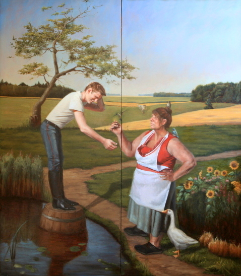
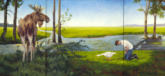
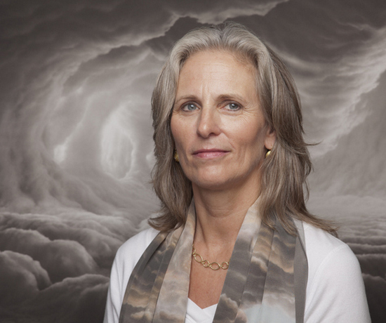
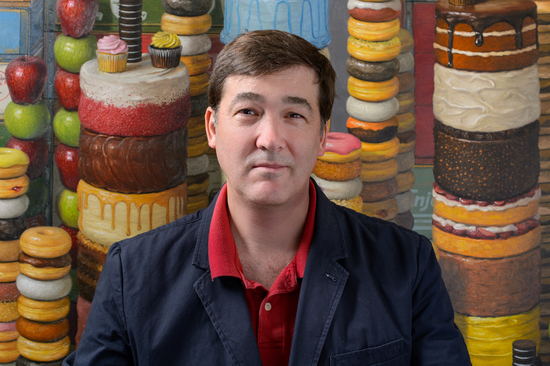
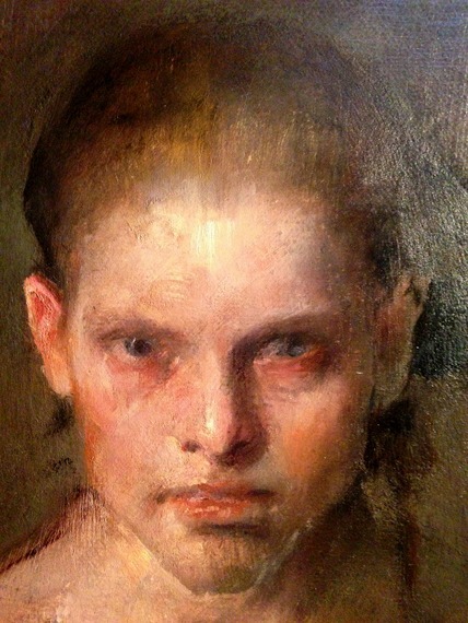
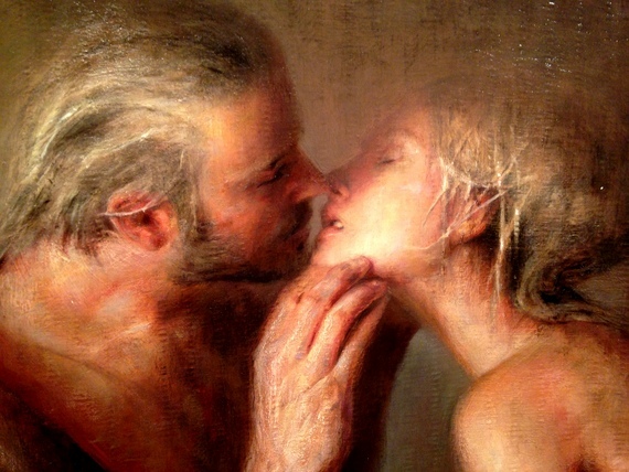
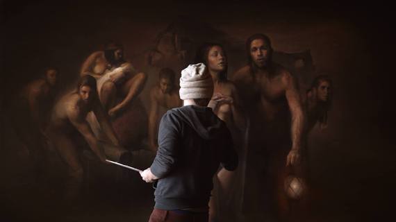
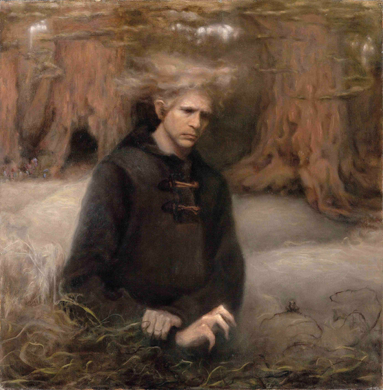
I recently interviewed Walton, who will be exhibiting eight recent still life paintings in San Francisco this month, and asked him about his background ideas and interests.

John Seed in Conversation with Conor Walton


2014-08-31-ScreenShot20140831at9.46.50AM.jpg
Veiled, Oil on linen, 18 x 20 inches

Tell me a bit about your childhood: were you always an artist?

No! I was an astronaut, a commando and a zoologist first, as far as I remember. But I always drew pictures. I probably spent most of my childhood lying on the floor drawing and painting. I was quite shy and a bit of a loner. Drawing allowed me to escape into a world of my own making. But it was also my primary means of relating to the real world. I built my world out of pictures.

2014-09-01-saturnalia.jpg
Saturnalia, Oil on Panel, 18 x 24 inches

Was Ireland a good place to receive artistic training? Tell me about your studies in Ireland and also in Italy.

The Ireland I grew up in was still a very traditional, conservative, Catholic country. It was largely untouched by the destruction and upheavals of the two World Wars that completely changed the cultural landscape in the rest of Europe. The teaching in the art colleges was very conservative up until the late sixties, when there was a sort of Cultural Revolution and the Modernists burst in and started shaking things up. As a result, when I went to NCAD in 1989, there were still some 'Ancien Regime' teachers left who were trying to teach painting as a craft according to "academic" principles. 

But there were also Abstractionists, Neo-Expressionists, Pop Artists, Postmodernists and Conceptualists. All the major strands of twentieth-century art were represented by the teaching staff when I was there. They all seemed to secretly despise each other, and disagreed in their teaching about absolutely everything, and I found the whole experience extremely disorientating, but I think I learned a lot, from all of them in different ways. In terms of the cultural power-politics of the time, the 'academics' and 'traditionalists' were a waning force, but they were still there. They are gone now. 

My time in Italy was in many ways the opposite experience. When I studied painting in Dublin, my interest in the craft and tradition of painting was seen as deeply reactionary. I was denounced for painting 'salon pictures', for producing a sort of wanna-be authoritarian or fascist art. But when I went to study with Charles Cecil in Florence, I was made to feel like an apostate of tradition - a Modernist! A Relativist! Charles avowedly hated the Twentieth Century, and his teaching seemed designed to produce a sort of simulacrum of the art of an earlier age, in which all evidence of Modernity, of NOW, was to be ruthlessly repressed.

I thought this was utterly pointless, and I ended up having as many arguments with Charles as I had with the Modernists back in Dublin. In fact they were even more bitter. I was almost banned from Charles' studio. The only thing that kept me in was that I knew my art history. Charles had a great way of quoting Leonardo, or Rubens, or Joshua Reynolds, like they were still alive and he'd just been talking with them over a drink in the bar next door. I'd studied all the sources he was quoting, and could answer back, and even correct him occasionally. Even while this annoyed him and challenged him, it thrilled him. No-one else answered Charles back. So he never kicked me out. And I did learn a lot from him, though not always what he wanted to teach me. I even respect the depth of his hatred for Modernity. I've absorbed it in my own way.

2014-09-01-ceci_nest_pas_une_big.jpg
Ceci n'est pas une Blague, Oil on linen, 24 x 30 inches

You have a degree in Art History: when did you make the switch and make painting your main priority?

Painting was always my main priority. But NCAD ran a joint honours degree in art history, and those with brains to spare were encouraged to sign up and get two degrees for the price of one. At the time, hardly anyone in Ireland was making a living from art; you were expected to support yourself principally by teaching when you left college. Because my work aroused the hostility of the Modernists I was constantly in danger of crashing out of the painting department, and I couldn't see myself getting a teaching position there in the face of such opposition, so teaching art history seemed like a reasonable alternative. I was even allowed to write my thesis on abstract art and received a prize for it, despite my saying things in the thesis that were highly critical of the whole notion of abstract art. It seemed to me that art history was still a true 'academic' discipline with objective standards, whereas in the painting department any notion of academic discipline and objectivity had collapsed. But the art history department in my art college was unusually liberal.

When I went on to do a masters in art history in England intending, again, to focus on Modernist art from a highly critical perspective, I found my path blocked. I found that the specialists in Modernism I sought out to supervise my thesis wouldn't even entertain my ideas and refused to cooperate. Their hostility showed me that art history isn't such an objective discipline after all!

2014-08-31-ScreenShot20140831at9.44.47AM.jpg
The Enemies of Progress, Oil on linen, 24 x 48 inches

Basically, those who make their academic careers out of studying an artist or movement become cheerleaders for their subject. They can become so wedded to the values and narrative on which the high reputation of their subject depends that they won't see them challenged. This is why the broad history of art in the twentieth century has become such a conventional, well-established orthodoxy. So I ended up doing my thesis on an episode in seventeenth-century cultural politics called "The Battle of the Ancients and the Moderns". I was still attacking the precepts of Modernism, but this time from behind! Which was fine. My supervisor said it was one of the best dissertations in the history of the department, and I was awarded my degree with Distinction.

In the end I found I didn't need to teach art history; I could earn a living from painting. But I owe a great deal to those studies. A grasp of past styles, iconography, symbolism has enriched my work in pretty obvious ways. But the drive behind my inquiry was my sense of cultural disorientation. Why did I feel so at odds with the ideas that were being taught at art college? Why did I find it so hard to admire or even respect so much contemporary art? These were puzzles that I could only solve by a period of intense study and deep reflection. And this was what I achieved while (supposedly) studying art history. So I managed to reorientate myself, and my world-view gained depth and maturity.

2014-09-01-judgement11large.jpg
Still Life with Judgement, Oil on linen 24 x 18 inches

You have a feeling for allegory. Tell me about one of your allegorical paintings.

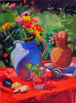
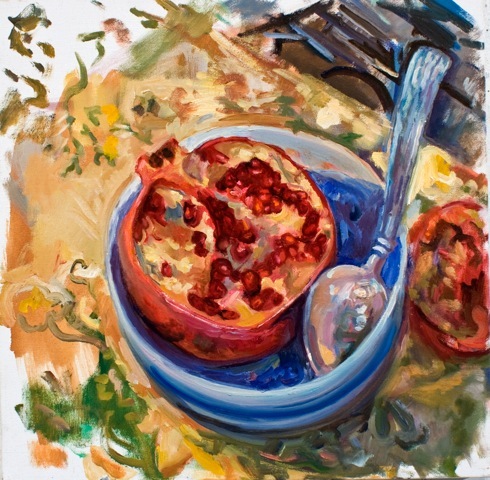
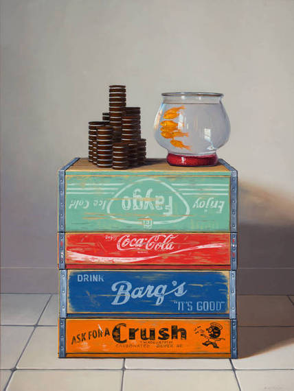
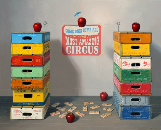
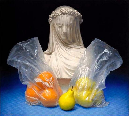
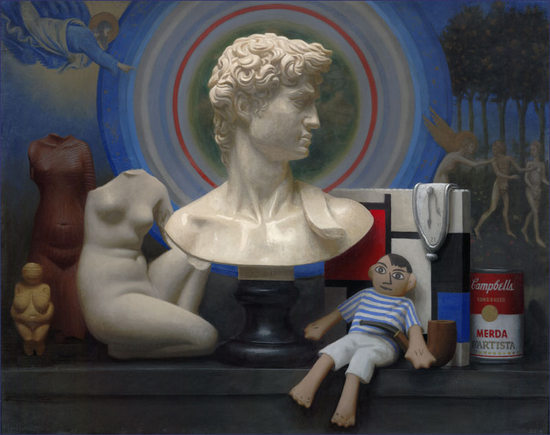
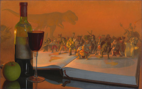
My Still life with Judgement is an allegory of aesthetic judgement. Modern notions of aesthetic judgement are derived from Immanuel Kant, whose Critique of Judgement is one of the books in the painting. The basic idea is that Art affords us an extremely pure pleasure, unmixed by any self-interest, because Art is useless. Now this idea is total crap. Art is extremely useful. Those who make a big deal about it demonstrate their refinement, their class and (if they have it) their wealth for all to see. It has huge social and cultural utility. But all these vested interests hide behind the common lie that, in matters of Art, good judgement is disinterested. And in this painting I've tried to make an image that articulates some of my feelings about the subject.

The old Krups weighing scales performs two functions in the painting. With a cast of a human face atop, it becomes a metaphor for the coldly calculating brain behind the face -- backed up by books of art theory, history and criticism -- weighing, measuring, judging 'disinterestedly'. The face is turned resolutely away from the earth and the fruity pleasures at the base, contemplating 'higher' things. But the face on the scales also invokes the symbolism of the Last Judgement and Weighing of Souls. So maybe the 'disinterested' aesthetic judge is also up for judgement. These echoes of Christian iconography also help to amplify the religious, apocalyptic feel of the picture, making it akin to a sacrificial alter or shrine. The fruit at the base are a sort of natural, earthy counterpoint to the strange, artificial construction above. Painted with the brightest, purest colours and most alluring textures I can muster, I want the whole picture to appeal to your sense of touch, to your appetites, to your fascination with illusions, to your covetousness, to every pleasure which is physical, earthy and NOT disinterested.

Overall, I hope the painting maintains a sort of equilibrium between the elements. Although I intend my paintings to honour Nature and appeal frankly to the senses, to pleasure and passion, in my demand for rigorous formal order and intellectual content, I know I'm also inside this painting's coolly calculating intellect.

2014-09-01-fat_tails_800.jpg
Fat Tails, Oil on linen, 15 x 36 inches

What is it about the still life genre that interests you?

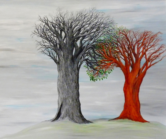
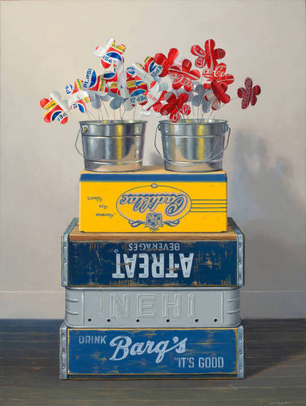
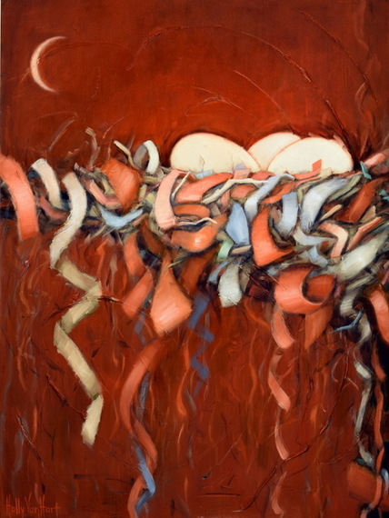
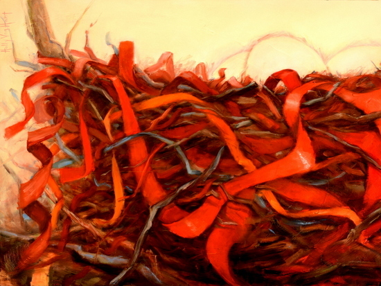
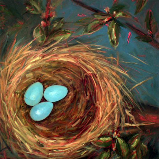
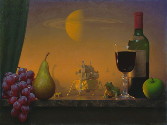
To begin with I was not really interested in the genre: my principal interest has always been painting people and 'living nature' rather than 'nature mort', but live models are expensive and I paint slowly, and still life seemed like a good way of producing small saleable works that I could paint from life and develop my eye and technique at the same time. But the deadness of objects, their lack of energy or any psychological presence has always been an obstacle to me, something to overcome. I'm not at all happy with still life as an exercise in pure objectivity or pure form. So I end up trying to treat the painting as a miniature drama, a microcosm. I use objects that have meaning for me and try to get the whole painting to make a statement, to express an attitude. And because still life is an art of objects -- of deadness -- attitudes like objectivity, materialism, fatalism, nihilism, are easily accessible through the genre. It's a battleground for me: a way of waging small-scale war against modernity.

Illusionism still has great artistic potential because reality is still something we find difficult and threatening. I've heard it said that people can avoid facing reality, but they can't avoid the consequences of not facing reality. I think my work is very much bound up with these issues; with naturalism at one remove, with fantasy and disillusionment. In our culture, to an historically unprecedented extent, affluence and industrial might have become weapons in a general war against reality, against nature. But Nature's still going to win.

I suppose fundamentally I think of myself as at odds with the still life genre and most of its 'default settings'. But in some ways it's a good position to be in: everything I do in still life is done tactically, strategically, self-consciously; my dissatisfaction with and to some extent contempt for the genre is what allows me to push it around, to use it purely as a means to my ends. Every once-in-a-while I get very frustrated with painting objects and feel like I'm close to exhausting its possibilities for me, but it usually doesn't last long. Right now I'm flying along. It's a great time to be a cultural pessimist!

2014-09-01-here_be_monsters_big.jpg
Here be Monsters, Oil on Linen, 15 x 24 inches

What will be showing in San Francisco? 

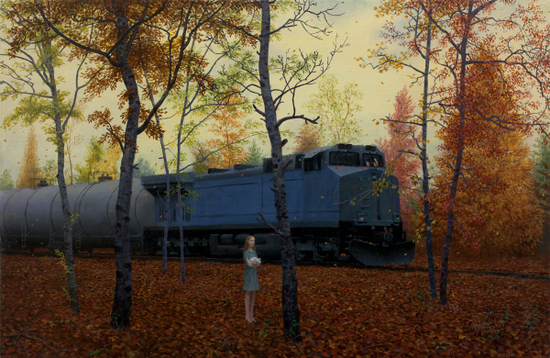
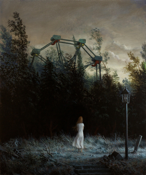
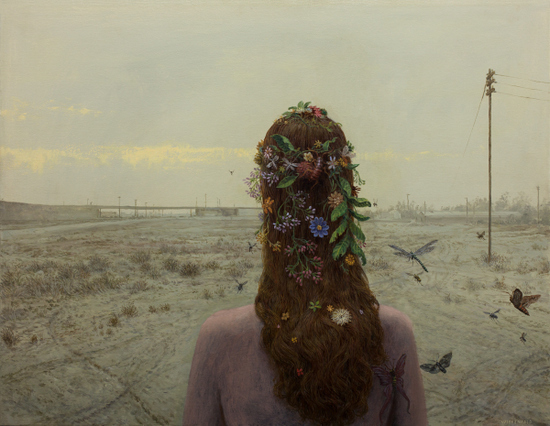
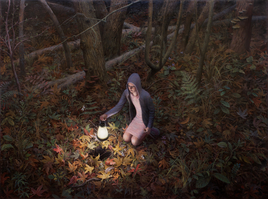
I'll have about eight paintings in a still-life exhibition at CK Contemporary along with eight really brilliant painters from right around the world: Jay Mercado, David de Biasio, Dianne Gall, Hollis Dunlap, K Henderson, Ottorino de Lucchi, James Neil Hollingsworth and José Basso. You can see an online catalogue of the exhibition here.

2014-09-01-earthmoondistance2.jpg
Earth-Moon Distance, Oil on linen, 18 x 30 inches

What are your interests outside of art?

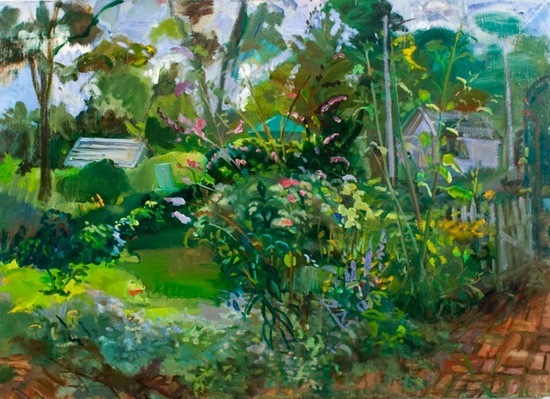
Any chance I get -- which is not too often these days -- I try to get some time in the wilderness, in something approximating Nature. I'm lucky to be living beside the sea, with long cliff walks nearby, and near the Wicklow mountains, where you can go off-track and not meet another soul for a day if you want to.

I like to read. I'm interested in philosophy and history and science. More recently, in order to fathom how our crazy world really works, I've taken to reading books on economics and scanning the financial papers.

But these days, raising my three young children is my main interest when I'm not painting. My eldest beats me at chess now, so things are getting very interesting indeed!

OBJECTS OF BEAUTY
Contemporary Still Life Painting
Opening Reception: September 6, 6-9 PM
CK Contemporary
357 Geary Street
San Francisco, CA

Carolin Peters: "The Journey" at the Kwan Fong Gallery

$
0
0

2014-09-03-Peters.JPG
 Carolin Peters, Under Days, Oil on Canvas, 48x36"

In her series The Journey, now on view at the Kwan Fong Gallery of Art and Culture at Cal Lutheran University, painter Carolin Peters has created an ambitious body of work that expresses the inner journey toward psychological individuation. Concerned with philosophical, spiritual and mystic phenomena, Peters creates narrative paintings that open up her ruminations on the nature of the true self.

I recently spoke with Peters and asked her about her background, and the imagery of The Journey.

John Seed in Conversation with Carolin Peters
 
2014-09-03-05_11_12web.jpg
Carolin Peters
 
Tell me about your childhood in Bavaria and how it shaped you.

I grew up in a pretty remote, rural town in lower Bavaria. It was a super idyllic place and I spent most of my time outdoors, either running through the forest with our dog Twiggy or later at the farm where we boarded two horses. By constantly riding, walking or biking through the surrounding fields and forests I formed a really deep bond to the landscape there. My parents also took us to the nearby Austrian mountains a lot and that whole region is my quintessential ideal place. I was a super shy and quiet kid and having close bonds with nature and animals kept me connected to the outer world. Otherwise I probably would have totally withdrawn since it was hard for me to relate and care about "normal" stuff like sports and fashion. Instead I've always been interested in magical worlds, legends and fairy tales. I'd see a fallen over tree trunk and imagine stories of gnomes living in its root system. So my imagination was constantly fueled by what I saw and I still draw heavily from that.

2014-09-03-2TheJourney_TheSource.jpg
The Source, Oil on Canvas, 48x64"
 
Growing up in Europe, what kinds of art were you exposed to?

The first art I was exposed to were my great grandfather's paintings and sketchbooks. He traveled a lot and his paintings were in line with those of the Orientalists and Classicists. But he also had illustrations for children's stories, portraits of fellow soldiers and scientific illustrations of plants. When I first saw his sketchbooks I knew that I wanted to be able to draw like this. But whenever art was addressed in school I realized that I couldn't become an artist because I just had no interest in painting abstractly, making video art or creating installations. That's how contemporary art was defined to us in school anyways.

So I figured becoming an illustrator was the only way to go. As long as I got a hold of those skills. I had no idea until I came to Laguna that there were still people out there painting realistically. Luckily we went to Munich's art museums regularly with school. So I got pretty well-steeped in all the greats from the Renaissance to Expressionism. Other than that, only after spending my first year in the States did I realize how much the local architecture had imprinted me: specially all those Romanesque and Gothic churches and castles with their elaborate ornamentation that are literally everywhere. Coming to the U.S. gave me a whole new appreciation for the "old" heritage that I'd taken for granted up till then.

2014-09-03-CarolinPeters1.jpg
Episteme, Oil on canvas, 49.5 x 45.5"
 
What did it feel like to come to the U.S. and study in Laguna? Who were your mentors at LCAD?

Coming to Laguna was amazing. I had struggled a lot in high school and been made to feel academically inadequate. Finally I was at a place where I wanted to learn everything that was offered to me and excelled at it. Luckily I had a few friends that I knew already from earlier student exchanges, including my husband and then boyfriend Ben and so I never felt alone. But the community around LCAD became my family and home away from home. After seeing an eye-opening faculty show that included a breath-taking portrait by Stephen Douglas I quickly changed my major from illustration to fine art and my course was set right then and there. Stephen later became my mentor during the MFA program and so did F. Scott Hess. I had numerous inspiring teachers that had a huge impact on me including Sharon Allicotti, Darlene Campbell, Ron Brown and many more: I owe so much to them.

2014-09-03-CarolinPeters4.jpg
Counsel, Oil on panel, 13x24"
 
Tell me about your series "The Journey." How did it come about and how has it developed?

When I graduated with my MFA degree I had a really tough time starting to paint in my new studio. I would spend days "organizing" the place and "preparing" stuff when finally my therapist at the time ordered me to "just push paint around" on a scrap surface and to do that religiously for the next few weeks without any expectations and demands of creating "serious" work. So I would pick my favorite pigment of the day and smear it around without any purpose other than enjoying paint-smearing (a terribly hard thing to do for someone brought up in a no-nonsense, everything-needs-a-function kind of environment). Inevitably I would always start to see something within the abstract marks and eventually excavate the image I was seeing.

 After I had done this for a month I laid all the scrap pieces of canvas out next to each other and realized that there was a narrative connecting all these seemingly random images. That's how the series got started. It got put on hiatus off and on and the images changed over the years but I wouldn't allow myself to sell off any of the pieces until I hadn't shown the completed thing as a whole first. I think it is very fitting and telling that the series is about an archetypal figure on a journey to himself since it spanned the time in my life in which I had to figure out who I was as an adult and as an artist.

2014-09-03-TheBeginningnoframe_email.jpg
Beginning, Oil on canvas, diptych, 74x62"
 
Can you tell me about one image from "The Journey" in some depth? 

  I don't like to dissect the meaning of a painting for the viewer because that would imply that there is a right and a wrong way of looking at art. For me the exciting thing about art is that regardless of my motivation to create an image anyone can walk up to it and experience their own reaction to it. I think we can benefit from art by listening to how it makes us feel and to what it brings up in us, not because the oh-so-wise artist imparted some mind-blowing insight to the lowly onlooker. Of course I have my own narrative in my head as I craft a piece and I work very hard to have my composition, color scheme and paint application support it. But the goal is to make a good image, not to make everyone agree with me.

But I will gladly tell you about the creative process now that I stepped off my soap box. As I said earlier, I started with this accumulation of over 30 painted sketches, which I then whittled down to 20 final ones. Before I started every new piece I would spend some time on finding better compositions and figuring out color schemes. About a year ago I got really burnt out and I was ready to give up on the whole thing. My interests had shifted and the series felt like a piece of led on my leg. I was tired of some of the earlier characters and only really wanted to work on animals. I felt like I was just rendering out earlier images that didn't mean that much to me anymore. Luckily Ben reminded me of the fact that I am painting about somebody's journey and that I should have the right to change course on my own. So I chucked a lot of the ideas that didn't resonate anymore and either started brand new ones or recycled the initial idea.

2014-09-03-Audience_web.jpg
Audience with the Coat Bearer, Oil on Canvas, triptych, 36x80"
 
Audience with the Coat Bearer, for example, is the same format as the sketch but the original sketch had the protagonist bowing in front of an old crone on a mountain pass with a castle in the distance and the scene was flipped the other way. I still think it would have made for an interesting image but I wasn't in that frame of mind anymore.

2014-09-03-CarolinPeters10.jpg
Open Field, Oil on panel, 17.5 x 12"
 
Tell me about how you see your situation as a representational artist making serious work at a time when Postmodernism seems to dominate.

I'm not sure. Being an artist is hard either way. Whether you are in line with current trends or not. As long as you are doing the hard work of confronting yourself and listening inward there are always going to be challenges. I didn't get into this because I wanted to be sanctioned by the higher echelons of the art world as valid. I paint because I love images and the silent stories they tell. I don't really care if they are categorized as art or illustration or neither. I care that I paint well and that people get to see my work. At times it seems hard to find spaces to show my work with but I can't obsess over if it has to do with my not adhering to postmodern criteria. That just ends up frustrating me and cutting into my painting time.  

What are your interests outside of art?

I love animals and being in nature. I almost decided to become a horse trainer but my parents thought that it wouldn't make for a very lucrative career. So I decided to take the safe route of being an artist. But seriously, I need the quiet and solitude of nature to recharge and the companionship of animals to find my center. I think animals really show us who we are because they don't take your masks for real. Being able to commune with them as equals is one of the most rewarding things ever. Other than that I started experimenting with dissection and taxidermy of fresh road kill. I've been teaching artistic anatomy for a few semesters and that has been so enriched by this practice. Nature is amazing at how inventive and efficient it is. Everything is built in perfect order. It's truly awe-inspiring. It's also sobering to reveal during a dissection the trauma inflicted on these animals by our cars.  

Who are some living artists that you admire?

Ruprecht von Kaufman, Paul Fenniak, Aaron Wiesenfeld, Jenny Saville, Julie Heffernan and Odd Nerdrum.

THE JOURNEY
Carolin Peters
Kwan Fong Gallery of Art and Culture
Cal Lutheran University
Artist's reception: Saturday, September 6, 2014 7:00 PM
Exhibit closes: Thursday, October 2, 2014

"Myth and Image" at El Camino College Art Gallery

$
0
0
Now on view at the El Camino College Art Gallery Myth and Image is an exhibition that explores the relationship of traditional mythology to contemporary visual imagery. The exhibit was organized by ECC Gallery Director Susanna Meiers, who comments that the show is "aimed at getting the viewer to consider the mythological in terms of connection with the numinous within us all." The twenty-four participating Southern California artists offer their individual interpretations of myths ranging from Classical Greek and Roman to East Indian, Latin American and Iranian. Each visual image is accompanied by a retelling of the myth.

 Four of the exhibition's images, along with the retellings that accompany them are featured below:

2014-09-06-crocus_messenger_small.jpg
Corey Sewelson, Crocus Messenger, Acrylic and oil on wood, 36 x 42 inches
Hermes, the trickster god of transitions and boundaries, and the human, Crocus were friends who often played discus. Hermes killed Crocus by accidentally hitting him in the head with the discus. He was so distraught that he transformed his friend's body into the Crocus flower we know today. 
This is not at all a literal illustration of this story. There is a mix of images from this Crocus story as well as some symbols of Hermes attributes and life. Hermes was the god of travelers, often shuttling back and forth between the two worlds of the gods and mortals. He was on the move so much of the time that I felt the image of the uprooted home helped convey that mobility. He was the messenger of the gods, primarily of Zeus, his father. Zeus often appeared in the form of an eagle, which in my painting shows him watching over Hermes. His typical attributes and symbols are shown- the winged sandals, pouch, cap, and caduceus staff. An abstract image of the crocus flower appears in the lower right. 
What appealed to me in the Crocus creation story was that Hermes demonstrated such devotion and humanity in wanting to memorialize his friend. He created a beautiful new species of flower so that mortals would enjoy the remembrance, and, since the crocus is a perennial, it will be renewed each year as a perpetual reminder.
- Corey Sewelson
2014-09-06-RoxeneRockwell_BaucisandPhilemon40x50inches.jpg
Roxene Rockwell, Baucis and Philemon, Acrylic on canvas, 40 x 50 inches
In my work I often use trees to symbolize humans. For me trees metaphorically represent all of us, as we stand strong or physically frail, bending resiliently with life changes or succumbing to old age. 
I was drawn to the Greek myth about Baucis and Philemon for their great kindness and enduring love, and for how they turned into trees. This couple wished to die together and so doing would stay together forever. Because of their benevolence the Greek god Zeus granted their wish by turning them into trees standing side by side as their lives as humans ended. 
- Roxene Rockwell
2014-09-06-NM_use.jpg
Nancy Mozur, Phane, Gouache and oil crayon on paper, 6 5/16 x 7 3/16 inches
I like to wed various myths together with images that emerge from within my mind. The phoenix bird is a tale of regeneration. Its fate is to burn up and through its remains, rises to be born again. That renewal repeats itself symbolically as carbon ashes give way to the diamond as new life. Fire plays an important element in this tale. Heat throughout myths often results in change from destruction to creation. In the Orphic religion, the hot passion between the black-winged Night and the Wind produces the silver egg of Eros. Within the fiery depths of the Egyptian underworld, the serpent Apophis battles against the fist of Amun furthering the soul's journey towards a renewed Sun God. As my imagination, sputters, inflames and blazes, visions appear, waiting to be transformed.
- Nancy Mozur
2014-09-06-IcarusFalling1994001.jpg
Jim Morphesis, The Fall of Icarus, 1994, Oil on wood panel with wood frame, 42.5 x 28.5 inches
Ovid's story of Daedalus and Icarus is the tale of a loving father's loss of his son. It is also the story of youthful exuberance and the first mortal hero to fly god-like over land and sea. 
Daedalus was a great craftsman and inventor who had gone to Crete to construct the labyrinth for King Minos. When his task was completed, Daedalus petitioned the king for permission to return home, but Minos, not wanting the only man who knew the secret of the labyrinth to leave, refused the request. Minos possessed the earth and the sea, but not the sky. And so Daedalus planned to make his ill-omened escape by constructing wings of feathers, wax and linen for himself and his son, Icarus. 
With ease father and son took flight. Their dual shadows passed over Samos, the fields of Delos, the villages of Paros and out over the sea. The exhilaration of flight, and the experience of seeing the world as no other human had, compelled Icarus to disobey his father and soar higher. When Icarus reached the realm of Apollo and his chariot, the heat of the sun melted the wax, feathers slipped away and Icarus fell. 
Greek myths have a way of offering even the most tragic heroes the means for redemption. In my painting, with broken-hearted Daedalus looking down helplessly, foolish and courageous Icarus plummets toward an apocalyptic landscape and a final dive in the sea that will forever bare his name and render Icarus immortal. - Jim Morphesis
Myth and Image
A multi-cultural look at myths paired with contemporary images
El Camino College Art Gallery16007 Crenshaw Blvd, Torrance, CA 90506
August 25 - September 18, 2014
Artist's Event with Lauren M. Kasmer, Tuesday, September 9, 1 p.m.

Participating Artists:

Melinda Smith Altshuler, Catherine Bennaton, Mark Clayton, Raoul De la Sota, Satoe Fukushima, Suvan Geer, Susan Hamidi, Zeal Harris, Brenda Hurst, Lauren M. Kasmer, Filip Kostic, Patricia Krebs, Peter Liashkov, Karena Massengill, Lynne McDaniel, John Montich, Jim Morphesis, Nancy Mozur, Stuart Rapeport, Annemarie Rawlinson, Thea Robertshaw, Roxene Rockwell, Cory Sewelson, Nancy Webber

GALLERY HOURS
Monday and Tuesday 10-4 Wednesday and Thursday 12-8
The ECC Art Gallery is closed Friday, Saturday and Sunday and selected Holidays.
Admission to El Camino College Art Gallery and to all related events is free and open to the public. On campus parking requires visitors to purchase a $3.00 permit.

The Anderson Collection at Stanford: An Uplifting Experience

$
0
0
2014-09-23-Staircase001.jpg
The grand staircase of the Anderson Collection at Stanford: Photo © Tim Griffith

Visiting the newly-opened Anderson Collection at Stanford requires taking everything -- your body and your expectations -- up a level. After entering the building's main lobby -- which will cost you nothing as the Anderson is free -- you will ascend a grand staircase that plateaus at the building's collection floor. A representative for Ennead Architects was able to provide me with some specifics about the stairs:
The grand stair brings visitors up 15 feet from the lobby over a distance of 60' feet. The steps are made of precast concrete and handrails are blackened steel which are intended to translate the look and feel of black zinc panels around the windows on the second floor. Translucent glass guardrails were chosen to relate to the frosted panels at the clerestory. The wall next to the grand stair is finished with polished plaster. The stair's width varies from 10' at the bottom to five and a half at the top and creates a forced perspective while heightening the sense of transition from the ground level to the gallery.
Upon arrival at the top of the grand stair, prepare to be confronted by the imposing red, black and ivory crags of Clyfford Still's monumental 1957-J No. 1 (PH-142). Still's uncompromising masterpiece sets the tone and sends a message: "You have reached the top of the art mountain."

2014-09-23-Dedication.jpg
Stanford President John Hennessy speaks at the Anderson Collection Dedication: Photo © John Seed

Speaking at the building's dedication on September 18, Stanford's President John Hennessy praised the Anderson's gift of 121 works by 86 artists as a "gift for the generations" and also noted with great pride that the Anderson would play a key role in the remarkable and ongoing "Stanford Arts Initiative." If you think Stanford is just a tech-incubator with a football stadium, think again: the opening of the Anderson makes the Stanford campus a genuine arts destination. "Overnight,"says Christopher Knight of the LA Times, "the Anderson Collection catapults Stanford into the top tier of American university museum art collections." Knight has that right, but I don't agree with his assessment of the Richard Olcott designed building which he dinged as "rather dull."

2014-09-24-interior.jpg
Anderson Collection at Stanford, gallery interior: Photo © Tim Griffith

I found the second floor galleries -- lit from above by a rim of semi-transparent clerestory windows -- serenely perfect. The Anderson Collection building is spacious, elegant and perfectly in tune with the collection it houses. One of the effects of the flowing "open room" gallery layout is that it creates a sense of egalitarianism that encourages each visitor to experience both individual works and groupings in their own way. In other words, the Andersons may have collected and donated the art, but each visitor is made to feel like the collection is their own: the sense of sharing is profound. As I ambled through the galleries I could almost hear Hunk and Moo asking me: "What do you think?"

2014-09-24-andersonsinstudiowinters_web.jpg
Mary Patricia "Putter" Anderson Pence, Harry "Hunk" Anderson and Mary Margaret "Moo" Anderson at their home in front of works by Donald Sultan and Terry Winters (2013): Photo © Linda Cicero.

A great deal has been written about some of the collection's most precious works, and standing between Pollock's Lucifer and Mark Rothko's Pink and White Over Red is pretty cool, but what I came to see were the Bay Area paintings. A painter friend who doesn't quite share my taste once called me "one of those David Park people," and frankly I took that as a compliment.

2014-09-24-Neri_Park_Seed.jpg
The author with Manuel Neri's Untitled Standing Figure, (1982, pigment on plaster, 69 1/4 x 17 7/8 x 19 1/2 in.) and David Park's Four Women, (1959, oil on canvas, 57 x 75 3/8 in.): Photo © John Seed. David Park painting © The Estate of David Park, and Hackett|Mill

I think that one of the most valuable things that the Anderson Collection is going to do over time is to create a conversation between postwar art from both coasts. Along with Pollock, De Kooning and Rothko there are three Diebenkorns, three Oliveiras, two terrific Paul Wonners and a great David Park. Elmer Bischoff and Joan Brown are conspicuously absent, but you can see their work -- and two more fine Diebenkorn canvases -- at the Cantor Arts Center next door. Add to that two Lobdell abstractions, terrific paintings by Christopher Brown and Squeak Carnwath and you will have some idea of how strong the presence of California painting is at the Anderson Collection. The reputation of California art is going to be lifted up by this great public display.

2014-09-24-moo.jpg
Mary Margaret "Moo" Anderson assists with the installation of Christopher Brown's 1946: Photo © Stanford University
Christopher Brown painting courtesy John Berggruen Gallery

There is so much to be said about what the gift of this collection will mean for Stanford, for California art and for the public, but I am going to keep it brief here and make just one more point: This collection was put together by a family that has a genuine passion for art. You can see it in the photo of Moo above as she showed up in her sneakers to watch a work being installed, and you could hear it in the remarks that Hunk made to a crowd of donors on September 19th. Apparently he cut himself a few years ago while assisting with the assembly of a large Frank Stella relief. Hunk got a nice laugh from the crowd when he mused that he may have left a little bit of blood behind on the piece. "It is really a Stella/Anderson work now" he quipped. I'm not so sure about that, but I doubt I will ever meet a family who have put more of themselves on the line for the love of art.


Visiting the Anderson Collection:
 Admission is free and advance tickets are not required for entry.
Reserved timed tickets may be needed for some weekends: consult the Anderson Collection website for more information. 

Hours: 
Wednesday - Monday 11 am - 5 pm
Thursday 11 am - 8 pm
Tuesday Closed

Aron Wiesenfeld: "Solstice" at Arcadia Contemporary

$
0
0
Aron Wiesenfeld's new show at Arcadia Contemporary, "Solstice," is both dazzling and disarming. Wiesenfeld has a feeling for solitude and the figures in his recent paintings inhabit vast, enveloping spaces that poeticize their otherness by suggesting open-ended narrative possibilities.

I recently interviewed Aron Wiesenfeld to ask him about his background, his ideas and his current work.

2014-09-26-Apictureofme.jpg
Aron Wiesenfeld
 
John Seed Interviews Aron Wiesenfeld
 
2014-09-26-Bride.jpg
"Bride" 2014, oil on canvas, 26 x 39.5 inches
 
How did your early life prepare you to be an artist?

I had huge support from my family for anything artistic and musical. My grandmother was an artist, she mostly painted with watercolors. I remember her telling me that kids' drawings were always better than grown-ups', which was very encouraging. I could draw anything and could always expect her to say "That's wonderful!" She made etchings with my brother and I, and showed us how to use watercolors and oil paint. My mom was also supportive of our artistic endeavors. She taped up all our drawings on the walls, the kitchen and dining room were literally covered with our drawings. We also had some prints in the house by artists like Rembrandt, Dürer and Sorolla, and I think I was lucky just to know what great art looked like, though when I got into comic books at about age 10, that was the only kind of art I was interested in. I also remember building things a lot, very ambitious projects like a three-story fort with a deck in the backyard. I think my work process now is like building -- the joy of it is in seeing it grow and what it will become.

2014-09-26-GodoftheForest.jpg
"God of the Forest" 2014, oil on canvas, 39 x 28 inches
 
Initially, you worked on illustrating comics: what did you learn from that experience? 

 I learned so much, it's hard to boil it down. Certainly it helped with drawing skills, and learning to draw from my imagination. Telling a story with a sequence of images is unique to comics, and it is better that the artist be sort of invisible so that the story can flow. A comic book reader has to connect the pictures in his or her head to make the story happen, so the reader becomes an active participant in the creation of the story. That idea, that the artist can only lead the audience part of the way stuck with me, and suggesting stories is still what thrills me the most. Doing that with a single image is a more implicit thing. I also learned that it was possible to achieve my goals. To me, drawing comic books professionally was like wanting to be an Astronaut as a kid and then actually getting to do it

2014-09-26-October.jpg
"October" 2014, oil on canvas, 23 x 35 inches
 
How did your studies at Art Center in Pasadena shape you and your art?

At Art Center I learned to paint from life by doing endless studies in oil and acrylic. The later part of my time there was mostly spent on larger paintings in the studio. Probably the most important thing I got from art school was learning to think about images differently. I had a lot of great teachers, but F. Scott Hess (who is now a Huffington Post blogger) was of particular help in that regard. We had many conversations about how a painting should stay with a person, or continue to reveal itself over time. It was a turning point for me. I began to think of paintings as an expression of the unconscious, or that they can be objects of meditation, speculation and much more. It's the exact opposite of the purpose of images in comics, which need to convey something very obviously.

2014-09-26-TheGarden.jpg
"The Garden" 2012, oil on canvas, 36 x 30 inches
 
Your works often have a wistful tone. Tell me about the emotions you are trying to work with. 

I always felt somewhat estranged, particularly in social situations. It's become a theme in the paintings, but it's by no means only negative. I love the idea of being in-between places, creating a path of one's own. Solitude has always been synonymous with freedom to me, which meant being able to make my own choices, explore and take risks. That freedom is something I've had to fight for at times, and that is in the paintings too.

2014-09-26-TheWeddingParty.jpg
"The Wedding Party" 2011, oil on canvas, 70 x 95 inches
 
Is it fair to say that there are "Kitsch" and "illustrative" elements in your art?

I admit my work does sometimes stray into the melodramatic, but it's not Kitsch, as I understand the word. My intention is to express what I feel, or surprise myself, and paint for my own enjoyment, with the secondary hope that it will communicate something of value to others. I'm not trying to push emotional buttons, or fashion something to have the broadest possible appeal. The Illustrative aspect is definitely there, though I think the same could be said of any painting that is not abstract. Labels are convenient, but art is very hard to put art into words, especially single words. They lead to a lot of pre-judgements and entrenched positions for or against certain "types" of art. I love Ray Charles's purely subjective take on the subject of music: "There are only two kinds of music: good and bad."

2014-09-27-Homecoming001.jpg
"Homecoming" 2014, oil on canvas, 26.5 x 34 inches
 
Can you describe one of the works from your current show for me?

There is a medium sized painting called "Homecoming" of a woman facing away, looking toward a distant freeway overpass. She is undressed. In her hair are various flowers and plants arranged in a perhaps ceremonial way. There are also insects in her hair; moths and other winged bugs follow behind and around her. The setting is a neglected, tire-scarred area on the outskirts of a city, which can be seen near the horizon. The overall color is murky yellow, with light coming through the haze of the sky in a horizontal stripe.

2014-09-26-THEWELL.jpg
"The Well" 2011, oil on canvas, 67 x 83 inches
 
Tell me a bit about the technical aspects of your work. 

 I do a lot of quick sketches when I have ideas, and those are usually the basis for the paintings. I paint on unstretched canvas, so the dimensions can be altered at any point. As far as paint application, I use the same techniques that have been around for centuries; starting with a monochromatic underpainting to establish the main forms and the light, then adding color in thin layers when it's dry. It's a matter of building and refining over weeks until it's finished. It's rarely a straight path, I usually change my mind about things, paint over them, add things or just start over. I use a limited color palette of white, black, yellow ochre, Indian red and cobalt blue.

2014-09-26-WinterCabin.jpg
"Winter Cabin" 2012, oil on canvas, 30 x 41 inches
 
Who are some artists that you admire?

Whistler, Corot, Titian, Bruegel, Caspar David Friedrich, Arnold Bocklin, August Sander, Balthus, Neo Rauch, Edward Hopper, Goya, Chester Arnold, Puvis de Chevannes, Carol Weight, El Greco and many others.  

What are your interests outside of art?

Reading, spending time with my family, hiking, playing and listening to music.

Aron Wiesenfeld: Facebook 

Exhibition Information:
Aron Wiesenfeld "Solstice"
September 18 through October 3, 2014
Arcadia Contemporary
51 Greene St., New York, NY 10013

Bruce Lieberman: 'East End' at Gallery North

$
0
0
Painter Bruce Lieberman's exhibition East End is about many of things: among them are his daily life on Long Island, his endless experimentation with paint and his need to "escape" from the pressures of the world. Bold, brash, broadly brushed and energetic, Lieberman's canvases display both the painterly confidence he has developed in over 30+ years of painting, and also his continuing commitment to the idea of experience as an aesthetic gateway.

I recently spoke to Bruce Lieberman about his life, his influences and his work.

John Seed Interviews Bruce Lieberman:


2014-10-12-meLourve.jpg
Bruce and Marilyn Lieberman at the Louvre
Tell me about your early background. When did you know you wanted to be an artist? 

My mother was a Sunday painter. She took classes at adult ed or something like that. I always drew, she put pencils and paper in front of me to keep me from driving her crazy. My folks always took me museums. I was the talented kid in high school but I never thought I could be an artist.

Shit man, I was told that if you were talented enough to be an artist you would know it by 18: born, touched or something. When I started college I was trying to be a marine scientist: but that was not for me.

So I dropped out of college and went on a walkabout -- in a Datsun and tent -- surfing in California. I got sick with the Russian flu, then there was the never ending Cali rain. Running out of money I started to draw draw and draw in the cluttered room I was stuck in. So decided I should go to art school and do what I always loved just to get a degree. At Stony Brook University Fred Badalamenti told me that in essence it comes down to this: Even Van Gogh wasn't Van Gogh till he was Van Gogh. Whatever he really said or meant, that is how I understood it. Art takes persistence and constant hard work!

So I figured: Somebody's got to do it, why not me!


2014-10-12-lieberman.jpg
Red Still Life, oil, 24" x 18"
Where did you study and who were your mentors?

I was lucky: Stony Brook University in the late 70's had Lawrence Alloway, Donald Kuspit, Melvin Pekarsky and Robert White. Bobby White was a huge influence on my life. I sort of think Bobby taught me how to draw and think about Art. I wanted to study with Hofmann but that was out of the question since he was long gone. So Bobby sent me to Paul Georges who I studied with formally at Brandeis, but hung out with him in NY and Sagaponack.

That was study.

He (Bobby White) introduced me to the Educational Alliance and NY figurative art world of the early 80's. We were part of "the wedding party." He had a way of making you feel you were fighting the good fight and not alone. I learned a heck a lot about painting and art just from being downtown in bars drinking with artists all much more experienced and older then I was. It was a virtual Who's Who of the Figurative Art World back then.

Lennart Anderson was also a major influence I wanted my MFA and I had tons of connections and choices but I had a huge respect for Lennart and those associated with him. So I went to Brooklyn College and in some ways Lennart was the control to Paul's emotional attack. I'm not sure he knows how profound an influence he had on me. Certainly in aspects of my work method. The way paintings and drawings develop: out of a gesture, a fog. To him I was always a Georges' guy. Like Seinfeld referring to the character Newman: "Ha ha ha."

When we talked about art he would smirk and say: "If you like that sort of stuff." I got a huge kick out of him. I thought he was brilliant. Still do. Georges too. It was sort of George's color and emotion vs. Lennart's control and a sense of tonal elegance and charm.


2014-10-12-Lieberman_TheGarden_oil_30x40.jpg
The Garden, oil, 30" x 40"
Have you always been a representational painter?

Yes, loved story telling, stories in art since a boy I collected info on artists like other did with ball players. Loved Guston, Beckmann: still do. Baroque and Renaissance painting. I knew names of artists and painting like kids knew batting averages.

2014-10-12-Lieberman_SquareLilies_oil_48x48.jpeg
Square Lilies, oil, 48" x 48"
How has your painting developed over time? 

They got better! And take me longer!

In art school I was a Neo-Expressionist before I ever heard the term. I was always representational.

I was really influenced by Abstract Expressionism (still am) the process showing, the gesture and macho guts... like Krasner LOL. I just did not want to do it. The Bay area guys were my Gods (and Clyfford Still). Early Diebenkorn, Park, and Bischoff still ring my bell.

Before that I remember being totally blown away by the Fauve Matisses and by Oskar Kokoschka at the MOMA. Nolde's watercolors: they woke me out of the Rembrandt brown world of color. All the German expressionists rocked my world: I devoured them. Lennart told me once that Expressionism was all too easy. I knew he was right so I pushed myself away from it. I see a connection to spatial qualities of Abstract Expressionism still appeals to me. Then I was in love with Fairfield Porter.

I was doing narratives when I showed at Pene Du Bois in the lower east side. I went over to this new midtown gallery Gotham Fine Art (LTD). He was beginning to get a lot of attention when the gallery's truck, when two years worth of my large paintings was stolen on the way to a show in Florida. After telling the New York Times he was gonna reimburse all his artist, the guy vanished. I was relatively devastated.

Ron Pisano (writer/curator) called me looking for work. When I explained my situation and told him I had only landscapes and still life. He ended up including me in several shows and his book on 20th century survey of Long Island landscape painting. It seems I had developed a reputation as a landscape painter (labeled painterly) after that. Dealers sure found them easier to sell then my figurative work and that was their focus. I shifted more to hiding in my backyard and away from people so I guess I went in that direction too.

2014-10-12-Lieberman_StormyAirbase_oil_48x48.jpeg
Stormy Airbase, oil, 48" 48"
Tell me the names of some of the artists you have been influenced by. 

I can't say who I'm influenced by: Everyone? You can't see Massacio in my work but he is there. Certainly Lennart Anderson and Paul Georges.

I had very eclectic tastes and that was fed and justified by the Hofmann stuff, by Paul and through Paul: also the tastes of Robert White. There was one big lesson: Steal and use everything and make it your own.

To be connected to the Masters if you want to be a master; see them as peers, see their humanness.

I started with this profound love for art history -- Rembrandt, Rubens, Michelangelo -- and could never say one person influenced me over another. I go thru periods of interest and likes -- Giotto, Velasquez, Balthus, Piero, Rubens -- the way one deals with the likes and dislikes of music or food. Maybe it is color, or composition devices or some interesting intelligent the negative spaces that interest me. Good is Good. Bob Henry got pissed at me for such a cavalier statement, saying that almost kicked me out of Brooklyn MFA program until I was able to defended it and that got me a scholarship! (said while dancing a little jig in my head)


2014-10-12-Lieberman_RainyBeach_oil_48x48.jpeg
Rainy Beach, oil, 48" x 48"
Your new show is called East End: tell me about where you live and how these paintings connect to that. 

My studio is in the Hamptons, On the tip of eastern Long Island. It was not the Hamptons of the Kardahsians back when we fell in love with it: tons of farmers and fisherman. I went there for the ocean, surf, fish and to have a bigger -- believe it or not -- cheaper studio away from people.

I grew up in suburbia and Georges and the New Yorkers called it the country. We called it out east. That should have been the name of my show: Does not matter to me at all.

My work is rather auto biographical and the title is just the title. It is painting about paint and painting...

My studio in Water Mill sits in a patch of woods on a rise overlooking a 50 acres of farm. It's rather secluded: more or less and once it was more. We are six minutes from the sea If traffic does not interfere.

The ocean: my early morning run with the dog or surfing, fishing. it's part of my whole hide from the world gig. I guess I'm tied closely to these things. My life revolves around my slice of nature: this world little I created for myself.

I am all escape: escape into my paintings, my studio, my books on tape, my garden and surf: Good big surf... 

Now, as more and more crowds and homes are built -- or were built -- I seem to spend more time hiding in my garden. When I m not in my studio that's where I am: tending the veggies and watching the wind and tide, waiting for a certain light or a certain sky so I can finish this or that particular painting. Sounds rather bucolic? Why do I feel so stressed? (I'm attempting to be sarcastic/ironic? funny)

 We have a little, rather nonproductive orchard and sometimes kick-ass organic farm. In case zombies invade. But it is all about making still lifes to live in. The paintings in this show are all about these things: the sea down the road and the hiding spot here in my studio, inside and out.

2014-10-12-Lieberman_Pomegranate_oil_16x16.jpeg
Pomegranate, oil, 16" x 16"
You seem to love paint and the texture of paint. Tell me about your working methods. 

Short answer: direct, alla prima, no holds barred. I draw with charcoal, then draw with very lean paint, then block in, let it drip sometimes, let it build other times, drag it, slap it, smear it, scratch it, wipe it.

I paint mostly wet into wet then don't. I scrap some, build some, glaze some: no technique, no system. I let brush strokes describe the form when it works: the GESTURE!Love that! No rules except lean to fat and let it emerge from a fog (Dickenson/Lennart). I do love when a variety of surface is achieved (ala Titian) and I love the marks of the journey showing, the way color builds: the surface builds is thrilling stuff to me. Dragging dry color across a built up surface: OMG - love that! But I also dig the way wet passages blend and become multiple colors. I look for color relationships and exploit them but that is a given.

That was pretty long but here is more...

I work from nature shifting back and forth to reoccurring themes. I work on many paintings at once. I start outdoors, direct, but always work and rework in my studio. Building up surface and manipulating paint.

I start with a drawing and then with very thin wet paint loose paint. Very loose letting the painting develop out of a fog: (Dickenson/Lennart). I love to drag color around as the surface and marks build up, mixing it up with a variety of applications. Impastos and dry short paint laid on top of stained and raw canvas combined with more wet into wet passages.

A relatively direct painting style, but I do use transparent glazes -- reworked and built up -- but I always try to preserving the fluidity of the process and maintain a certain look of spontaneity even if there was nothing spontaneous about it. On Tuesdays and Thursday anyways...

What are your interests outside of art?

The short answer: Sounds rather stupid but life long passionate interest in surfing, fishing, gardening, good food, good books, kissing the wife, travel and martial arts (although as of last year I'm too old and broken apart).

Video (above) Bruce Lieberman: East End Exhibition at Gallery North
Bruce Lieberman: East End
October 17 - November 14, 2014
Opening Reception: Friday, October 17, from 5:00pm-7:00pm
Gallery North90 North Country Road Setauket, New York 11733
 Gallery Hours: Tuesday - Saturday 10am - 5pm | Sunday 12pm - 5pm | Closed Monday

Hilary Brace: Entering a Moisture-laden Palace

$
0
0
"We travel with her and take the same uncertain path, entering a moisture-laden palace that twists our minds."

Gretel Ehrlich on Hilary Brace

Artist Hilary Brace has been using an old material (charcoal) and a new one (plastic) to invent images of clouds, ice and waterfalls. Simultaneously suggesting the artist's sense of awe and her consciousness of nature's fragility in the face of global warming, Brace's recent body of work manages to seem both tangible and imagined.

I recently interviewed Brace and asked her about her background, her working methods, and her ideas.

John Seed Interviews Hilary Brace:


2014-10-14-Hilary_Brace.jpg
Hilary Brace
How did your early life shape you to be an artist?

When I was young my family lived in Europe for a couple of years and we visited a lot of museums, so very early I was introduced to the importance of art and to the idea of being an artist. I also remember being very determined and particular about my art projects, wanting badly to realize them in the way I imagined them. Later, with the opportunity to take art classes in middle school, I developed confidence about making things. So I was fortunate that a natural inclination was met with opportunities. It made my choice to become an artist feel natural and worthwhile.

Spending most of my early life in the Pacific Northwest, around such abundant natural beauty, undoubtedly had an impact on my work. I was always so moved by the grandness of the landscape and the displays of light and atmosphere. We went skiing often, and I loved being in the mountains, looking down at the landscape, and sunlight falling on snow seemed incomprehensibly beautiful. My work has had a lot to do with being moved and mystified by these things.

2014-10-14-Brace.JPG
Untitled (June, 2013), Powdered charcoal on polyester film, 7.5 x 10 inches
Have you always been a representational artist? What was your work like during your college years?

When I began studying art in college I worked abstractly but I usually began with something observed, something to do with light. My first serious paintings were equal parts abstraction and representation, with shadows handled as two-dimensional pattern in a three dimensional context, usually architectural interiors. I love the challenge of describing space, so as time went on this dichotomy between two and three-dimensional space became more representational, more integrated. I realized from making those paintings that they said something about how I perceived things in general; that reality is elusive and shifting.

For years the work was more about this kind of play of light and form in space than depicting any specific place. Once a horizon line crept into the imagery and it moved toward landscape, that part changed.

2014-10-14-Brace2.JPG
Untitled (March, 2014), Powdered charcoal on polyester film, 8.25 x 13 inches
Your work balances between the real and the imagined. How do you blend and balance these two approaches?

It's really another expression of the dichotomy I was exploring in those early paintings, but more complex. I'm interested in making places that seem very tangible or believable, but I also want them to also feel elusive and mysterious, or fluid and changing, so I retain my sense of wonder about them. I work from my imagination and I don't know what I'm going to make when I set out, so I keep myself in that space as I'm developing the image: At the same time I'm working with realistic aspects of rendering an image, I'm surprising myself by discovering an unexpected world.

When people first see a drawing they often assume it's "real" because it's so fully rendered, but then they become confounded by how that could be true, given the subject matter. Those different responses have to come together finally in their experience of the work. I like that, because it mirrors my own process in making the work.

2014-10-14-drawing_setup.jpg
Hilary Brace's drawing setup
Tell me about your technique and how you arrive at an image.

My drawings are charcoal powder on polyester film (Mylar is a brand name). The matte polyester surface appears completely smooth, but is actually like super fine sandpaper. The charcoal moves around easily but also comes off easily. This allows for a lot of spontaneity, but also a lot of detail. On smaller pieces, I begin by covering the surface completely with charcoal, then erasing or lifting it off with Q-tips and brushes to reveal lighter areas. As an image begins to suggest itself, I slowly bring it into focus with more detail.

For larger drawings, I make a study first. I use Photoshop as a composition and drawing tool, but in many ways the process is the same because I have no preconceived idea of where I'm headed and the image develops through exploration and then slowly comes together. Even though I know what the image will be when I make a drawing from a study, I still work in a subtractive way, laying down darker values and erasing to create lighter ones, because I have more control removing darks than adding them.

2014-10-14-Brace7.JPG
Untitled (March, 2012), Powdered charcoal on polyester film, 23.5 x 32 inches
Do you consider yourself a Romanticist in art?

I believe that intuition and emotion have a place in making and experiencing art and I'm inventing emotive images, but they aren't about escape or yearning for some other, ideal place. They have much more to do with my actual responses to the natural world, with making those and my psychological framework feel real. I use curiosity and my emotional responses to make choices about my imagery, so feelings are important in a variety of ways, but it's not romantic. I think of myself as an experiential artist.

2014-10-14-Brace6.JPG
Untitled (February, 2014), Powdered charcoal on polyester film, 10.675 x 8.5 inches
What kinds of emotions do you want your work to evoke?

As wide a range and as complex as possible, because that's what life is like.

But that said, as a drawing begins to suggest itself, I go after a feeling that seems unique to that image. It might change as the piece develops, but it's a guide. There's a quote by Howard Hodgkin that I've always remembered: When he was asked how he knew if a painting was finished, he said, "When the original feeling comes back as a painting." I like that.

2014-10-15-brace_8.jpg
Untitled (July, 2014), Powdered charcoal on polyester film, 11.75 x 9.125 inches
What about your feelings about nature and global warming? Some of your recent work depicts icy places that appear to be thawing.

I've been thinking about this a lot. I can't look at my work now without also thinking about what we are doing to the Earth. For a very long time, I've been inspired by nature as something vastly powerful and it's been a metaphor in my work for a range of forces larger than ourselves. I've been thinking about how to reconcile that view with the fact that we need to see the Earth as fragile and vulnerable if we are going to change our behavior. All the forces that have shaped the planet will always be present, even if we destroy it, but the loss and potential loss are excruciating. So my perspective is shifting and it's showing up in the work. There is plenty of reason to feel a sense of awe about the beauty that exists and it ought to motivate us, so I'm glad if my work can be a reminder. But I want it to do something more or different than that, for myself, so it seems that I may have to find a new way to see.

2014-10-14-Brace5.JPG
Untitled (May, 2014), Powdered charcoal on polyester film, 6 x 7 inches
What are your interests outside of art?

Mainly gardening. I've spent most of my free time developing my garden. I'm a plant fiend--even thinking about going to the nursery makes me salivate. Designing in the garden is a lot like painting, but you also have the elements of time and change, which is fun to think about and observe. But now that my garden is established, I'd like to expand my range and get out and explore, to see more of the changing, shifting world.

All images © 2014 Hilary Brace, All Rights Reserved

Hilary Brace: Drawings
Ann Lofquist: Urban and Pastoral
October 18 - November 22, 2014

Online Catalog: http://issuu.com/craigkrullgallery/docs/hilarybrace2014Craig Krull Gallery

Bergamot Station
2525 Michigan Avenue, Building B-3
Santa Monica, California 90404
Reception: October 18, 2014 4-6PM
Gallery Talk: November 8, 2014 10AM

A Quiet Place: The Windhover Contemplative Center at Stanford

$
0
0
"The concept of wings as metaphors for the soaring of one's mind suggests a sense of contemplation, a sense of spirit..." - Nathan Oliveira

2014-10-18-windhover_pano.jpg
A panoramic view of the Windhover Contemplative Center

The newly opened Windhover Contemplative Center, a 4,000 square foot rammed-earth and wood structure which occupies the former site of a parking lot, wouldn't exist without a deeply held conviction of the late Nathan Oliveira (1928-2010): that quiet contemplation feeds and fuels the imagination.

Years of working in the silence of his own studio and also the solace he found during long walks in the peaceful Stanford hills -- where he delighted in watching soaring birds -- convinced Oliveira that each of us has an inner imaginative world that blossoms through observation and meditation. "If you persist and you believe in it your world opens up to you," Oliveira once stated. "Sometimes that takes an entire lifetime."

Beginning in the 1970s Oliveira worked on images of birds and flight that culminated in the paintings now permanently on display at the center. These images, in turn, led to the idea for the Windhover, which will extend the artist's uplifting vision into the future.

2014-10-18-Center001.jpg
A detail of Nathan Oliveira's Diptych

Oliveira's Windhover paintings take their name from a poem by Gerard Manley Hopkins (1844-1889), that uses the flight of a falcon as a metaphor for spiritual striving and realization. A portion of the poem is etched into reflective glass visible near the building's entrance. The imagery of the four Oliveira paintings on view at the Windhover includes wings, catenary curves and a kestrel, all presented on semi-abstract grounds.

Designed by Aidlin Darling Design, the glass-enclosed center shows the influence of Japanese architecture. As they approach the building, visitors will pass through a long stand of bamboo that delineates a kind of barrier between the outside world and the center's meditative space. In the building's interior are three rooms that feature four Oliveira paintings -- Big Red, Diptych, White Wing and Sun Radiating -- all of which are visible from both inside and outside the building. Skylights and motorized louver drapes provide carefully modulated natural light. The thick rammed-earth walls, made from soil excavated directly from the site, help moderate heat and sound.

2014-10-18-outside_pond.jpg
The Reflection Pool

A reflection pool near the building's entrance features two concrete monoliths that are in fact pieces of architectural debris from the university's boneyard. The sound of running water, which flows into a rectangular fountain, helps dampen outside noises. A pebble-floored Zen garden rimmed by benches appears at the building's opposite end, sheltering a single tree and another small fountain.

2014-10-18-water.jpg
An Interior Fountain

Stanford's Office of Religious Life is overseeing the Windhover, which will provide a quiet alternative to Stanford's relatively busy Memorial Church, which hosts services, weddings and concerts. The center fits in well with two of Stanford's current initiatives -- the Wellness Initiative and the Arts Initiative -- and compliments the display of three Oliveira paintings in the new Anderson Collection at Stanford. The Windhover Contemplative Center joins Houston's Rothko Chapel and James Turrell's "Twilight Epihany" at Rice University as one of a slowly growing number of American structures that meld contemplative practice with the visions of modern and contemporary artists.

2014-10-18-10575146_10152750475238566_7450278687759817612_o.jpg
The Reflecting Pond

In a 2009 speech in Vancouver, the Dalai Lama offered his opinion that "The world will be saved by Western Women." During my visit to the Windhover Contemplative Center a group of Stanford women chatted on the benches of the Zen garden and shared their sense of excitement about the new center. I couldn't help envisioning these young women growing into adulthood, their imaginations sheltered and nourished by the Windhover, to fulfill the Dalai Lama's prediction.

Visitor Information:

Windhover will be open daily from 11 a.m. to 11 p.m. to students, faculty and staff.
A Stanford I.D. card is required to enter.
 Docents will lead tours for the public from 10 a.m. to 11 a.m. on Tuesdays.
Visit the Cantor Arts Center website for more information.

Visitors are asked to refrain from using cell phones, tablets, laptops and other electronic devices while inside the center.

Links: 

Windhover Contemplative Center Opens on Stanford Campus

Nathan Oliveira on the Windhover Project (SFMOMA Video)


Dave Hickey: 'I Will Never Retire From Art or Writing'

$
0
0
"Of what use is a philosopher who doesn't hurt anybody's feelings?" -- Diogenes

 Whatever you think of writer/critic Dave Hickey, you have to give him this: He speaks his mind. Retired from "The Art World" but still more than willing to talk about art, Dave has been experimenting using Facebook as his water cooler but feels that as a medium Facebook has defeated him: Perhaps that is because his musings are often too wide-ranging, esoteric and paradoxical to simply "like."

I recently interviewed Dave Hickey via e-mail. I am posting his interview unedited, except that I did add a few French accents and hyphens where he had missed them...

John Seed Interviews Dave Hickey


2014-10-20-dave_h.jpg
Dave Hickey
In 2012, you announced your retirement from the art world. In October of 2013 Pirates and Farmers was published. Would it be fair to call you "semi-retired?"

No. I am retired from the art world. I will never retire from art or writing. Art is the way I think. Whenever I can, I fly to New York, stay in a midtown hotel, get a limo, and go look at art. The art never tells anyone that I have been looking at it. Nobody recognizes me.

In Pirates and Farmers you offer the metaphor that pirates - who you favor over farmers - tear fences down. What are a few of the cultural fences that you feel need tearing down right now? 

I would like to tear down the vestigial fences that remain from the segregation imposed by "identity politics." The class barrier between blue chip artists and no-chip artists could be removed to everyone's benefit. I think the gentle womb of academia could do with a radical Caesarian. I think tenure should be abolished, and graduate schools, as well. I think the wall between 'high' art and 'low art should be demolished too. Since neither is any better or worse than the other--since everything, high and low, is blended in the same digital fastness, why bother? Counting by my clock, Art was obligated to abandon digital means twenty years ago. Technology is not a raison d'être.

You recently stated on Facebook: "I depend on the first person singular as a badge of modesty" and then went on to characterize yourself as "just this guy writing in the desert." As an internationally known critic and MacArthur prizewinner how modest can you really be?

First, except for a couple of Polish dudes, I am not internationally known. I have never been reviewed in any major publication. I have never had a good review. My books sell 100k copies at best. I don't get invited to book fairs. My writing is grounded in Victorian belle lettres, in Ruskin, Lamb, Carlyle, DeQuincey and Dickens. Out of tune with the times? Ya' think. I have six new books about art criticism on my desk. Having writ on water, I am not mentioned in any of them. My phone doesn't ring.

About the MacArthur award? I think it's bullshit. I was grateful for the honor, since it measures the respect of one's peers, but the money was crass, and condescending. I don't fucking do money. I make a living. The whole inference that I couldn't support myself made me look vulnerable, since the idea of supporting oneself is the first prerequisite for an independent critical voice. If you can't support yourself, they can touch you, so you maintain solvency. Now, everyone sees me wallowing in the largess of a poncey foundation, and I have hitherto been free, beholden to nothing and to no one.

I am Dave the Writer--no foundation--no institution---no artist friends---no connections---and no family. I write words and I am not a public servant. I want to be a purist because I do not believe, and I do not belong. So I got this award. I got this new constituency of dudes and dames on the dole. I got this tainted money that I used to pay off my wife's student loans, to buy her some cool stuff, and to refine my game of Texas Hold'em. Five years later, I was trying to put up a giant piece of art-graffiti under the Westside highway in Chicago. It was part of a sculpture show. The alderman went ballistic. The mayor went ballistic. I called up the MacArthur to curry a little hometown juice. The Foundation said, No. We can't help. We don't do that sort off thing. No, no, no, no, no, and don't call back. Today, I like my Peabody Award way better. It looks like a plus size penny.

Neurological research is discovering the mechanisms by which a viewer's brain interacts with art works, including intense reactions that are precognitive (sophisticated interactions with art happen before we analyze them). Have the past decades of art criticism put the cart before the horse by championing the primacy of language and text over visual understanding and aesthetic empathy?

Art starts where language stops, where the word stops and the gesture continues. Language is easy. Theory is easy. Critique is very easy. Art is very difficult. I have been saying this for fifty years. I majored in theoretical linguistics in graduate school to learn my palette, as a painter might study color, but also to learn where language stopped and the mystery began. The mystery of writing, I finally decided, resides in the phonotext--in the music we hear as we read---the sounds and silences. Since most people don't hear this music, I will always be an acquired taste. Also. I am less a critic than a theorist. The simple decision to write about something is an evaluative gesture. Then I theorize about that conditions under which the art might sustain itself in vogue.

 You certainly aren't alone in disliking Jeff Koons, who makes pieces that you feel "... just stand there under the Christmas tree, dead out of the box." Have you read Jed Perl's piece on Koons in the New York review of books? 

Jeff Koons manufactures objets trouvés. Robert Gober manufactures objets trouvés. They are oceans apart. You pick 'em. I find Koons lead-footed. I read Jed Perl's review of Koons: It sounds like a jejune, Manhattan catfight. I can't see why publishing in a periodical publication should mitigate the essential seriousness of what critics try to contribute, but Koon's myopia keeps us gazing down into the cocktail zone. You can't fly a lead balloon, so, if the cards fall right, I think Koons could achieve total oblivion in his own lifetime. His opening game was beautiful but I don't see him managing the endgame that well. He gets over-invested in retro-Fitzcarraldo technological projects. But what do I know? When I was running a gallery in Soho. I hung with Jeff a little in Fanelli's. I was always disappointed in the slow-pitch thud of his wit. So, maybe I find Koons a bit of a pedant. Koons does a lot of things that I like and I hate the art. Robert Gober does a lot of things that I hate, and his art has a diaphanous heart. Go figure.

How do you define beauty in today's art? Or the sublime? Are any contemporary artists achieving either? Beauty is that which elicits precognitive affirmation. It is an indispensable asset to artists who have embarked upon difficult and transgressive career paths. I would pick DeKooning, Bradley Walker Tomlin, Warhol and Mapplethorpe as artists who needed beauty and managed it. So maybe I'm interested in "difficult" beauty---beauty that flies in the face of "the beautiful." Since the art world today is an amoral clusterfuck, not much beauty is really required. The sublime is beauty for boys---anti-sissy beauty---an irrelevant category in this moment.

You recently stated on Facebook: "I think craft, or working within a craft, is probably over." Why do you feel that way? Don't you think that there are some artists who might just come along and prove you wrong? 

That was a stupid, old-guy bullshit thing to say. Craft and technology exist in an extra aesthetic dimension. We can do art with them or without them. My reservation about craft derives from the "Deus ex machina" nature of technique. Lets say you develop a way to make everybody cry, because you want people to cry on this occasion. The question is this: Can I use these devices to make people cry again, not because I care, but just because I can? I would say no. Art making creates a constant demand to subsume technique to the urgency of the occasion, to create more refined technique: fragile meta-techniques of which Edward Ruscha is the master.

You say: "The demotion of Pop Art into Visual Culture is the most outrageous misprision and re-purposing of art in the twentieth century." Can you break that down a bit? Just exactly how and by what process did Pop Art get demoted?

This observation dates me, because, with the exception of Jasper Johns and Robert Indiana, I knew the pop artists fairly well and I found them to be very serious artists. I always found their company very refreshing, very refined and very Beaux Arts. They had taken on the job of redeeming and refreshing popular trash by using premodern genres and imposing the high-art graces of size, scale, color, form, and gesture on popular drivel. When German sociology won the field in the seventies, the image was just the image. Size, scale, color, form and gesture counted for nothing. It was all "picture" for the Germans, so Pop art disappeared into muck of cultural theory. The artists all left town and the kids started collecting Donald Duck dolls. Under the guidance of German thought, art became culture.

As collectors of pop artifacts, I should note, the pop artists sucked. They just didn't do it. Tom Wesselmann wrote hillbilly songs but he knew more about the odalisque than anyone else in New York. Wayne Thiebaud painted cakes but his conversation was all Proust and Joaquin Sorolla, the deft Spanish impressionist. David Hockney painted swimming pools but he was never without an art catalog devoted to some obscure brand of painting--Scandinavian landscape, the last I remember. Ed Ruscha has a good collection of rockabilly records but the images pinned on his studio walls are all 19th century paintings: John Everett Millais, Caspar David Friedrich, and Thomas Cole's "The Course of Empire"---a subject Ruscha would address in paintings of his own, exhibited in Italy, the mise-en-scène of Cole's "Progress."

Roy Lichtenstein painted cold, high-modernist Pointillism. Rauschenberg collected junk, but he liked history paintings. He liked Harnett and Peto who inspired his early work. Rosenquist and Warhol liked fancy drawing and painting from the ancien régime. The last time I was in Andy's brownstone, there were four red-chalk drawings by Dante Rossetti of the blonde Fanny Cornforth. They were hanging in the entry hall on forest-green silk wallpaper: "Marilyns après le lettre." I would suggest that none of these obsessions or enthusiasms has shit to do with "visual culture." As a consequence, soggy-thinking and slovenly- looking stole the birthright of 21st century art.

You seem pretty active on Facebook. What do you think of Facebook as a medium of being in touch and hashing out ideas?

 Facebook turned out to be sour gruel. I wanted a Toontown Chautauqua: smart, funny, dry, and just a little chippy. I offered up bite-size bits of wisdom cropped to the attention span of Millennials. I was hoping for responses in that mode. I didn't get them. I tried and tried again and all I got was lame excuses and obsessive money envy. It just didn't work. My present project is to mount a wiki-page to which we all can contribute using our names, and from which we all can all redact anything using our names. My bet is that the page will go black everyday, totally redacted. Maybe a cat picture will survive, but Facebook, as a medium, has defeated me.

Everyday Sheeple: Alex Gross 'Future Tense' at Jonathan Levine Gallery

$
0
0
2014-10-24-Gross_Shopaholics.png
Shopaholics, Oil on Canvas, 37 x 37 inches

Every now and then, artist Alex Gross surprises someone by telling them that yes, he does own and use an iPhone: he doesn't see himself as being above or outside of the culture that he nails in his current show Future Tense, now on view at the Jonathan LeVine Gallery on West 23rd St. Alex Gross is one of us, so we can all relax now and check our text messages.

Gross has a sharp, satirical sense of who "we" are now, and Future Tense lays out his tainted vision with big-screen LCD clarity: he sees a tsunami of consumer culture that is drowning our collective soul in a sickly-sweet flood of lattes and Double Gulps. We are clones with phones, guarded by drones, grimly satisfied by the perks of consumerist culture and just distracted enough to avoid introspection and all its inconveniences.

Interested in our disinterest, Gross has a certain sense of humor about materialism's consolations and signifiers. One of his recent canvases, Narcissism, a mass-selfie that shows his own smug mug multiplied towards the horizon, staring outwards as he indulges while he can. It is a funny -- Hell, very funny -- painting that is both a confession and an unflinching rumination on the interminable, materialist present. God has blessed us with many fine brands, it seems to say, even when He is nowhere to be found and purgatory at least offers a cornucopia of fast food treats and all the latest Apple devices.

John Seed Interviews Alex Gross:

2014-10-24-Alex_Gross.jpg
Alex Gross

Tell me about your childhood and your early artistic proclivities.

 My childhood was pretty normal. I grew up on Long Island, in New York. We used to go to the Natural History Museum regularly with my school. I loved going there and seeing the dinosaurs, as well as all the stuff from ancient Egypt. At one point, the Tutankhamen exhibit came through New York and we saw that as well. My artistic passion as a kid was mostly centered around comic books. I read them constantly, and that's more or less where I learned to draw. I copied figures out of comics relentlessly. I would create my own comics, but usually run out of gas an hour or two after starting.

Around age 9, I saw Star Wars, and that also inspired me a great deal. I always loved science fiction prior to that, things like Planet of the Apes, which was always in reruns on television, and Star Trek. But Star Wars was a whole other level, and I bought all of the toys and action figures. But when it came to drawing, I was still most heavily influenced by comic books. I guess seeing another person's way of drawing that was so powerful and stylized really appealed to me, and made me want to try that myself. After Star Wars became a phenomenon, they came out with a book called The Art of Star Wars, and that was perhaps more influential on me than the film itself, just because it was full of amazing drawings and paintings. Throughout all of high school, I thought that I would probably end up being a professional comic book artist.

2014-10-24-Gross_Spores.png.jpg
Spores, Oil on Canvas, 50.5 x 73 inches

When you attended Art Center in Pasadena, were you classified as an "Illustrator"?

Art Center has two very separate departments, Fine Art and Illustration. I was an Illustration major, in spite of not really knowing what that was. But I suppose it sounded more practical, and I had an older brother who was just starting a career as a freelance photographer, so the idea of being some kind of commercial artist seemed doable, and appealing. Plus, at that point, I still thought I wanted to pursue doing comics. I was not particularly interested in Fine Art. Growing up, we visited the Metropolitan Museum of Art and MOMA often, so I had been exposed to plenty of world-class art, and I always preferred representational painting to anything else. And when I had visited Art Center, before applying, the most impressive work in the student gallery, to me, had been paintings by Illustration department students. The Fine Art department was not very interested in representational painting at that time.

 At Art Center, the two departments had a strange relationship, something like stepbrothers who don't get along. Illustration students were required to take some fine art classes, with teachers from that department, who often resented having to teach us. At that time, the Illustration department was far bigger than the Fine Art department, and they depended on Illustration students to fill their class rosters. And then there was the Foundation department, whose classes we also took, and who had several faculty members that were fine artists too. But looking back on it now, and seeing how many successful fine artists have come out of the Illustration department, it seems pretty clear that it provided a well rounded education that covered both technical skill development and conceptual thinking. This was largely due to the Chairman of Illustration, Phil Hays, who had transformed the department in the mid seventies from one based solely on technique into one based on concepts as well as technique.

2014-10-24-Gross_Candy_Crush.png
Candy Crush, Oil on Canvas, 48.25 x 33.5 inches

What were some of the ingredients that came together to help you mature as an artist?

Experience, persistence and poverty, to name a few. Honestly, I only feel that it is in the last 5-10 years that my work finally reflects my feelings about the world around me. It took me quite awhile to figure out what I wanted to do and say in my work. And decades of practice with my tools, both digital and painting ones, have also helped me technically be able to accomplish what I want in creating an image, which is very important.

2014-10-24-Gross_Distractions.png.jpg
Distractions, Oil on Canvas, 60 x 42 inches

Your show at Jonathan LeVine portrays the de-sensitized denizens of consumerist culture. How did you become interested in that kind of imagery?

In her seminal book, No Logo, which dissects how and why the branding phenomenon has taken hold of our world, Naomi Klein wrote about some innovative and intrusive new ways that companies were foisting their brands upon regular citizens. What is truly astonishing, now that the book is already 15 years old, is how much of what she described has become commonplace. She wrote, "Calvin Klein stuck... perfume strips on the backs of Ticketmaster concert envelopes; and in some Scandinavian countries, you can get 'free' long-distance calls with ads cutting into your telephone conversations." Neither of these sounds nearly as disturbing as it did then, now that we are all accustomed to watching ads before videos on YouTube, or picking up the LA Times, and finding the entire front page is actually an advertisement. We have gone so far, so quickly, it's frightening.

My generation, people born from the mid sixties to the mid seventies, has a unique perspective on the world as it stands today. We are old enough to have been adults for awhile before there was an internet, or cell phones, and perhaps even before computers were a necessity. But we are also young enough to have adapted to the many technological and 'lifestyle' changes that these things have brought, and even embrace some of them.

The same can be said for the parabolic rate of increase of branding that has occurred since I was a child to now. Our generation grew up in a world where most companies still sold (and made) products rather than brands. Ballpark names did not feature names of corporations. Of course, everything is changed now. Younger generations have grown up in a world where everything is sponsored, and all brands promote "lifestyles," and they have never known another way. Ask a 25-year-old what selling out is, and see if they can come up with an answer. For my generation, it might have been a late night talk show host doing a credit card commercial, or a musician being paid to mention brand name items on her album. But that doesn't seem to bother most kids anymore.

I think this gives me an interesting ability to view this stuff both from afar, and from within. It's a fascinating subject for me. I often get the feeling that all technology has been developed or at least directed with the sole aim of promoting consumption and spending.

Ultimately, what I see nearly everywhere, are "de-sensitized denizens of consumerist culture," as you so aptly put it. And I am trying hard not to become one myself, or raise one in the future. And I fear that I am fighting a losing battle.

2014-10-24-Gross_Narcissism.png.jpg
Narcissism, Oil on Canvas, 28 x 28 inches

Tell me about your painting Narcissism.

 What preceded Narcissism, was another piece entitled Distractions. It's a similar image, except that in Distractions there are a multitude of different men and women, mostly holding either food, drinks, phones or cigarettes. Narcissism is an extension of this idea, except all the subjects became me. In the piece, I am eating a burger, reading a tabloid mag, eating ice cream, texting, talking on the phone, drinking a double gulp, a Starbucks, etc. Just generally consuming things, like many of us do.

Once, about four years ago, at one of my exhibitions, someone looking at a piece I had done with zombie-like people staring at iPhones, said to me, "So you obviously don't have an iPhone, right?" When I told her that in fact I do have an iPhone, the look of disappointment on her face was unmistakable.

I get this from time to time: people think that because in my work I am looking critically at aspects of our current popular culture and lifestyle, that I am somehow above it or better than it. I am not. Although I try not to walk around staring at my phone, and I try not to watch ads or television commercials, I am still living in the same world as everyone else, and I am not immune to the overwhelming power of technology, social media, and most of all branding. So, I feel that it is important to also turn the lens on myself from time to time, as unpleasant as that may be. I suppose if Narcissism were more personally accurate, instead of a burger it would be a salad, and instead of the Double Gulp, it would be a Konbucha, because I don't really eat junk food. But that would be more about 'me' and less about 'us.'

2014-10-24-Gross_Service_Industry.png
Service Industry, Oil on Canvas, 29.5 x 46.5 inches

In your current work is it fair to say that humor and pessimism balance each other out? 

That's a completely subjective statement, but yes, it is fair to say. There is no question that I am not optimistic about things in America, or on Earth right now. But I would say that I am a realist, more than a cynic, or a pessimist.

When I hear a musician or a comedian expressing similar views to mine, it makes me feel that I am not alone in feeling this way, and that maybe there are others out there who also connect with these thoughts. And, in fact, there are many of us! Although these ideas can be depressing, such as the knowledge that our own government has, for years, been illegally spying on all of us, I find it helpful to know that there are many others out there who are unhappy about this and who also feel powerless to do anything about it. By expressing some of these critical ideas in my work, I think that many viewers find a strong connection to their own feelings about things, and take strength from it, rather than finding it overly negative.

Incorporating humor into some of the work perhaps makes it more palatable, less heavy-handed and as you say, balances some of the unpleasant ideas. It's hard not to have a sense of humor about these things. I think it's the only way for many of us to stay sane.

2014-10-24-Gross_Food.png.jpg
Food, Oil on Canvas, 26 x 26 inches

What are you passionate about?

I'm passionate about all of the things we've been discussing today. Most of them have to do with the fact that things are very messed up right now, and getting worse. I'm passionate when someone like Adbusters gets out there and tries to raise awareness and inspire people to take action to make change. I'm passionate when I read about Edward Snowden and just how much he has sacrificed for the rest of mankind. I'm inspired now by the student protests continuing in Hong Kong. These are the things I am most passionate about today. And I'm also passionate about the new AT&T family plan for talk and text!*

*(This sentence sponsored by AT&T)

2014-10-24-ft_cover.jpg

Anything else worth mentioning? 

I have a new book that I hope people will check out. It's called Future Tense, sharing that title with my current gallery exhibition in New York, at the Jonathan LeVine Gallery. The new book features paintings that I have done over the last four and a half years, and includes some of the new work, though not all. I don't want to sound purely self-promotional, but the book was a lot of work, and I am happy with how it's turned out, and I hope that folks who are interested in my work might check it out.

Alex Gross: Future Tense
October 8, November 9, 2014
Jonathan LeVine Gallery
557C West 23rd Street New York, NY 10011

Work by Alex Gross is also on view in:
Masterworks: Defining A New Narrative
The Long Beach Museum of Art
October 23, 2014 - February 1, 2015

The Lotus Eaters: Expatriate European Artists in Bali

Robert C. Jackson: 'Tinkering with Reality'

$
0
0
2014-11-09-RJ194_In_Need_of_a_Plan_4022_x_3022_l.jpg
In Need of a Plan, Oil on linen, 40 x 30 inches

Painter Robert C. Jackson likes things... lots of them. His current show at Gallery Henoch, Tinkering with Reality, is populated by cosmologies of pancakes, donuts, goldfish bowls, apples, oreos, vintage soda crates, and postcards. There is a philosophical vibe to the show -- Thiebaud meets Hegel? -- and some spiritual connotations as well: Jackson's donuts multiply like the Boddhisatvas in a Buddhist scroll, suggesting multiple realities. Funny, inquisitive and just a tad moralistic, Jackson's still lifes are conundrums that blend Jackson's affection for Americana and the entire history of the still life genre.

Jackson also likes books, and he is the proprietor/editor of a striking new book that features interviews with 20 representational painters, himself included. It is titled Behind the Easel: The Unique Voices of 20 Contemporary Representational Painters and you have to wonder: where did Jackson find the time to put it together? You would think that painting kept him busy enough...

I recently interviewed Robert C. Jackson and asked him about his background, his ideas, and his new book.

2014-11-09-Robert_Jackson.jpg
Robert Jackson: Photo by Ned Jackson

John Seed in Conversation with Robert Jackson

Tell me about how you transitioned from being an electrical engineer and assistant pastor to a full-time artist.

I started painting during the last semester of my senior year at college and knew from that point on I wanted this newly found love as my career. Having an engineering job lined up I was certain I would quit to be an artist one day. I found after 5 years I was so stir crazy to be an artist that I spoke to the pastor of my church and told him I planned to quit my job to go for it. To my surprise he asked if I would make a detour and quit to work at his church. After 5 years I once again became stir crazy about becoming an artist and quit the ministry. The pastor this time said he always knew that day would come. To a certain extent the decision was always blind faith, one never could make a full time living with part time work. I always knew I had to jump in feet first.

2014-11-09-RJ196_Lure40x30_l.jpg
Lure, Oil on linen, 40 x 30 inches

Have you been characterized as a "Pop" artist? If so, does that annoy you? 

Honestly, I haven't been too concerned about labels. What's that silly expression, "call me whatever you want, as long as you call me?" There's some truth to that. I love what I do and hope there are some that get it. From interviews and what I've read, Wayne Thiebaud struggled against being called Pop as he saw himself as more of a painter than the Pop movement. That being the case, I strongly identify with being a painter myself, but if Pop means that my work is speaking to a contemporary society I don't mind that.

2014-11-09-moredonuts819.jpg
More Donuts, Oil on linen, 60 x 48 inches

You seem to like things.... LOTS of things. Is your art, to some degree, about glut? 

I do tend to think of my art in different groupings; food fights, wall of crates, dilemmas, quests for immortality, art dialogs, and some I call excess paintings (and of course some mix these). Funny to see your word "glut" as I suppose that is a more bombastic form and possibly dark side of excess! But yes, they are about abundance, desire, want, collecting, amassing, and the extreme.

2014-11-09-artproject819.jpg
Art Project, Oil on linen, 48 x 48 inches

How would you describe your personal philosophy? 

I'm going to answer this both personally and artistically. Personally, I try to live by grace and would like to think I view others with that in mind and attempt to offer it freely. Of course I am a far cry from being successful at that, but I do believe in believing the best and keeping a non-judgememtal and open spirit.

Artistically, I really feel strongly about a healthy marriage between concept and craft in art. I've even drawn quadrant diagrams thinking this through. Representational painters can fall into the trap of focusing 95% of their energy on craft at the expense of concept because well-handled painting is so alluring. Though, a low concept painting can't be salvaged by high craft. So I do spend quite a bunch of time brainstorming and hope it bears fruit. I'd like to have concepts that are enriching and challenging.

2014-11-09-icons819.jpg
Icons, Oil on linen, 40 x 30 inches

I'm betting that you collect art and objects: am I correct? 

I am definitely a creature of habit and routine. Ever since I was a little boy, every Jefferson Nickel I get as change, I check the date and if it is earlier than 1964 (the year I was born) I save it. They aren't worth anything at all, it's just something I enjoy for a reason I can't even explain myself. I own all the crates that show up in my paintings. My art book collection has gotten a little out of hand. And yes, I love to collect and look at other artist's artwork. Very little of my own artwork hangs in my house. Mostly contemporaries that make me stand in shock and awe.

2014-11-09-Comeonecomeall819.jpg
Come One, Come All, Oil on linen, 48 x 60 inches

Your art strikes me as aiming to appeal broadly: to "art" people and everyone else. Is making a wide connection one of your aims? 

YES! Many artists say their ultimate goal is to paint only for themselves. Of course I admire that and embrace much of that, but I see myself as wanting to create work that speaks to people. Otherwise why show it in public? I love revealing my inner dialog in a way in which others can in turn continue the dialog when viewing the work. I find it a rewarding challenge to create work that speaks AND can be heard.

2014-11-09-Behind_the_Easel.png
Behind the Easel: The Unique Voices of 20 Contemporary Representational Painters
by Robert C. Jackson with Pamela Sienna

Artists: Steven Assael, Bo Bartlett, Debra Bermingham, Margaret Bowland, Paul Fenniak, Scott Fraser, Woody Gwyn, F. Scott Hess, Laurie Hogin, Robert C. Jackson, Alan Magee, Janet Monafo, John Moore, Charles Pfahl, Scott Prior, Stone Roberts, Sandra Mendelsohn Rubin, Daniel Sprick, Will Wilson, and Jerome Witkin.

In the foreword to your new book you say that "The last thing I want to do is be a writer" but you managed to get this book put together. What motivated you? 

Really it's my belief that this book needed to be done and it wasn't going to happen unless I did it and so I created the book I wished I had. I'm pretty passionate about art and artists and wanted to provide another platform for these artists to have their voices heard. I have 2 copies of John Arthur's "Realists at Work" that was published in 1983. For those that have not seen the book, artists such as Wayne Thiebaud, Janet Fish, and Jack Beal were interviewed with images of their work intermixed. I'll often grab a copy at lunch and reread one of the artist's interviews. It's not a curator or critic talking about the work, it's the artists themselves and I love that. But in the ensuing 30 years plenty of artists have come onto the block and a book of this type with representation painters hasn't been done again. In tackling the same general idea, I wanted the images much larger and the questions directed more about their creative processes as opposed to the technical but that book was somewhat of an initial impetus.

2014-11-09-thethinker819.jpg
The Thinker, Oil on linen, 48 x 72 inches

How did you choose the artists in "Behind the Easel"?

This was really hard for me as there are tons and tons of talented artists out there and the last thing I wanted to do was exclude people. I respect anyone who has chosen to make this their life's path. However, I knew I didn't want an encyclopedia or "who's who" with a single picture for everyone, rather I wanted a somewhat intense and respectful look at a grouping of artists. My goal was to have about 12 pages per artist and reproduce them larger than I had seen any of them reproduced in a publication before. Simple math, and keeping the book to around 250 pages, limited me to about 20 artists.

After much consideration, I set up 2 constraints. Firstly, I wanted artists that had caused me to drop my own brush and give up my own work to see what they were doing (and it takes me a lot to make me want to leave my easel). I've gone to their shows and dog-eared their catalogs. Secondly, I wanted artists who were identifiable enough that from across a room that I knew who did the painting without having to run up and read the nametag. Which explains the subtitle of the book, "The Unique Voices of 20 Representational Painters"

2014-11-09-RJ205PopFlorals_l.jpg
Pop Florals, Oil on linen, 40 x 30 inches

Are you ever reticent about using humor in your work?

I actually find it an incredibly challenging pursuit. Nothing is as awful as a stale pun or a one-trick pony. To create a laugh or smile that visits again and again is difficult. To a certain extent it is a balancing act to push it right to the edge without falling. But when all is said and done, if my work brings a little joy to someone's journey I find that pretty darn satisfying.

What do your children think of your art? I have a very close family. My children are 22 (wow, 23 this month - Happy Birthday Becca!), 19, and 10 and I couldn't have bigger fans than these three.

2014-11-09-RJ204Pancakescopy_s.jpg
Pancakes, Oil on linen, 48 x 12 inches

Robert Jackson: Tinkering With Reality
November 6-29, 2014
Gallery Henoch 555 W 25th St, NYC

Holly Van Hart: 'Possibilities Abound'

$
0
0
Artist Holly Van Hart is a committed optimist. Her work expounds on the idea that finding serenity in the face of life's trials and turmoil is a matter of staying alert to possibility and open to change. In many of her recent paintings images of eggs and nests serve as metaphors for life's dynamic opposing forces.

I recently interviewed Holly Van Hart and asked her about the unfolding of her career and her vision as an artist.

John Seed Interviews Holly Van Hart:
 
2014-11-15-HVanHart_32001edited.jpg
Holly Van Hart
 
Tell me about your early years. When did you know you were an artist?

I was raised in New York City by my artist Mom and police officer Dad, and always knew I was an artist. As a girl, my Mom taught us drawing and painting, and freely shared her high-quality art supplies. I usually had multiple art projects going, including painting, ceramics, crocheting, and calligraphy projects. At college I majored in engineering which didn't leave much time for art. But later, while working in high tech, I pursued painting passionately as a hobby - taking many classes, reading hundreds of books, forming an art critique group, and painting every spare minute. Also, I was entering painting competitions, winning awards, and selling my work.

2014-11-15-DreamWeaver_OilPainting_by_HollyVanHart_40x30x2.5.JPG
Dream Weaver, Oil on canvas, 40 x 30 inches
 
How and when did you decide to leave your career in the tech industry and devote yourself to art?
I enjoyed a fulfilling, 20-year career in the tech industry, and painting was a hobby. Over time, the artist side of me became more consuming, then all consuming. In 2012 I decided to make the switch and paint full-time. In 2013 my painting 'Possibilities Abound' won the California Statewide Painting Competition and that gave a big boost to my art career. As a professional artist I work harder than I ever did before. But now my life and my work are all one thing, which feels more authentic and satisfying. I turn 50 later this month, and am psyched about having many decades ahead as a professional artist. This definitely feels like what I was meant to do.

2014-11-15-LargerThanLife_OilPainting_by_HollyVanHart_54x72.5001.jpg
Larger Than Life, Oil on canvas, 54 x 72 inches
 
Nests are a recurring image in your work: tell me about them and why you are attracted to them.

For the last 18 months I've been totally absorbed with my 'Possibilities Abound' series. This series uses larger-than-life birds' eggs and nests to symbolize the promise of our own capabilities, to be nurtured and explored and stretched to their fullest potential. That's what really excites me. DeWitt Cheng nailed it in his recent essay about my work, and I'll quote him here, "These works about potential and metamorphosis, then, are clearly autobiographical, but they're also universal (as the deepest, most personal work often is, paradoxically)." My work is personal because it relates to my switch to art from high tech. But there's another personal slant to it . . . it reflects my experience with Silicon Valley's culture.

Silicon Valley has this unique culture of creativity and unrelenting optimism. New technologies are created every day, and are transforming lives around the world. This is a place where anything is possible. I love that. Interestingly enough, Preston Metcalf, Chief Curator at the Triton Museum of Art, had an additional interpretation of my work. Preston identified more with the nests than the eggs. He thought that we are each metaphorically a strand or twig that combines with our fellow beings to find the opportunities that abound when we realize that we are all connected.

2014-11-15-NestAtNight_OilPainting_by_HollyVanHart_36x18.jpg
Nest at Night, Oil on canvas, 36 x 18 inches
 
What kinds of energies and emotions do you want your work to transmit?

I'd like people who look at my work to feel the 'anything is possible' vibe and to be energized by that. Our lives are as large as we make them.

2014-11-15-Nestled_OilPaintingByHollyVanHart_30x40.JPG
Nestled, Oil on canvas, 30x40 inches
 
Your switch to full-time artist is one 'anything is possible' story. Tell us another.

Sure, here's one from my early 20s. I wanted to take 6 months off work to go travel and explore the world, but thought there would be too many obstacles. One was that my family wasn't big on international travel so they wouldn't understand. Another was that I didn't want to have to quit my engineering job. Also I had to pay off my student loans and would need to save some pennies to pull off the travel idea. A friend coached me and helped me see that these weren't such big obstacles. Then I took the leap. Along with a girlfriend, we made the case and were granted leaves of absence from our engineering jobs. We bought globe-hopping plane tickets, and had the time of our lives backpacking across Australia, Asia, and Africa for half a year. That experience definitely opened up my thinking about what's possible in life.

2014-11-15-Opportunity_OilPainting_by_HollyVanHart_30x40x2.5.JPG
Opportunity, Oil on canvas, 30x40 inches
 
How do you develop your images?

Everything I'm doing right now is in the 'Possibilities Abound' series of oil paintings. Within that context, I first think about what message to convey, and then about which subjects, colors, textures, and style will enable me to say it best. Next that idea needs to get turned into a design that is fresh, compelling, and inspired. These things are typically 80% baked before I start painting, and the rest happens through the painting process. Well, it doesn't just happen as simply as that. This last 20% is critical and requires huge amounts of time and energy and concentration. By the time a painting is done, it has 5-10 layers of oil paint, and has required lots of inspection and introspection over a period of months.

Regarding the subjects in my work (nests, eggs, branches, magnolias, cherry blossoms, sticks, feathers, ribbons), some of the inspiration comes from photo references and some comes from my imagination. I like using a combination of each. It might sound counter-intuitive, but the more that comes from my imagination, the longer it takes to create the painting. Not every painting succeeds. Not knowing whether a painting will succeed or fail keeps me alert. I think it also lends a certain energy and freshness to the work. The last part of the process is naming the painting, and the title for each painting typically gives away my intent for it. Also, my blog postings reveal even more background and context. At the same time, I aim to leave plenty room for viewers to make their own interpretations.

2014-11-15-PossibilitiesAbound_OilPainting_by_HollyVanHart_30x40.JPG
Possibilities Abound, Oil on canvas, 40 x 30 inches
 
Is your work all about optimism?

Sure. But not naively so. In life, and in my work, excitement about life's possibilities is usually tempered by fear of the risks. I like to convey the fine balance between the beauty of nature, and her unseen forces and risks. Look closely at my paintings, and you'll see heavily textured organic swirls throughout each one. The texture is applied first (before the eggs and nests are painted), and is meant to represent threats to the eggs and nests. Examples include predators, wind, rainstorms, and humans. These textured swirls sometimes align with the subject of the painting, and sometimes go against the natural lines of what's represented in the painting. That's on purpose. It mirrors the complexity of our lives.

2014-11-15-PossibilitiesOnHigh_OilPainting_by_HollyVanHart_24x30x2.5.RAF.jpg
Possibilities On High, Oil on canvas, 24 x 30 inches
 
Who are some artists that you admire? 

I admire all artists who create something daring and different. Some of my favorites include Turner for his expressionistic landscapes, Georgia O'Keeffe for her striking images of flowers and bones, and Mark Rothko for his awe-inspiring color fields. Each of these artists challenged current-day artistic conventions as well as social conventions. Ditto for the poet Walt Whitman. I admire his controversial and poignant poems about human nature and connectedness.

2014-11-15-Serenity_OilPainting_by_HollyVanHart_20x20.RAF.jpg
Serenity, Oil on canvas, 20x20 inches
 
What are your interests outside of painting?

My absolute favorite thing is spending time with family and friends. So much the better if that time can be combined with mountain biking, hiking, traveling, or consuming super-sized quantities of dark chocolate.

Event:Holly Van Hart: 'Possibilities Abound' Solo Exhibition 
Dates: November 23, 2014 - February 14, 2015  
Reception: Friday, December 12, 2014, 6 - 8 pm Possibilities Abound Online Catalog 
Location: Triton Museum of Art in Santa Clara, CA

Christopher Benson: 'INSIDE and OUT' at Paul Thiebaud Gallery

$
0
0
2014-11-19-Condee_Benson.jpg
A young visitor contemplates Christopher Benson's The Quilter's Daughter

At Paul Thiebaud Gallery in San Francisco, painter Christopher Benson is currently showing a suite of paintings that feature contrasting settings and themes. One cycle of recent paintings is set in Berkeley; there is one exterior depicting the side yard of the Benson family's former home, and three views of the artist's wife Cybele posing in the house where she grew up.

2014-11-19-Quilters20ptgs.jpg
The Quilter's Daughter, 2012-2014, oil on linen, 48" x 96"

Another group consists of four paintings of a three-block section of a partially abandoned industrial/commercial district in the city of Roswell, New Mexico. According to Christopher Benson all of the Roswell paintings represent "one day in that location on a very hot morning and afternoon in June of 2013."

2014-11-19-Roswell4.jpg
Roswell 4, 2013, oil on linen, 48 x 72 inches

There are also two earlier works on view: one depicts the artist's wife and son in a Rhode Island interior, and another shows Cybele having her hair hennaed by a friend in Berkeley.

2014-11-19-Henna20ptgs.jpg
Henna, 2005, oil on linen, 26" x 26"

Considered as a whole, Benson's show is an essay on visual clarity. The artist's solid, reduced brushwork shows his efforts to deal with the essential in order to harmonize his subjects. As a result the emotional tone of the show is both subdued and inviting. In a short essay written for the exhibition catalog Benson discusses his approach: "All these paintings together reflect my desire to reduce some essential visual and emotional response to subjects that are often far more cluttered and complex in real life; despite their seeming realism, they are more like memories than exact records of what I saw."

 Looking over the surfaces of Benson's paintings I kept it in mind he worked as a cabinetmaker in his 20s and 30s. In both his interior and exterior scenes Benson has a firm awareness of structure and architecture. His forms are carefully carved by light into planes that imply firmness and weight. Even with a brush in his hand, Benson has a carpenter's sense of structural rectitude.

2014-11-19-IMG_5101.jpg
Roswell 4 (Detail)

2014-11-19-IMG_5100.jpg
Roswell 4 (Detail)

In his interior scenes Benson plants his figures firmly in their painted worlds in a way that hints at a certain sense of restraint. One of the artist's stated themes, when painting his wife, is to show "how she is ultimately isolated, as we all are, inside her own experience."

2014-11-19-Athena20ptgs.jpg
Grey-Eyed Athena (for Mark Edmundson), 2013, oil on linen, 12" x 16"

Seen from a few steps back Benson's paintings radiate order, serenity and singularity of vision. Seen at close range the artist's hand and brush are very much present: he isn't in any way a Photorealist. In his catalog essay, Benson opines that "... in the end, every painting is put together by the eyes and hands of its maker, wrestling the primitive alchemy of colored earths and oils."

2014-11-19-Roswell8.jpg
Roswell 8, 2014, oil on linen, 22" x 36"

2014-11-19-IMG_5097.jpg
Roswell 8 (Detail)

INSIDE and OUT is a beautiful and very honest show: it looks superb in the Thiebaud Gallery's perfectly lit spaces. Don't go expecting to be knocked out, but do go expecting to see a show that quietly says more than you might at first expect.

2014-11-19-ACMEBread.jpg
ACME Bread, 2014, oil on linen, 42" x 48"

2014-11-19-Roswell220ptgs.jpg
Roswell 2, 2013, oil on linen, 10" x 14"

Christopher Benson: INSIDE and OUT
November 14 - December 20th, 2014
Paul Thiebaud Gallery
645 Chestnut St San Francisco, CA 94133

Painters: Submit Your Memorable Paintings from 2014

$
0
0
2014-11-23-10_memorable_sign.jpg

Attention all painters:

Send me an image of your most memorable painting from 2014 for possible inclusion in my year-end blog: Ten Memorable Paintings from 2014

To view last year's blog: 10 Memorable Paintings from 2013 Paintings in all media -- including oil, acrylic, watercolor and gouache -- will be considered. All types of painting, including abstract, representational, etc., are welcomed.

Painters from anywhere in the world may enter.

Ten paintings will be chosen by John Seed, based solely on his judgment and personal opinions.

Restrictions:

Your painting must have been completed during the 2014 calendar year. Only one painting may be entered per artist.

 Entries must be made directly by artists: please no submissions from friends, dealers, family members etc.

All entries must be received by midnight (Pacific Time) on Friday, December 19th. The blog featuring the chosen works will be posted on Monday, December 22nd, 2014

No prizes of any kind will be awarded: being included in the blog is the only "prize" available.

How to Enter:

E-mail a single jpeg image to seedblogs@gmail.com The subject line of the email should read: Memorable Paintings 2014 entry 

Images may be no larger than 1000 pixels in either height or width Optional: Include a few sentences about yourself and/or the painting you are submitting.

I'm looking forward to seeing your work! - John Seed

Please share this blog via Facebook, Twitter, and other social media.

2014-11-23-10_memorable_kid.jpg

Margaret Bowland: They Say It's Wonderful

$
0
0
2014-12-01-bowland_install.PNG
Installation View: They Say It's Wonderful
 
Margaret Bowland, whose work is now on view at the Alan Avery Art Company in Atlanta, often deals with issues that are common concerns of postmodernism including race and identity, but her technique comes from a much older source: the deep tradition of European representation. Bowland is searching for beauty, an eternal quality that she feels has been diminished and re-defined by consumer culture. Bowland's works seek out difficult truths, evoking awe and discomfort as the artist's perceptions challenge and deepen our own. She understands that art has the power to let both her models and viewers "exist apart" from the world's limits.

I recently interviewed Margaret Bowland, and asked her about her background, and the ideas and values that vivify her art.  

John Seed Interviews Margaret Bowland
 
2014-12-01-margaret_b_web.JPG
Margaret Bowland
 
Tell me about growing up in NC and how it shaped you?

I grew up in a North Carolina that no longer exists. Pre-internet, small towns were kingdoms. Burlington, NC, the town of my birth was totally self contained. We were taken as children to Greensboro, to Raleigh or Chapel Hill as my own children have experienced going to London or Paris. Books were my only link to a larger world. I found solace in knowing that others were asking the same questions that consumed me.

Everyone attended a church in my home town. As a small child I thought when an adult referred to "various religions" he or she was speaking of Protestant sects, Methodist, Baptist, etc. And I was taught to vaguely fear Catholicism. My family's social life was created by its submersion in family and the Baptist Church. From very early childhood I knew that there was something wrong with me.

Sitting in church, three times a week, I believed what others were telling me, that God was speaking to them. But I knew that He never spoke to me. I had no idea why. I prayed nightly and listened, straining in the dark, but there was only silence. So I began to lie about it. There were times in the life of a Baptist child in which you were expected to "testify" that Jesus was in your heart. I did as I was told, all the while knowing myself to be a fraud. This self knowledge, this great shame, created me.

2014-12-01-bowlandsomedaymyprincewillcome_2.jpg
Some Day my Prince Will Come, 2010, oil on linen, 78 x 64 inches
 
At the University of NC you studied both art and English. Why did art win out?

When attending the University of North Carolina at Chapel Hill I wavered for years between declaring a major in art or one in English lit. I decided to throw in my lot with the English department. I was in total despair within the art department. This finally led to my dropping out of college altogether.

I had arrived at Chapel Hill, which is just 30 minutes from my home town, like a kid today arrives in NY City from Iowa. Everything was dazzling, sophisticated, and terrifying. Here I believed, I would find the answers to so many of my questions. Here, I would be taught to paint like the great artists I had seen in books. But of course, I was walking into college in the early 70's and none of what I wished to learn was for offer in the art department of that time.

I was living in a time that celebrated "freedom." Yet, in the art department I found there to be one way and one way only. The teachers were all Abstract Expressionist men from Chicago. When I met them they had warily begun to move from Rothko to Frank Stella. The largest conversation was whether to let the lines you made on the canvas bleed or not; whether to leave the masking tape you were using to create those lines breathe a bit at their edges or fix them hard and fast with acrylic medium. I was told firmly there was no painting of the figure.

I entered a life drawing class where before us stood a naked young woman. Our instructor told us to "draw the fourth dimension." I was 17 years old. My despair and confusion shook me. I painted abstract paintings along with everyone else. I felt exactly like I had in the Baptist Church. I was back in a religion that held no answers for me, that dismissed my questions. Again I was a fraud. But the depression at times would flare up as anger.

2014-12-01-They_Say.PNG
They Say It's Wonderful, 2009, oil on Linen, 78 × 66 inches
 
I enrolled in a sculpture class to learn how to sculpt. The teacher regaled us the first day with an hilarious story of how he had gotten into the Master Degree Program at the Art Institute of Chicago. He and a friend had dropped acid and gone all over the city of Chicago throwing chains over objects, over tree limbs, etc. The pal had photographed these works of art. These photos had comprised his portfolio and gained him entrance into one of the most respected art schools in the country. He thought it all "a gas". I said nothing but I began to feel anger. Who was the real fraud in this case?

I made the sculpture teacher a huge magnolia pod of felt that I sewed and affixed to a chicken wire base. I lined the pods with pink satin and he absolutely loved it. Each seed could be pulled from its own vagina of pink satin and pushed back within. The seeds were the size of a child's hand. His euphoria over the piece deeply confused me. I had liked making the pod. I liked replicating it. But these instincts I believed were relegated to just playing with crafts.

The works I had glimpsed in museums were getting further and further away. In the English department the big questions were being asked. How to deal with death without the solace of God? How to define meaning? Here I discovered many writers, among them James Baldwin. His life experience, coming as it did from such a rigid religious background was one I understood. This brilliant man was writing from exile. His doubts and downright disbelief were written there on the page.

Back in the art department, it felt to me there were no conversations of importance. Teachers wafted in and out of classes. often only staying for an hour of a three hour class. At critiques I was totally lost. I could fathom no continuity in the values and judgments of the teachers and they did not pretend to have one. Frankly, it broke my heart. So I ran.

2014-12-01-3482_Bowland_PAINTING_THE_ROSES__jpg550x0.jpg
Painting the Roses Red, 2012, Oil on linen, 55 1/2 x 51 inches
 
You have been a realist for your entire career. Since postmodernism has been dominant for the past decades, have you felt your career has a contrarian aspect?

Yes, I have spent my entire life as a "contrarian", but I never for one moment wished to be. I have sought all of my life to be in a community, to feel like others feel, think like they think. But as in a line said by a character in Saul Bellow's "Augie March". "The soul wants what the soul wants."

My parents could never understand why I could not believe in God as my college professors could not understand why I could not embrace their new religion of Abstract Expressionism. Now the current orthodoxy is Post Modernism and I have had the predictable results. I stand in line anxious to receive my glass of Kool-Aid but when it is in my hands I find that I cannot swallow, even though if I could, rewards might be mine.

Art in my life time has been as doctrinaire as any church I have ever encountered. There are things "one cannot do" and these seem to be the things to which I am attracted. I have been told by current artists that the very way that I paint marks me as unsophisticated, backward. One can paint the figure now, but only in a somewhat careless way, or in a cartoon-like format. It reminds me of the humor of Wes Anderson, Bill Murray. You can tell the story but only insofar as you are signaling to us that you are simultaneously aware that storytelling is an ironic exercise.

The paintings I make are what come to me. They are born of my searching through this world for a belief system. I paint what my psyche tells me to paint and what my eye perceives to be beautiful. I am not coy and I realize, profoundly, that this is a problem for many artists in these times.

2014-12-01-TheTeaParty.PNG
The Tea Party, 2013. Oil on linen, 64 x 78 inches
 
You have said that beauty only makes sense to you when it "falls from grace." Tell me how this applies in one painting you have done?

I have made that statement. A more accurate statement would be that beauty makes sense to me when it has suffered damage -- therefore entering the world -- yet has held on to a sense of itself. That is a shocking accomplishment in a world that distrusts all shared beliefs. Beauty no longer exists as an ideal. The word has fallen to the level of a description of pretty girls and boys attired in expensive clothes.

I look at a model I have used for years, Klare Potter. She is a preposterously beautiful woman by any standards. Fair, long legged, tall, perfectly proportioned. But an extreme case of Alopecia has left her with no hair on her body at all. In the Metropolitan Museum of Art I saw a statue of the goddess Isis. She also had no hair. The Egyptian royalty are thought to have suffered from hair loss as a side effect of inbreeding. Looking at Isis, covered in white paint over the terra cotta, I saw Klare. I covered her in white paint and placed her in a bath tub.

2014-12-01-venus1.jpg
Venus #1, 2009, oil on linen, 68 x 52 inches
 
I wanted the viewer to see the woman beneath the paint, the real woman beneath the goddess as the paint loosed from her body in the water. I see Klare as more beautiful now than I believed her to be when she had a head full of blond hair. Now her beauty holds a question. The flaw, the loss, underscores the perfection of what remains. I am painting her again now.  

How and why did you begin your "Anna" series?

I began the "Anna" series like I have every series in my life, by meeting the model. Anna appeared one day at the bus stop on the corner of my street and I asked her if she would model for me and she said yes. Our lives then began to entwine. I have been out in the world with her, at restaurants and bars. I am 5 feet 10. So the two of us get our share of glances. Anna always acts as if she does not notice. But when we are alone I have heard stories, of course. Anna lives defiantly. She has suffered extensively by existing outside the norm, but she has triumphed.

2014-12-01-08olympia_4L550.jpg
Olympia Series #4, 2006, oil on linen, 78 x 62 inches
 
When painting Anna I had never asked her to pose for me nude, as she had seen me paint other models. One day she asked me why. Did I think she was not as beautiful? Heart in throat I said, "No, of course not. I just did not think that I dared." She disrobed. She wanted to be seen through the idealizing medium of oil paint.

Now we look at historical portraiture and see within it only the trappings of the rich and powerful. As modern artists we rummage through these trappings and symbols as through a sack of old costumes. We see in the paintings of Van Dyck, the imperial victory of capitalism and we walk away. We know better. Capitalism has been found out. It is both the monster and the master.

But what of the beauty within a Van Dyck? What of the validation, of the immortality that Van Dyck bestowed upon his subjects? You stand before his paintings of golden haired brothers, attired in satins and read below that both were killed in battle just after the painting was completed. You think of their final scene, of the mud and the blood. Yet that reality does not render the portrait before you a sham. Both are true. Anna wanted to live within this paradox. She wanted to feel that lifting off. She wanted to stand before a painting done by me of her and see herself through my eyes and as such, through the eyes of the world. She wanted to exist apart as art allows one to do.

2014-12-01-Flower_girl.PNG
Flower Girl, 2009, oil on linen, 44 x 52 inches
 
Have you ever been told that as a white woman you were wrong to paint African Americans?

Yes, I have often been told this; but rarely by African Americans. And this taboo certainly does not hold true in other art forms. For decades white authors and film makers have made films and written books about African Americans.

I feel I have the right to paint African Americans because out history is combined. I grew up in a segregated South. I grew up in a world of signs on doors and water fountains that said "White and "Colored." Children know in their bones when they are in the midst of injustice. They experience the nausea that comes from the realization that the adults are not to be trusted. They grow up in a world of shame from which there is no departing.

Again, in a quote from Saul Bellow, I see the facts of this. He says "Repression is not precise. You repress one thing; you repress the thing adjacent". The white adults who raised me had no idea of what they were paying through the repression of their souls by the world order in which they lived. But damage was done.

2014-12-01-Twelve.PNG
Twelve, 2013, mixed media, 59 x 49 inches
 
How do you feel about "identity art"?

The inclusions of more voices in art has certainly been a wonderful thing. As a woman, I am one of the voices that were not heard in the past. All of my life people have approached me and declared, "You paint like a man!". And all of my life I have flinched but realized that this, from the speaker, had been meant as the highest compliment. It is the obvious and correct statement, after all, to ascribe to a painter who has spent her entire life looking and trying to learn how to paint from men. I never thought of it in that way, not once. I simply wanted to learn what they had known so that I could try to create my own worlds as had they.

I find it depressing when artists who are not white males say that they have nothing to learn from these old dead guys. Well, there is an inherent problem here. The very language they speak, the images they see, have for the most part been created by males. Throwing away the accomplishments of these men is not possible. If you are a feminist film maker you are using machinery created by men and the very concepts you are employing to tell the story were created by men.

"Isms" are not my thing, There is always at the heart of any political act a simplifying a cutting away of the very details I find most interesting. Often political units feel to me like desperate attempts to find a center again, but sadly, this center is not one of intellectual unity but only a grab for power. I do not see change, only the replacing of one despot by another.

I teach at The New York Academy of Art in NY. It is solely a graduate school so the students we have are facing the hard facts of the market place upon graduation. In the hall I heard two of my students discussing a third. They said, exasperated, "How can we be expected to compete with her? She was born poor, if white, in a trailer in NC. She was raised by a single mother after her father became mentally ill." What stunned me was that the student to which they were referring was indeed a threat to them. She was one of the most talented students that I had ever had, but her work was never even mentioned. It was her story that frightened them. The personal story has often now become the Art. Art is not about creating something. It has become a lifestyle choice. One decides to be an artist and then whatever follows is art.

There are many artists whose work places them way above the pettiness of these facts. I was teaching from the art of Michelene Thompson one day. I had showed images of hers to show the students about the ways space could be manipulated in the hands of a great artist. Thompson had led us into a perspectival space only to leave us circling back upon ourselves like in De Chirico. Unlike his nightmare colors of greys and browns, Thompson had lit her world with lime green and pink. She had scored her moldings with glitter. All to show us that what we believe we can enter we cannot. She shows us how easily we can be seduced by gorgeous color into entering a world that wakes us up. The class and I talked about this work, brought in paintings of Giotto to compare; we talked for nearly an hour.

Michelene Thompson is an African American lesbian. But not once were these facts necessary in the discussion of her work.

Of course a backstory is of use in the understanding of an artist's work. But it should be small potatoes by comparison to the work itself. After all, the work presumably will one day leave home and have a life of its own without mom or dad. Or that remains my hope.  

Margaret Bowland: They Say It's Wonderful
November 14, 2014 - January 16, 2015
Alan Avery Art Company
315 East Paces Ferry Road
Atlanta, Georgia 30305

'Pupils of Apelles' at Copro Gallery: One Cult, Two Masters

$
0
0
"The time which I have been thrown into does not interest me." - Odd Nerdrum

 Pupils of Apelles, a four person exhibition now on view at Copro Gallery, is about reaching far back in time for inspiration and connection. Although the Norwegian artist and mentor Odd Nerdum appears in the largest font on the show's roster, it is the 4th century Greek artist Apelles of Kos who is presented as the presiding master of its cult.

The invoking of Apelles may strike some as a kind of smokescreen, as show's star attraction is Nerdrum, an aesthetic refusenik who once painted himself in a custom-sewn golden robe as The Savior of Painting. Whatever you may think of Nerdrum's art -- and his ego -- you have to grant him this: no living "master" has magnetized more ambitious and talented young representational painters than he has. Yes, offering up his own art as a model is part of what Nerdrum does, but to be fair, Nerdrum's approach has also involved asking his students to look far outside the perimeters of current tastes in art: that is where Apelles enters into things.

2014-12-03-nerdrum_trac.jpg
Odd Nerdrum: Photo by John Seed
 
"Rather than dialogue and cooperatively compete with contemporaries," explains painter David Molesky, "Nerdrum has taught us the benefit of ignoring the packaging of time and to strive with masters of the past as if they were our peers." Striving to create an artistic dialogue with Apelles involves both research and considerable imagination since none of his works have survived, except in copies and descriptions. Molesky, who studied with Odd Nerdrum between 2006 and 2008 says that the legend of Apelles came up as they looked over a book of Pompeian frescoes: Nerdrum told him that the paintings preserved by the ashes of Vesuvius were "copies upon copies" that echoed the original great works of Apelles.

A lyrical painter whose works are recorded as having employed elaborate allegories and personifications, Apelles made a number of portraits of Alexander the Great including one of the young ruler wielding a thunderbolt. History has noted Apelles as being an early advocate of a tetrachrome (four color) palette consisting of white, yellow ochre, red ochre and black: from this basic set of pigments a wide range of tints including flesh tones could be mixed. Apelles' technique also presages European oil painting methods: in his <em>Natural History</em> Pliny the Elder says that Apelles used a varnish on his paintings that "caused a radiance in the brightness of all the colours and protected the painting from dust and dirt." The "rough technique" of Apelles — in combination with his limited palette — was adopted by Titian in his late works and also by Rembrandt and Velasquez. Odd Nerdrum's son, Öde Spildo Nerdrum, notes that Apelles' methods also had an esoteric aspect: "The understanding of the limited palette also goes further than just an idea of mixing color," he comments: "It is an alchemistic tradition."

"It really triggered my imagination," Molesky recounts, "to think about what these paintings must have looked like, these invisible paintings -- all destroyed 1200 years ago -- that were esteemed by Rembrandt, Titian, Botticelli and others as the greatest works ever, even though they had never seen them." Raphael, another admirer, portrayed himself as Apelles in his fresco <em>The School of Athens</em> which graces the Vatican's Apostolic Palace. In a sense, striving to emulate Apelles offers up the fantasy of joining what Molesky describes as "a secret bloodline of painters whose imaginations were ignited into fierce striving when the imagination was set to try and create something worthy of the Greek master."

2014-12-03-BMaenads.jpg
Odd Nerdrum, Maenads, 2014, oil on canvas, 75 x 106 inches
 
What would Apelles have thought of the rivetingly strange Maenads, the largest of six Nerdrum canvases on view at Copro? The subject is classical: maenads were women who resisted the worship of Dionysius and were driven mad by being forced to participate in rituals against their wills. Its seven nude figures, who rise from an ashen scrim of water, glower accusingly toward the viewer offering variations on the theme of refusal. One of them, second from the right, is androgynous or even masculine: in fact she/he resembles Nerdrum. Just what are these unwilling Northern bacchants accusing us of? I'm guessing fatuousness and inanity: their resistance and suffering are the emblems of their character. Like the asylum inmates that Gericault painted, Nerdrum's Maenads are to be both pitied and admired.

2014-12-03-IMG_5234.JPG
Maenads, (Detail)
 
The characters in Nerdrum's paintings have some pretty weird circuses going on in their heads, and to like his paintings you have to buy into the lugubrious strangeness, which not everyone does. Jenny Dubnau, a realist painter who earned her MFA at Yale, argues that Nerdrum's imagery is "...like a parody of a Wagner opera or something: it feels like a very false, silly mythology that has no relevance to anything real in our culture. He himself describes his work as kitsch, but there's zero humor to it, so it's intensely unlikable." In contrast, the late critic Hilton Kramer (1928-2012) found Nerdrum's works valuable as cautionary tales: "They reject the present and exploit the past in favor of pictorial fable, allegory and myth that offers the viewer a grim symbolic account of the human condition in extremes."

For the past few decades, young artists interested in classical training -- exactly the "wrong" approach in an era dominated by postmodern theory -- have looked to Nerdrum as a beacon. His Road Warrior meets Rembrandt imagery and his considerable facility have made him a figure of considerable adulation. Luke Hillestad came to study at Nerdrum's farm after an art school put-down helped him clarify his sense of difference:
At 22 I made a picture of two lovers for an Art University. The teacher's only comment was that I "should get a job making covers for romance novels," which sparked chuckles in the classroom. I would have happily taken that job, as I would have been equally glad to make pictures for video games, if only I had those connections. While the University upheld Kant's call for disinterestedness, I was on an earnest search for beauty which pleasures and drama that delights. Odd's farm was a place that facilitated these desires.
2014-12-04-IMG_5228.JPG
A detail of Luke Hillestad's Abyss
 

Hillestad's melodramatic painting Abyss which depicts couple kissing in a water-filled cavern shows the tenderness and luminosity that was encouraged under Nerdrum's tutelage. Migration, Hillestad's image of a nomadic clan seems to be located in the precise mythological zone that Nerdum has invented, but its figures and surface are more carefully burnished. There is a hint of Pre-Raphaelite grace in Hillestad's female figures that gives his work its distinctive mood.

2014-12-04-Luke_Norway_2013.jpg
Luke Hillestad at work on his painting Migration in Norway, 2013
 
Caleb Knodell, who is represented by three oils including his glowering Self-Portrait as Possessed, found that his studies with Nerdrum offered both a sense of belonging and the support he needed to attempt challenging subject matter:
Working with Odd really isn't work. While it can be strenuous at times, it usually involves small things. He will say things like "we will do this, and then we will have a nice time."Whenever there was some big chore it was always followed by great food, relaxation, always coffee. He tends to always look at the other side of things. Not necessarily playing devil's advocate, but more so a sense that whatever the majority believes is probably wrong.
2014-12-04-ZCalebKnodellmalm3.jpg
Caleb Knodell, Self-Portrait as Possessed, oil on linen, 49 x 50 inches
 
David Molesky, who first worked as an apprentice and model for Nerdrum at his studio in Iceland, found that his best moments with Nerdrum mainly consisted of watching Nerdrum paint and listening to his cultural anecdotes. Studying painting with Nerdrum -- in Paris, Reykjavik or Memorosa -- is rather like studying architecture with Frank Lloyd Wright at Talesin: just being in the presence of the master can be the most important aspect. Rose Freymuth-Frazier, who studied with Nerdrum in 2005 says: "Odd's very compelling, generous etc. A lot of people looking for that influence in their lives find that, even temporarily in him. He's bigger than life and he has the artistic mastery to back it up."

2014-12-04-atNerdrums.jpg
David Molesky painting at Odd Nerdrum's farm in Norway. 
 
Of course, the adulation of masters is something that has to come to an end at a certain point. When asked why had had left the studio of the sculptor Rodin, Constantin Brancusi famously replied: "No other tree can grow in the shadow of a great oak." For that reason, David Molesky's paintings, which have moved from Nerdrum's Nordic mythological zone into a contemporary world filled with depictions of fiery confrontations and conflagrations, offer a welcome indication of artistic separation and maturation.

2014-12-04-KfrfaceToAir18x20sm.jpg
David Molesky, Surface to Air, oil on canvas, 18 x 20 inches
 
From Odd Nerdrum, his first master, Molesky learned the importance of drama and atmosphere. Apelles, his second master, helped him realize that the imagination is a much broader field than any one person could ever show you. Artists who never walk away from the shadows of their masters risk being what the Greeks called epigones: less distinguished followers or imitators.

Pupils of Apelles
Odd Nerdrum, Luke Hillestad, Caleb Knodell, David Molesky
Through January 2nd, 2015
Copro Gallery
Bergamot Arts Complex, 2525 Michigan Ave T5
Santa Monica, CA 90404

Holiday Reads: Ten Recent Books on Art and Culture

$
0
0
2014-12-06-Books_billboard.jpg
Ten Recent Books on Art and Culture

One of the joys of being a art writer is that over time I getting to know many other writers in my field. In the case of Britta Erickson, I have actually known her for over 35 years (we attended college together) and I really had no idea that she was writing until I re-connected with her on Facebook. As I have recently learned, Britta is an independent curator and scholar who lives for part of the year in Northern California, but who also spends a fair amount of time in China: she is the Artistic Director of a contemporary art gallery and experimental space called The Ink Studio in Beijing. It was Britta who introduced both the sponsor and organizer of the Ai Weiwei exhibit now on view at Alcatraz to the artist several years ago.

2014-12-07-10560314_10153851910573647_7696336405606625525_o.jpg
Ai Weiwei with Britta Erickson

As becoming re-aquainted with Britta has reminded me, each writer I know offers me an open door into their extended world, full of their most treasured ideas and images. Writers share what they find most valuable. In that spirit, I'm sharing ten great books with you and "paying it forward" for the writers -- and artists -- who have created them. With each book I'm offering you a few lines of information and opinion in the form of a description and a micro-review. If you find something you just have to have, most of these books are available on Amazon.com and when they are not I have provided links that will take you to sites where you can order them.

2014-12-06-Zeng_Chongbin.jpg
Zheng Chongbin: Impulse, Matter, Form (Contemporary Chinese Ink)
By Britta Erickson and Zheng Chongbin
Softcover, 192 pages

Description:

 Zheng Chongbin is an artist who works with traditional Chinese brushes, black ink and white acrylic on xuan paper. Shaped by the bicultural experience of studying and living in both the United States and China, his works fuse the language of traditional ink painting with the philosophical and practical concerns of Western Modernism. In the books featured essay, Establishing Spirit in a Sea of Ink, Britta Erickson credits Chongbin with finding "a new direction for art, with a new way forward for both abstraction and for ink." This book also includes essays by Kenneth Wayne, Craig Yee, Amjad Majid and the artist.

Micro-Review:

A strikingly beautiful book that opens up a new set of possibilities for contemporary abstraction and for the continued dialogue between Eastern and Western aesthetic traditions.

2014-12-06-River_of_Ink.jpg
River of Ink: [An Illustrated History of Literacy]
By Thomas Christensen
Hardcover, 320 pages, Published by Ink Studio

Description:

A wide-ranging series of essays that are loosely connected by the theme of literacy: the book's title refers to the sacking of Baghdad in 1258 when the Tigris ran black with the ink of books flung into the water by Mongol invaders. Its essays traverse the world and time, from Prehistoric China to contemporary America. Its author views culture as a mirror and asserts that "To explore other times and other cultures is really to explore our own time and our own culture..."

Micro-Review: An eclectic and sporadically brilliant book in which an erudite writer takes his readers on a set of historical and cultural birdwalks. The essay Journeys of an Iron Man, which tells the story of a 19th century Benin iron sculpture of the god "Gu" -- the god of ironworking and warfare -- is a particularly informative and engaging read.

2014-12-06-hawaii_cat.JPG
Art Deco Hawai'i
By Theresa Papanikolas and DeSoto Brown
Softcover, 138 pages, Published by The Honolulu Museum of Art

Description:

Art Deco Hawai'i is the catalog for an exhibition at the Honolulu Museum of Art that will remain on view through January 11, 2015. Included in this book are paintings and sculpture by such artists as Don Blanding, Marguerite Blasingame, Robert Lee Eskridge, Isamu Noguchi, Agnes Lawrence Pelton, Gene Pressler, Lloyd Sexton, and Madge Tennent, and, at the center of them all, the six-mural cycle that Eugene Savage created for Matson in 1940.

Micro-Review: A gorgeous and engaging book that documents the enchanting hybrid style that emerged when Parisian-born Art Deco came to dominate the fields of architecture, design and visual arts in Hawai'i in the 1920s, 30s and 40s. The catalog's main essays The Exotics of Leisure: Art Deco in Hawai'i by Theresa Papanikolas and Art Deco in Hawai'i Modernity and Tradition in Commercial Art by DeSoto Brown are superb.

2014-12-06-Art_in_America.jpg
Art in America 1945–-1970: Writings from the Age of Abstract Expressionism, Pop Art, and Minimalism
Edited by Jed Perl
Hardcover, 886 pages, Published by The Library of America

Description:

This book is a compendium of primary source materials on American art. It includes major critical essays by Clement Greenberg, Susan Sontag, Hilton Kramer, and other influential figures. There are also responses to art by poets and novelists, including John Ashbery on Andy Warhol, James Agee on Helen Levitt, James Baldwin on Beauford Delaney, Truman Capote on Richard Avedon, Tennessee Williams on Hans Hofmann, Jack Kerouac on Robert Frank. Add to that, a selection of memoirs, diaries, and journalism by Peggy Guggenheim, Dwight Macdonald, Calvin Trillin, and others.

Micro-Review: Jed Perl has done a major favor for those of us with a deep interest in American art. This book combines a lovingly selected cross-section of historically significant writings with helpful headnotes. Perl's scholarship is, to put it succinctly, awe-inspiring.

2014-12-06-Leos_Brain.jpg
Leonardo's Brain: Understanding Da Vinci's Creative Genius
By Leonard Shlain
Hardcover, 240 pages, Published by Lyons Press

Description:

Leonardo's Brain opens with two interwoven strands of exposition: one deals with the life and works of Da Vinci while the other the evolution of the human brain. The book's final section then goes on to both explore the role of brain anatomy on creativity and to offer some notions about the evolutionary future of human neuro-anatomy. In total, it offers an ambitious conflation of biography, art history, and neuroscience layered with scientific and sociological conjecture.

Micro-Review: Leonardo's Brain, published posthumously through the efforts of the author's three children -- Kimberly Brooks, Tiffany Shlain and Jordan Shlain -- is the magnum opus of prodigiously curious man with a larger-than-life intellect. It is rare and stimulating to find a book that locates so many profound and unexplored connections between art and science.

2014-12-06-Creating_Future.jpg
Creating the Future: Art and Los Angeles in the 1970s
By Michael Fallon
Hardcover, 400 pages, Published by Counterpoint

Description:

Creating the Future is a work of social history/cultural criticism that examines the premise that the progress of art in Los Angeles ceased during the 1970s and didn't resume until sometime around 1984. Fallon takes a particular interest in the sheer variety of approaches and voices that appeared in the 1970s. Arranged into twelve themed chapters, it tells the stories of artists and their communities.

Micro-Review: This book is a valuable record that captures the beginnings of a number of movements that later became tremendously influential including Feminist Art, Chicano Art and Lowbrow. Read it and and plan on finishing with a more nuanced and insightful view of Los Angeles culture.

2014-12-06-Reading_Basquiat.jpg
Reading Basquiat: Exploring Ambivalence in American Art
By Jordana Moore Saggese
Hardcover, 268 pages, Published by the University of California Press

Description:

Reading Basquiat offers a carefully constructed approach to Basquiat's themes and the impact of his practice. It does so by discussing his work in relationship to important aesthetic concerns including identity, appropriation and expressionism.

Micro-Review: A deep and decidedly academic book that takes itself and its subject seriously. Its first chapter -- The Black Picasso: Jean-Michel Basquiat and Questions of Race -- offers insightful and overdue analyses of the complex "black experiences" that the artist's works both broadcast and embody.
2014-12-06-Behind_Easel.jpg
Behind the Easel: The Unique Voices of 20 Contemporary Representational Painters
by Robert C. Jackson
Hardcover, 264 pages, Published by Schiffer Publishing Ltd.

Description:

Artist Robert C. Jackson interview 20 contemporary representational artists (himself included) and showcases there work. The artists are Steven Assael, Bo Bartlett, Debra Bermingham, Margaret Bowland, Paul Fenniak, Scott Fraser, Woody Gwyn, F. Scott Hess, Laurie Hogin, Robert C. Jackson, Alan Magee, Janet Monafo, John Moore, Charles Pfahl, Scott Prior, Stone Roberts, Sandra Mendelsohn Rubin, Daniel Sprick, Will Wilson, and Jerome Witkin.

Micro-Review: Beautifully produced: the interviews are wonderful, but it is the high-quality plates that make this book a knockout. Prepare to be WOWED.

2014-12-06-Gipe_Progress.jpg
Lawrence Gipe: Century of Progress
by Lawrence Gipe
Hardcover, 80 pages, Published by Zero+ Publishing

Description:

A selection of works by Lawrence Gipe, who is fascinated by the romanticism of early images of industry and technology and their evocations of power and politics. The book includes an interview with Gipe by Marshall Price and contains containing 49 color plates and featuring Gipe's paintings from the '80s and 90s.

Micro-Review: Gipe's work blends critical intelligence with a strong feeling for atmosphere. A great coffee table book for those who feel the nostalgic pull of the "Cult of Progress."

2014-12-06-The_Figure.jpg
The Figure: Painting, Drawing, and Sculpture
Edited by Margaret McCann
Hardcover, 240 pages, Published by Skira/Rizzoli

Description:

The Figure: Painting Drawing and Sculpture, Contemporary Perspectives has the look of a high-end coffee table decoration, but don't judge this book just by its Martha Mayer Erlebacher cover. Inside, you will find it crammed not only with striking images but also with essays by critics, artists, and other thinkers that air out thematically related historical, philosophical, theoretical, and technical issues. The Figure is an ambitious and overdue tome that fills a void: if you haven't noticed, contemporary representation is coming on strong. It is is also a celebration of the burgeoning influence of the New York Academy of Art (NYAA), a singular institution that has come into its own more than three decades after its establishment.

Click here for my full review

Micro-Review: If there ever was an art book that needed to become a major exhibition -- or a maybe a salon -- The Figure is it.

'Hubert Vos: Court Painter to the Empress Dowager Cixi' by John Seed is featured in the Jan/Feb 2015 issue of 'Arts of Asia'

$
0
0
Now, really, I was struck very strongly by her appearance…Erect with a tremendous will power, more than I have ever seen in a human being. Hard, firm will and thinking lines, and with all that a brow full of kindness and love for the beautiful. I fell straight in love with her.

- Hubert Vos, writing about the Empress Dowager Cixi from Peking, June 28, 1905

Hubert Vos (1855-1935)


Hubert Vos: The Dowager Empress Cixi (Tzu Hsi), 1906 
Collection of the Summer Palace, Beijing 

Read the complete article in the Jan-Feb 2015 issue of "Arts of Asia"


Ten Memorable Paintings from 2014

$
0
0
All of these artists to watch. So few artists to look at.

 - Dave Hickey

When I came across writer/critic Dave Hickey's quote a few nights ago on Facebook I had to smile. For the past two weeks I have been looking over more than 550 submissions for this blog, which I guess is my version of a top ten Artists to Watch blog: yes Dave, it's that time of year. Of course, I hope this blog is a bit different. I truly hope that what you find here are artists to look at whose visually charged work lingers in your memory for a long time to come.

The art and artists you see here were carefully chosen: there were some really tough cuts involved getting this list down to just ten. Seen as a group, they represent a slice of what I think matters in painting, and if I had to present my taste as a list of adjectives the words authentic, masterful and heartfelt would be on it. As time goes by I'm realizing that I like artists whose work resonates a quality of egolessness: the power of what their work comes from a dedication to their craft that allows their imagery to come through them. These artists stand out both as individuals and also as painters who join the long, varied and distinguished lineage of Western painting.

With each painting I am providing some comments by the artist, a few comments of my own and a direct link to the artist's personal website.

2014-12-21-dorothy.jpg
David Kassan, Dorothy, Oil on canvas, 22 x 19 inches

Artist's Comments: 

The subject of this painting Dorothy, is what I call a neighborhood wanderer. There are a few people that you see hanging around that are almost as ubiquitous as the buildings and storefronts of your neighborhood. There is a non-car culture that persists in my neighborhood in Brooklyn. It's like a small village where everything is within walking or biking distance. What this does to a culture is that it really makes you get to know people that live in your area. For example, every business on my block knows my son and has watched him grow up all his life.

2014-12-22-Dorothy_detail.png
Dorothy (detail)

A major fixture in Bay Ridge, Brooklyn is Dorothy, She isn't homeless, however she lives in a group home on social security and because she wanders almost aimlessly from business to business, from bus stop to bus stop each day, everything one "knows" her even if they haven't really met her. I've sorta kept an eye on her for the past 5 or 6 years as a subject of a painting because she has been such a mystery to me. One day one of my good friends Callum, who bar tends one of my local bars, The Three Jolly Pigeons, who knows my work well, offered to introduce us.

John Seed:

Extraordinary work by an artist who is still a few years away from his 40th birthday. If you don't think mastery has a place in contemporary painting, spend some time with David's work and you may want to re-assess.

Website: http://www.davidkassan.com

2014-12-21-redboge.jpg
Rebecca Crowell, Red Bog
Oil and mixed media on panel, 48 x 36 inches

Artist's Comments:

I have been an artist in residence at Ballinglen Arts Foundation in County Mayo, Ireland for the past 2 years, and have returned home filled with memories of the rich colors and textures of the boglands of that part of the world. The memories feed my abstract work, comprised of layers of cold wax medium mixed with oil, powdered pigments, pastel and other materials, built up and selectively scraped and dissolved back.

2014-12-21-redbogdetail2.JPG
Red Bog (detail)

John Seed:

Rebecca Crowell has what Richard Diebenkorn and Agnes Martin had: the ability to let the landscape come through her.

Website: http://www.rebeccacrowell.com

2014-12-21-AfterBrown.jpg
Kyle Hackett, After Brown
Oil on aluminum, 20 x 16 inches

Artist's Comments:

This is a self-referential portrait. I recall the image of insurgent abolitionist, John Brown and his declaration of war on slavery. I made After Brown when my brother faced trial in court and was labeled as a young black male, despite being of mixed race. He was incarcerated. The pressed hand represents hope or a passage back into time that would allow me to participate and give a testimony. Out of desperation to be authentically heard, I broke the illusion of painting/underpainting with my handprint. I satirically indicate a touch of criminal identity (fingerprints) prosecution, inner-rage and the doubt of overcoming or defending race when marked brown on trial.

John Seed:

 The mark of the artist's hand serves as a signature and an accusation, giving this work both tremendous immediacy and a lingering sense of moral challenge.

Website: http://www.kylehackettstudio.com

2014-12-21-Schoening_Chrysanthemum_2014_small.jpg
Krista Schoening, Chrysanthemum
Oil on board, 58 inches in diameter

Artist's Comments:

Lately have been thinking about Baroque/Early Modern flower paintings. I am not the only one to use that era of budding consumerism as a mirror for our contemporary culture of consumption. This painting was built from my observations of dozens of white Chrysanthemums. I was part of a wonderful seminar on Gian Lorenzo Bernini at the same time that I was working on this painting. Perhaps something about the movement and structures I found attractive in the flower have some resonance with that wonderful 17th Century torsion Bernini does so well.

John Seed:

It is thrilling to see work that is so skillfully and perfectly realized.

Website: http://k-schoening.tumblr.com

2014-12-21-_MG_3367.jpg
Lisa Pressman, The Darkest Day
Encaustic, 24 x 24 inches

Artist's Comments:

I picked this painting because it was /is my antidote to the passing of my mom and the deep dark days of December here in New Jersey. This piece reminds of the joy of painting!

2014-12-21-Pressman_detail.jpg
The Darkest Day (detail)

John Seed:

Lisa Pressman has developed a convincing personal language that is fused with a wonderful feeling for materials. This is mature, hard-won work.

Website: http://www.lisapressman.net

2014-12-21-Alla.jpg
Alla Bartoshchuk, Transience
Oil on canvas, 24 x 30 inches

I painted Transience for the exhibition Sound and Vision which took place on October 11, 2014 at Sound City Studios (now Fairfax Recordings). Sound and Vision paid tribute to all the musicians that have recorded there, creating some of the greatest music in rock n roll history. I chose the band The Lumineers as the inspiration for this work. Here is something I wrote about them:
The sounds of The Lumineers awaken a sense of familiarity that is hard to place. It is a polarizing feeling: a combination of thrill and anticipation coupled with a sense of warmth and comfort. Usually triggered by sentimental smells, foods or favorite folk tales, it materializes into a brief slide show of memories that one holds dear.
John Seed:

Alla Bartoshchuk is a gifted storyteller whose work takes your imagination on a fine ride.

Website: http://www.b-alla.com

2014-12-21-photo2.JPG
Doug Webb, Redemption
Acrylic on linen, 30 x 40 inches

Artist's Comments:

I was commissioned by a gallery in Japan to create four paintings, this being the first depicting the destruction from the earthquake and tsunami of 2011, in Tohoku, Japan. The Japanese Army, the mayor of Onagawa and the major newspaper in Sendai, gave me volumes of research to work from. This scene is from Onagawa, ground zero, which I visited in February. My task was not only to be true to what took place, but also to juxtapoz objects symbolizing hope. The four commissioned works will be involved in a massive campaign by city governments, major media outlets and many corporations including the 3M corporation, in an effort to restore much of the Sendai-shi area that was devastated. I've never been involved in anything like this, and am a bit overwhelmed, but very grateful and honored to be included.

2014-12-21-Webb_det.JPG
Redemption (detail)

John Seed:

Doug Webb's work is poignant and completely realized.

Website: http://www.dougwebbart.com

2014-12-21-DianaCorvelle_Cornerstone.jpg
Diana Corvelle, Cornerstone
Gouache on paper with cut paper overlay, 30 x 40 inches

Artist's Comments:

Cornerstone is a portrait of my remarkable friend Stacey. Stacey lives with her mother, two siblings and young niece in their childhood home, because she knows that her income is needed to upkeep it. That Stacey chooses to remain at home in order to support her family reveals much about the type of person she is. The fact that she is an out, gay woman choosing to live in a traditional, working-class suburb reveals even more. I see my friend as a kind, noble and quietly heroic individual and I wanted my portrait of her to reflect that. Drawing reference from religious icons and royal portraiture, I depicted Stacey in her family sunroom framed by a paper-cut of her home.

2014-12-21-Corvelle_detail.png
Cornerstone (detail)

John Seed:

I feel echoes of Grant Wood in Diana Corvelle's feeling for American subject matter: an exquisitely crafted image that radiates love and dignifies its subject.

Website: http://www.dianacorvelle.com

2014-12-21-pathmark.jpg
Catherine Mulligan, Pathmark (night)
Oil on masonite, 16 x 20 inches

Artist's Comments: A formative experience for me was growing up in the suburbs. Being a friendless and intensely shy adolescent, I found myself hanging out with my mom more than any group of friends. Many hours were spent waiting in parked cars for her to finish running some errand or other, protected from the ugly world in the big metal vehicle. I had nightmares about being stranded at the Willowbrook Mall or by the side of the Jersey Turnpike, through some accident, without a means to get home. It was around this time that I became aware of a disjunction between what commercial worlds were meant to represent and what they actually did. Every banal setting or mass-produced object, chain restaurant, and bus station became intensely charged with these fears and these memories. As I walked home from school, I would be shouted after and taunted by my classmates. I remember endless autumns; the brisk, white air that cast a clear cold light over so many shopping centers and deluxe movie theaters.

My work has continually gravitated towards these subjects. As opposed to the photorealists in the middle of the last century, I don't intend to approach them ironically or with a detached and critical distance. They are infused with personal histories, such as my own. Although it is common to lament the spread of corporate franchises, no two McDonalds™ are really the same. In my paintings, I hope to represent this tension between the somewhat static and sanitized promise of the corporation and the reality of the public space that is employed and patronized by actual individuals. Further, in my still lives and self-portraits, I'm similarly interested in what Diane Arbus called the "gap between intention and effect". It is the complexity and strangeness of the actual effect, and the actual world as it is, that I choose to examine.

John Seed:

Catherine Mulligan is an alchemist who transforms mundane subject matter into a world of deep feeling.

Website: http://catherinemulligan.com

2014-12-21-ThomasWharton_Adam.jpg
Thomas Wharton, Adam--The Becoming
Oil on linen, 36 x 36 inches

Artist's Comments:

This painting is part of a series I'm working on where I'm using the nude in unusual and unexpected aspects to express states of emotion or spirituality that seem to lie below the level of ordinary reality, what I think of as "Hidden Realities". These realities exist below the surface of daily activity and may reflect currents of emotion, like deep ocean currents that exist and perhaps shape our lives in ways by which we may not be aware. I believe that when we view a body in a pose or position, especially an unexpected or extreme one, we experience it sympathetically at some level and that physical experience creates an emotional experience. I also believe that as we become aware of the hidden realities in our lives, we begin to live more in a more authentic world, and can even free ourselves from limiting currents that shape our lives.

John Seed:

Thomas Wharton's work has an exquisite balance of visual tension and emotional resonance.

Website: http://www.whartonstudio.com
Viewing all 1454 articles
Browse latest View live