Quantcast
Channel: John Seed, Art Writer
Viewing all 1456 articles
Browse latest View live

Vincent Desiderio: Painter and Theorist

$
0
0
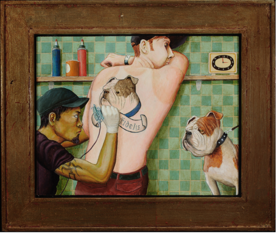
Vincent Desiderio, whose work is on view at Marlborough Gallery through February 8th, is a painter and critic whose works balance a cerebral, theoretical sensibility with powerful emotional cues. In particular, Desiderio's recent paintings incorporate notions of reification, a theory that refers to making something real or concrete despite an absence of evidence. The rich, heavily worked surface of the artist's paintings -- and his interest in sculptural forms -- demonstrate an engagement with materiality and process that vivify his ideas.

I recently spoke to Desiderio and was able to ask him about the sources and meanings of a few recent works and also about some of his key theories.  

John Seed Interviews Vincent Desiderio
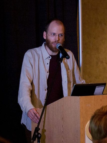
 
2014-01-27-desiderio.jpg
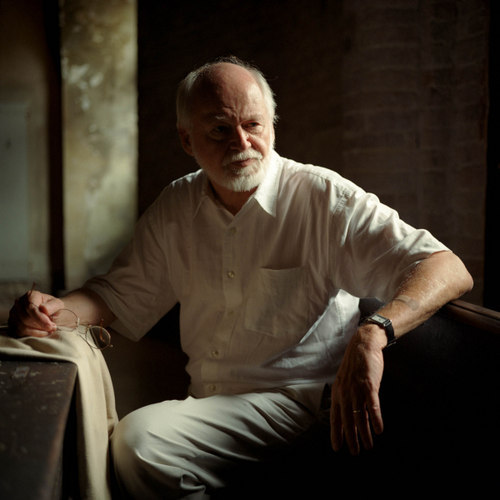
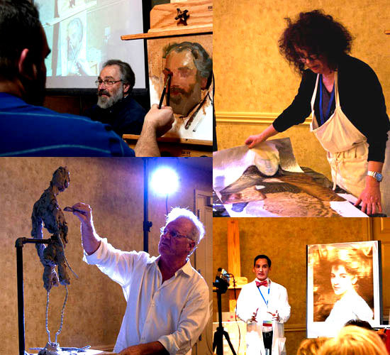
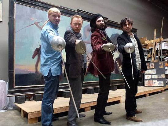
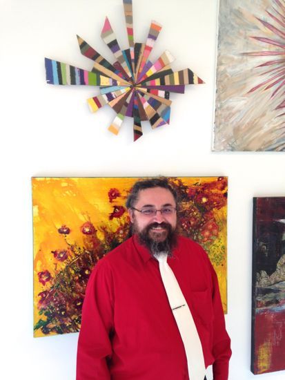
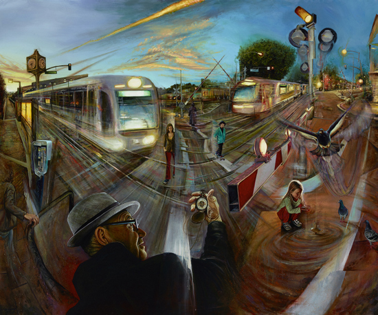
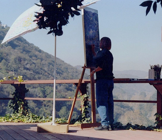
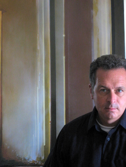
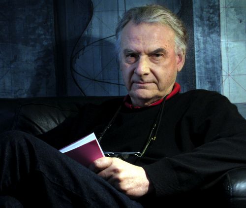
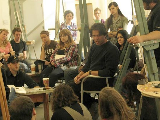
Vincent Desiderio teaching at the New York Academy of Art
 
One thing you talk about in relation to your work is reification. I'm starting to understand it - it's a process making something abstract concrete - but perhaps you can tell me more about it.

There is an ironic edge to the use of the word reification in terms of making paintings because for me a successful painting remains in constant motion; evoking a sense of the perpetual present tense of being. It remains open ended, thus facilitating the flow of artistic thought that is always and everywhere streaming through the history of painting.

However, painting's greatest strength lies in its stasis, its capacity to produce the coup d'oeil, the momentary freezing of this motion. Recently my work has taken on a density that underscores the materiality of the image, a move diametrically opposed to the screen image or the photograph. I see this as related to the radical materiality of Courbet and his Socialist concerns. My pictures now have a technical weight, and so, a palpable presence that I feel more comfortable with. I tend to dwell on the staging of the technical procedures so that visual information is emitted at varying degrees of intelligibility and speed.

From the start, I recognize that the real idea of the picture resides in the way materials are coaxed into meaning.

2014-01-27-desiderio_trans.jpg
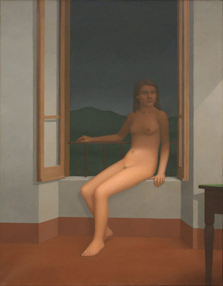
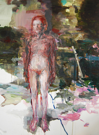
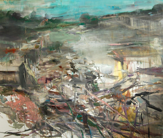
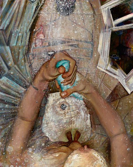
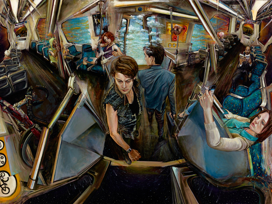
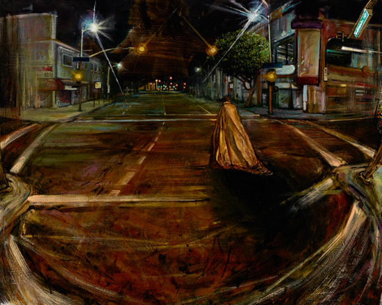
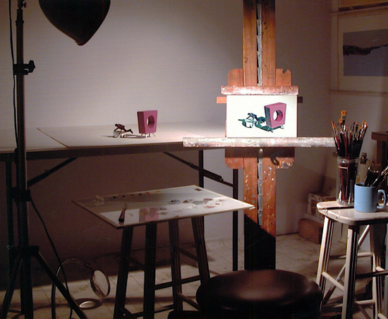
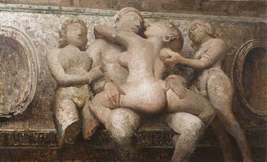
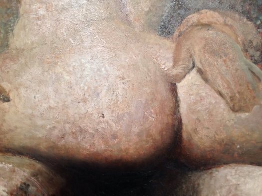
Vincent Desiderio, Transubstantiation, 2013
Oil and mixed media on canvas mounted on board, 68 x 111 inches
Courtesy of Marlborough Gallery, New York
 
 
2014-01-27-detail_trans001.jpg
Surface detail of Transubstantiation: Photo - Thomas Wharton
 
The subject of sculpture comes up in your recent work: it is a subject that seems to lend itself to reification. 

 Yes, certainly. As subjects they lend themselves well to the way in which I want to paint. But all of the subjects that I paint are inextricably bound to the evolution of material manipulations; their organization constitutes a narrative in its own right. One might call it the technical narrative. This may or may not be at odds with its dramatic narrative ( the recognizable elements in my work that seem to be engaged in one activity or another). The sculptures in my paintings are frozen forms but are imbued with motion by the way they are contextualized by the paint itself.

2014-01-27-desiderio_hitchcock001.jpg
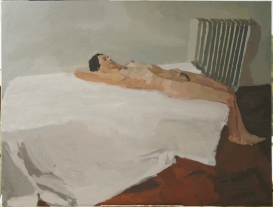
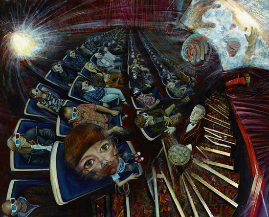
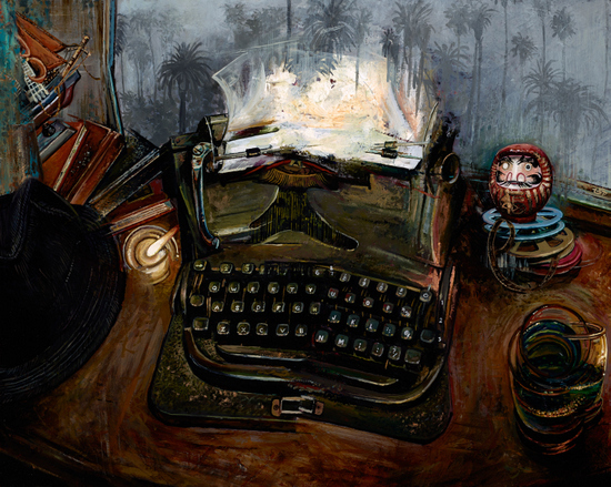
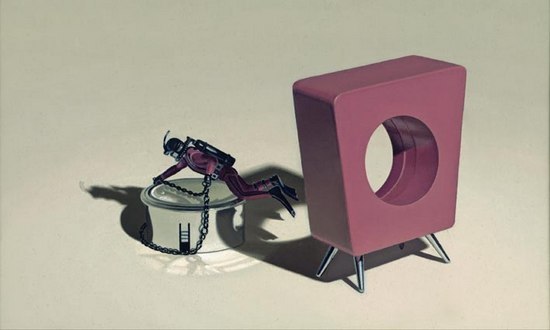
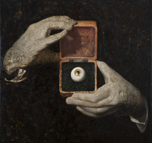
Vincent Desiderio, Hitchcock's Hands, 2012
Oil and mixed media on canvas, 64 x 66 inches
Courtesy of Marlborough Gallery, New York
 
What can you tell me about the painting Hitchcock's Hands?

To tell you the truth, that image is the most appropriated of any of the images in the show. It's taken from one of the opening sequences of the old Alfred Hitchcock Presents television show. I wish I could tell you I own this image completely, but by painting it the way I painted it I wanted to own it; changing its scale, context and scumbling the hands until they seemed sculptural. I don't often do that kind of thing -- appropriate images directly -- but I simply couldn't resist. The eye in a box looks so much like an old box camera. Enucleated, it becomes a mere artifact.

2014-01-27-desiderio_hands.jpg
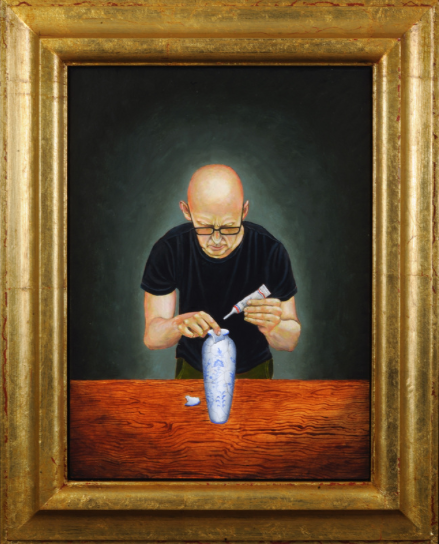
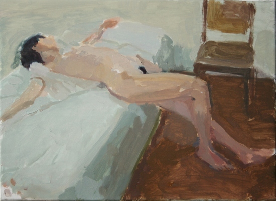
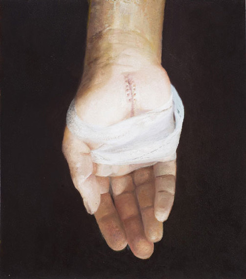
Vincent Desiderio, Study for Hand, 2012
Oil on board, 23 1/4 x 20 3/4 inches
Courtesy of Marlborough Gallery, New York
 
Another image in your Marlborough show that intrigues me shows of a single hand with stitches and a dressing. How did that image come about?

That was a study for a picture that never materialized. I didn't spend much time on it before I realized it was going nowhere: a sutured stigmata.

 In another interview you did, there was a mention of a quote that inspired you: Everything should be painted as if on a grey day...

It's from Delacroix. On May 5th, 1852, he made a curious journal entry describing color's relationships in terms of the optics of illumination, which anticipated the eventual subversion of form by color in avant-garde painting. Its substance is absolutely central to the artist's conception of color: both optically and as an allegorization of the exotic.

You see, for Delacroix half-light of a grey day represented an exotic realm where color was free to demonstrate its highly reflective propensity, undisturbed by incidents of direct light and shadow. In describing shadows as mirrors, Delacroix inferred that the reflective potential of objects untouched by direct light is obliterated by direct illumination. I think it is remarkable that Delacroix not only accords half-light privilege over classical light mass, but endows it with both optical truth and symbolic meaning. This was later fully played out in the divergent interests of the Impressionists and Post Impressionists.  

One of your former students - Timoty Stotz - suggested I ask you this question: What is the difference between and symbol and an emblem?

A symbol is a representational tool, meaningful either through convention or association as a condensation of a more complex idea. An emblem -- as I have coined it -- is something that precipitates out of a soup of continuity, disrupting the viewer's suspension of disbelief.

When I have used the terms emblem or emblematic I am generally speaking of types of pictorial discourse. I distinguish between two types of technical narrativity: sequential and emblematic.

Sequential narrativity is a form of pictorial construction that privileges a continuity of effect linking the viewer, through the painting to the artist and his intention. It creates a seamless fictive whole characterized by a rapture or trance of viewing. The optical field opens before the spectator, inviting a kind of surrender to the picture's illusion (here used in a broad sense, inclusive of all sensually transmitted visual ideas). As such, he/she enters in to a kind of optical complicity with the work and through this complicity participates in a picture's narrativity. A visual experience of this nature suggests an orchestrated disclosure of intention -- on the part of the painter -- and an uncanny capacity to follow/participate in its unfolding (on the part of the viewer).


Conversely, the optical field can be made to shut down before the spectator, discouraging direct sensual participation. A visual event of this kind is interrupted by the presence of an element (emblem) removed from the sequence of normal comprehension or cultural utility and inserted within the visual field: like throwing a wrench in the works. This forces a more detached reading, emphasizing a critical model of experience over an undisturbed complicity. The expected meaning of an object and that meaning's continuity with experience are at odds with one another: essentially a re-contexutalization inviting redefinition. This de-familiarization signals a rupture in the stream of sequential disclosure. I call narratives of this type emblematic. 

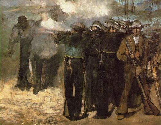
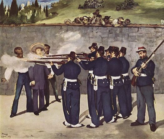
Can you give me an example of emblemization in a painting? The development of emblemization is brilliantly demonstrated in Manet's three versions of The Execution of Maximillian, all date around 1867.

2014-01-27-Manet_Boston.jpg
Édouard Manet, The Execution of Emperor Maximilian (1867)
Oil on canvas, 195.9 x 259.7 cm., Museum of Fine Arts, Boston
 
In the first (in Boston) a full-blown Romanticism is evident in the dense, smokey haze and swift and brutal brush strokes that speak directly to the violent death of the Emperor and his aides. Borne on a whirlwind of empathic disclosure, its reality contrasts sharply with the second version (in London) which is oddly dispassionate. Our spectatorial view removes us from the brutality of the action. The technical narratives of either picture offer no real surprises in terms of their sequential expectation: both are firmly rooted in pictorial practices that would have been instantly recognizable to their viewing publics.

2014-01-27-Manet_Mannheim.jpg
Édouard Manet, The Execution of Emperor Maximilian (1868-69)
Oil on canvas, 252 x 305 cm., Kunsthalle Mannheim
 
The third version (in Mannheim) is a different story entirely. The detachment already discernible in the London version attains a level verging on visual agnosia. The figures are pure synthetic creations -- almost like decoupage -- lifted from one context and reinserted into another. One might interpret the abbreviated brushwork as lively reductions of form into the service of optical illusions, the way that works by Velasquez or Hals dissolve into vigorous masses of color at close range, while space is solidly established from a few meter's distance. The forms in the Mannheim Execution, however, un-resolvable at any distance, are marks isolated from their utility in the accomplishment of illusion. One is tempted to see them as signifiers detached from the onus of the signified: misquotations from the index of recognition.  

Current Exhibition:  
Vincent Desiderio
January 8th - February 8th
Marlborough Gallery, New York 40 W. 57th St.  

Upcoming Exhibition:
THE BIG PICTUREDesiderio, Fischl, Rauch, Saville, Tansey
January 28 - March 2, 2014
Opening Reception: Tuesday, January 28, 6-8 PM
The New York Academy of ArtWilkinson Gallery

Residency:
Vincent Desiderio will be resident Guest of Honor at the JSS in Civita Summer Art School & Residency 2014

What Makes a Jackson Pollock Painting Worth Millions?

$
0
0
2014-02-01-20131115Pollock_100.jpg
In Pollock We Trust: Digital collage by Photofunia.com

On November 12th of last year, Jackson Pollock's Number 16sold for $32,645,000.00 at Christie's, New York. The 30¾ by 22¼ inch painting has a surface area of 684.1875 square inches, which means that it sold for $47,713.52 per square inch. To put this in context, the Median U.S. Household Income for 2012 was $51,017.00.

Just how did this Pollock painting -- a rectangle of paper covered with skeins of enamel paint -- come to be worth such a mind-boggling sum? It is a fantastic and vexing question isn't it? I think there is a short answer and a long answer.

The short answer is that the figure of Jackson Pollock sits at the apex of a vast cultural construction: the currently accepted history of American art and culture. To explain how he got there, and how his work became a form of currency, requires a long answer.

2014-02-01-pollocknumber163.jpg
Jackson Pollock (1912-1956), Number 16, 1949
Oil and enamel on paper mounted on masonite, 30¾ x 22¼ in.

Jackson Pollock, who was born in 1912, perfectly embodies a cultural myth that has fascinated and obsessed Americans -- and those who have admired and/or envied American culture -- since World War 2: the myth of the heroic individual creator. Over time, Pollock's legendary status has been woven very completely into the fabric of a media society that has built art and culture into a very lucrative business.

Pollock is an artist who is seen as the prime mover and innovator behind a new American style of art (Abstract Expressionism) that blossomed in this county in the aftermath of our nation's defeat of the Axis powers. America's triumph in the war, infinitely aided by our having developed nuclear weapons first, validated our obsession with progress and paved the way for an era of American cultural hegemony that has lingered strikingly. Interestingly, if the rise of Fascism hadn't driven a generation of intellectuals to emigrate to the U.S. the nuclear bomb and Abstract Expressionism would have likely both been invented in Europe.

Jackson Pollock led the American avant-garde -- originally a military term -- in its defeat and supersession of European culture. As we now know, Abstract Expressionism even had some CIA help in terms of becoming the representative style of American individualism and in turn confirming American exceptionalism. A new generation of critics, especially Harold Rosenberg and Clement Greenberg, made striking arguments for Pollock that helped him earn a lofty position in postwar America's rapidly evolving cultural Pantheon.

Before the war America's cultural superstructure already had been developing rapidly. The Museum of Modern Art was founded in 1929: the same year that seventeen year old Jackson Pollock moved to New York to study art. The growth of Pollock's career and the growth of the market for his work has coincided with the ascent of New York's status as America's -- and arguably the world's -- capital city of art and culture.

According to this informative chart -- A History of New York's Gallery Districts -- there were 140 art galleries in New York when Pollock arrived. There are now about 1500. New York's art museums welcomed some sixteen million visitors in 2012. Arts in the broader sense -- Visual Art, Theater, Dance, etc -- are a huge economic force: a New York state survey of 2010 identified 53,085 arts-related businesses employing 335,683 people.

Getting back to Pollock, a striking aspect of his work is that it is abstract. To put it another way, it requires anyone who accepts and or "likes" it as art to accept what was once a radical premise: that ideas are more valuable than skill. In the American model, progress starts with ideas and if you have a great one you are going to own a factory (or today an internet startup) not work in one.

The Philistine modern art haters of the fifties who would look at a Pollock in a magazine and say "My kid could do that" missed the point that Pollock was a "genius" who had changed how things were done because he had a new idea of how to do things: he replaced the brushstroke with the drip. Ideas begin in the mind as abstractions, and if you don't "get" a Pollock there remains a possible taint: if you need or like images or realism maybe you have an excessively literal mind.

Pollock's career unfolded in an era when the development of mass media accelerated and multiplied the dissemination of new ideas and images in art. Pollock's career was certainly aided by the rise of mass media: a tremendous impact was made by the spread Life Magazine did on him in 1949, which posed the question: "Is he the greatest living painter in the United States?

In other words, he got in early on a trend that was just emerging. If you are a visual artist living and working now you can't help but be aware of the fact that if you come up with a great idea in the form of an image it will be infinitely multiplied by a tsunami of jpegs that will spread your fame and increase your reputation across the globe. Try googling "Jackson Pollock" and you will get over 18 million search results. Jackson Pollock, who has been the subject of a feature motion-picture, a Pulitzer Prize winning biography and innumerable magazine articles and museum exhibitions has had his myth multiplied by a media society, and it didn't hurt that he died young in a spectacular car crash.

Pollock's secure place as an embodiment of Americanism -- and as an internationally famous artist ---has translated into extraordinary cash values for his art. The price record is reportedly held by his No. 5 of 1948 which is believed to have sold for $140 million in 2006. Disputes over the authenticity of several purported Pollock works have made for some very entertaining news stories in the past decade. Recently, the authenticity of what some believe is Pollock's final painting has come to hinge on forensic analysis of a polar bear hair found embedded in the paint.

It is an accepted fact now that works of art can serve as financial instruments just like stocks, bonds or precious metals. If you want to check the value of Jackson Pollock as a "stock" you can use the Mei Moses® Fine Art Index to get an objective handle on the market. Art databases including those at Artnet.com and AskArt.com have made access to data about the prices of art at auction instantly available to anyone interested in investing works of art. By the way, we still refer to people that purchase multi-million dollar works of art as "collectors" but is there anyone with that kind of money who shouldn't be called an investor?

One way to look at the prices for Pollock's work is to call it a great American success story. Can't we just sit back and beam with pride over the story of a trouble young man whose artistic legacy is valued by museums, auction houses and banking institutions? Another way to look at the situation would be to speculate that Pollock's prices are the result of a cultural asset bubble. What would happen, for example, if art historians came to a new conclusion and decided that Pollock was actually a rather minor artist after all? Books would need to be re-written, curricula redesigned, and museums might put his works into storage.

Pollock's Number 16 is an abstraction backed by an abstraction: the construct of America's cultural and artistic history. Like a one hundred dollar bill it is ultimately just a piece of paper that we have learned to trust as valuable. It is worth many millions of dollars only because an entire cultural system has been built on the assumption of its value. It seems like an unintended consequence, but the generations of predominantly left-leaning critics, curators, and academics who carefully constructed the story of American modernism ultimately built up a new asset class for super-wealthy investors.

It strikes me as ironic that an artist we value for his rebelliousness and innovation has now become a figure that is somehow beyond question. Could you get a job as a Museum Director in the United States if you told those interviewing you that you didn't care for Pollock? I doubt it. The process of turning Pollock into an icon and a commodity has gone so far that it is nearly impossible to turn back. Perhaps for that very reason, Pollock paintings continue to look good to investors. After all: Pollock is too big to fail.

Note: for another very illuminating take on some of the forces at work in the Art Market, have a look at the video below, created by Tymek Borowski and Pawet Sysiak.

F. Scott Hess: The Perfect Hess-Storm

$
0
0
What a year Los Angeles artist F. Scott Hess is having: his works are simultaneously on view in a two-part retrospective, and a one-man gallery show. His deadpan historically-themed mockmentary and curio cabinet The Paternal Suit: Heirlooms from the F. Scott Hess Family Foundation is gradually making its way from the deep South to the West Coast.

Hess is the subject of a feature article in February's Juxtapoz, and a ten-page spread in a Polish art magazine: since he doesn't read Polish, that has been a bit frustrating. A 200 page F. Scott Hess coffee table monograph is due out this fall. It all seems to be coming together in a kind of perfect storm: in fact, Scott has been calling 2014 the year of the Hess-storm.

2014-02-09-scott.jpg
F. Scott Hess: Photo by Marc Trujillo

Despite all the attention Scott can still go martyr and bring on a striking crucifixion pose at a moment's notice as he did on the opening night of his CSU Fullerton retrospective. "I tend to focus on what hasn't happened, on what's lacking," Scott wrote in an unpublished set of career musings he penned a few years ago: "Positive reinforcement rolls off me like water off a duck's back." Still, even while throwing back his head in a martyr's pose Hess can't quite wipe the grin off his face...
2014-02-09-hess_book001.jpg
F. Scott Hess, 10 x 13 inches, 200 pages
Published by Grand Central & Gingko Press, Designed by Wendy Peng
Essays by John Seed, Leah Ollman, Doug Harvey, and Mike McGee
Available: Fall 2014

To achieve what he has, Hess has relied on his inborn "mule-like stubbornness" for nearly forty years, making art on his own terms. Remarkably, he has built his career without any real acknowledgement from the East Coast art establishment: his work has never been reviewed in Art in America, Art Forum, or Art News. He has had solo shows in Vienna, Tehran, Laguna Beach, San Francisco and Mobile, Alabama, but only scant exposure in New York. Of course, there is always 2015…

Committed to narrative and representational painting since the start of his career, Hess has always seen himself as standing outside the periphery of the official Art World. "I didn't play their game," he has written: "I didn't deal with issues the Art World felt important. I didn't work in forms and mediums that were of the time."

Instead of "playing the game" Hess has been painting brilliant and darkly funny paintings, building friendships, teaching and serving as a beacon to an upcoming generation of representational artists. In recent years he has used social media expertly and hit the max of 5,000 Facebook friends a long time ago, and he uses the "like" button fearlessly. Scott is a great painter," says his friend and fellow artist Marc Trujillo, "and in addition to the example he provides in rigor of his work he's also been really generous and helpful with his contacts. He puts me in touch with people and we compare notes about everything."

As this year's Hess-Storm demonstrates, all the effort that has paid off in both his personal and professional spheres. "Scott is responsible for a resurgence of narrative in painting," says curator Mike McGee, "A lot of younger artists have come along since (Scott) and felt empowered to tell stories."

2014-02-09-16_portraits001.jpg
F. Scott Hess at Barnsdall Art Park on 2/2/2014 with 32 Portraits from 1991
Photo by Ron De Angelis courtesy of Koplin Del Rio Gallery

One of his new paintings from 2014 -- Lift at Koplin Del Rio -- is a trenchant and enigmatic masterpiece that needs to be seen in person to be appreciated. It features four naked figures -- two men and two women -- who hoist a hippo skull against a sky that illuminates its interior with a flecks or golden-orange light. Scott says it was designed to have "multiple meanings" and to be seen as alternately "religious, cultish, evolutionary or mystic."

Of course hippos don't normally have fangs, so the skull that the figures gingerly hold aloft is from an animal that doesn't really exist: it is an artist's willful invention, admired by a naked cult. It is a very funny painting but it also makes a point: don't be embarrassed if your taste is a bit different from everyone else's. Find the right cult, enjoy the camaraderie and admire the fire of ideas that only the imaginative can perceive…

2014-02-09-lift.jpg
F. Scott Hess, Lift, 2014, oil and egg tempera on aluminum panel, 39" x 32"
Photo: Koplin Del Rio Gallery

F. Scott Hess
Koplin Del Rio Gallery
6031 Washington Blvd
Culver City, CA 90232
January 11 -- February 15, 2014

2014-02-10-Thief.jpg
F. Scott Hess, Thief, 2002, Oil on Canvas, 32 x 40 inches at the Begovich Gallery

F. Scott Hess: Retrospective
CSU Fullerton: Grand Central Art Center
Curator | Begovich Gallery Director, Mike McGee
125 N. Broadway
Santa Ana, California 92701
January 25 -- February 27, 2014

2014-02-10-SuddenStorm001.jpg
F. Scott Hess, Sudden Storm, 1987, Oil on canvas, 87 x 121 inches, at Barnsdall Art Park

F. Scott Hess: Retrospective, Part II
Los Angeles Municipal Art Gallery, Barnsdall Park
4800 Hollywood Blvd.
Los Angeles, CA 90027
February 2 -- March 16, 2014


The Paternal Suit: Heirlooms from the F. Scott Hess Family Foundation
Sumter County Gallery of Art
Sumter, South Carolina
February 13 -- April 18, 2014
Coming to the Long Beach Museum of Art: Dates TBA

F. Scott Hess at The Representational Art Conference (TRAC2014)
Presentation: Achieving Figural Movement
March 3, 1:45 to 2:30
Panel Discussion - The Future for Representational Art
Moderator: John Seed
Panel: Candice Bohannon, Graydon Parrish, Peter Trippi, Kara Ross, F. Scott Hess
March 5, 8:30 to 10AM
The Crowne Plaza Hotel Ventura
Visit the TRAC 2014 website for registration and information

Tim Vermeulen: Speaking to Shared Experience

$
0
0
Tim Vermeulen's recent paintings -- on view at the George Billis Gallery, New York through March 15th -- are awkwardly confessional: just as the artist intends. Strong autobiographical, psychological and spiritual elements charge his seemingly modest paintings with considerable narrative power.

I recently interviewed Tim Vermeulen and learned more about his background, his imagery and his need to share his most personal experiences and impulses.

 John Seed Interviews Tim Vermeulen

2014-02-23-vertical_Tim.JPG
Tim Vermeulen

Can you tell me a little bit about your early background? I understand that your father was a funeral director who kept a morgue in the basement of your home.


I was born the son of a mortician in Paterson, NJ. The behind-the-scenes aspects of the business were never hidden in any way from the children in the family, so I regularly watched people being embalmed and prepped for services. I have never figured out exactly what effect this daily experience of death has had on my psyche, but I imagine this was a great motivating force in my decision to become an artist.

I also come from a strict, Dutch Calvinist background with a theology that emphasized our "total depravity" (e.g., from Calvin's Institutes: "I am compelled here to repeat once more: that whoever is utterly cast down and overwhelmed by the awareness of his calamity, poverty, nakedness, and disgrace has thus advanced farthest in knowledge of himself."). Once, in a graduate school critique, I said that my work was about dealing with issues of life and death; one of my professors disagreed and said she thought it was more about redemption and damnation. I now see that my funeral home experience, while strange and sometimes frightening, has had nowhere near the powerful, daily, often deleterious effect that religious indoctrination has had on my essential nature.

2014-02-23-ScreenShot20140222at6.52.46PM.png
Tim Vermeulen, The Animal Realm, 2014, oil on panel, 18.5 x 16"

When did you first become interested in art and where did you study?

I was always very interested in art as a child, but in my junior and senior year of high school I had an art teacher who introduced me to art as a very serious pursuit, as far more than a mere cultural frill, and as a way to work through what he called "the basic plights of man." I went on to receive a B.A. from Calvin College and an M.F.A. in Painting and Drawing from The University of Illinois Champaign/Urbana.

2014-02-23-ScreenShot20140222at6.55.05PM.png
Tim Vermeulen, December, Oil on Panel, 13x10''

What have your artistic influences been?

The primary influence has been 15th and 16th century Dutch painting (e.g., Jan VanEyck, Dirk Bouts, Pieter Bruegel). I especially like in early Dutch narrative painting what I have heard referred to as the "realism of particulars," where certain objects, often of great symbolic weight, are rendered with incredible devotion while the painting as a whole lacks the rigorous underlying structure that was so essential to the Italians. So, the paintings often draw you in to a somewhat believable stage space but something is always askew and awkward.

2014-02-23-ScreenShot20140222at6.57.52PM.png
Tim Vermeulen, The Hell Realm, 2014, oil on panel, 18.5 x 16"

How does the theme of the true self versus the false self appear in your work? can you tell me about a specific painting?

During a period where I underwent Jungian analysis I was introduced to this notion and the theme is most directly addressed in any of the many of my pieces that incorporate masks. For example, my most recent series of paintings is based on the six Buddhist Realms of Existence. In The Hell Realm I stand before a bathroom mirror with the mask of a demon obscuring most of my face. The mask represents this false self. In my understanding the true self creates this mask to protect itself from the vagaries of a cruel and uncaring world.

2014-02-23-ScreenShot20140222at6.36.25PM.png
Tim Vermeulen, Displaced, oil on panel, 14.5 x 12.5"

Is that you holding the two suitcases in the painting Displaced? Tell me about the image

Yes, that is me in the piece. All of my work is autobiographical and most incorporates direct self-portraiture. In the past 12 years I have moved 7 times and I have almost never felt truly rooted anywhere. I have come to recognize that the feeling of uprootedness is about far more than just the physical house. In the painting I gaze at a damaged home. For Jung the house is often a representation of the ego, so the feeling of being uprooted can be anchored deep within a self that for me has dimensions that are psychological, physical (about coming to terms with the changing body), spiritual, and intellectual.

Can you briefly tell me the stories behind a few of the other paintings in your show?

2014-02-23-ScreenShot20140222at6.49.50PM.png
Tim Vermeulen, Vision Test, 10 X 12.5", Oil on Panel, 2013

Vision Test: For most of my life my eyesight has been above average and I have never required any aides. In recent years I have succumbed to the inevitable weakening of my vision and I now require regular visits to the eye doctor. This painting incorporates the eye test but for me it becomes a piece about being an artist and the artists' constant questioning of the meaningfulness, authenticity, and insightfulness of his/her "vision." There can be an almost crushing subjectivity and freedom in art-making that probably plagues artists with more self-doubt than any other profession.

2014-02-23-ScreenShot20140222at6.48.07PM.png
Tim Vermeulen, Restoring, oil on panel, 8 x 11"

Restoring: Many of my paintings employ excruciating detail and very complex arrangements. In this piece I wanted to try something very pared down with a void-like background like one sees in many Baroque portraits. For me repairing the vase represents the process of trying to reintegrate a fractured and fragile personality.

2014-02-23-ScreenShot20140222at7.04.04PM.png
Tim Vermeulen, Stray, 19.5 X 15.5", Oil on Panel, 2013

What are your interests outside of painting? I understand you are active in a dog rescue organization.

I have been very active with English bulldog rescue and bull terrier rescue in the last 7 years. We have had over 20 foster dogs and have adopted 3 ourselves. Dogs play a very prominent role in many of my paintings. They can be the classic symbol of fidelity or in some pieces they symbolize the aggressive nature that I both fear and jealously desire. I have also done a number of portraits of rescues and foster dogs to raise money for our organization.

2014-02-23-ScreenShot20140222at6.51.19PM.png
Tim Vermeulen, Marked, 7.5 X 9.5", Oil on Panel, 2013

How do you hope people will respond to your current show at the Billis Gallery?

I hope that my paintings work on a couple different levels. There is a surface story that is easily read and accessible. Beneath the surface story is an autobiographical and psychological impulse. This can relate to childhood traumas, to dreams I have had, to my current life concerns, and to my experiences of and in the world. Though based in autobiography, I seek something that is universal, and I think of my own place in the work as a kind of everyman figure. The work is very personal but I want to make pieces that are more than just a visual diary. I hope they speak to a shared experience.

Tim Vermeulen
February 18th - March 15th
Gallery hours: 10am-6pm, Tuesday - Saturday
George Billis Gallery
521 W. 26th St New York, NY 10001

Skill and Subtlety: A Conversation With William Bailey

$
0
0
William Bailey's current exhibition at the Betty Cuningham Gallery in Chelsea covers a lot of ground. Although it emphasizes recent paintings created both in the U.S. and in Umbria, it also includes works made in 1963 and 1977. Examples of Bailey's methodically burnished still-life paintings are on view alongside his serenely elegant figure paintings. In all the works on display are traces of what writer Mark Strand characterizes as a dreamlike, almost theatrical rationality.

I recently spoke with William Bailey and asked him about his work and about his observation that representational painting is now flourishing in the studios of a new generation of artists.  

John Seed in Conversation with William Bailey
 
2014-02-27-W_Bailey_portrait.jpg
William Bailey
 
When I look at your paintings I see skill and subtlety. Am I right in calling those things central to your work?

As far as skill goes, one always hopes to acquire the skills that are needed to do what one wants to do. What I mean to say is that skill is not a free-flowing, free-floating issue in my work -- if that makes any sense.

2014-02-27-WB12938.jpg
Night Near Monte Murlo, 2009, Oil on linen, 57 1/2 x 45 inches
 
It certainly does. You have been painting and exhibiting your work for over 60 years now, so you have been building your skills for a long time.

That's right... In regards to subtlety, I think again you are either subtle or you aren't... I think subtlety has to do with a way of seeing and what you value in what you see. I suppose from the outside in relation to a lot of work that goes on I might be seen as seeking subtlety and that is fine with me.

2014-02-27-WB13007.jpg
Giostra, 2009, Oil on linen, 50 x 60 inches
 
The painter James Doolin -- whose work was highly refined, rather like yours -- once told me when I was inspecting one of his canvases: That is how I see the world. In other words his paintings reflected a very personal way of seeing. You seem to work the same way.

I would agree with that. That is well put. However, you can't see everything subtly. What I mean to say is this: unless you have a very strong structural basis, subtlety can become merely wishy-washy.

2014-02-27-WB13594.jpg
Afternoon in Umbria, 2010, Oil on canvas, 51 1/4 x 63 3/4 inches
 
So a strong structural basis is something you strive for early in the development of each work?

Oh yes...always.  

So your work has its basis in drawing? In form?

I would say in drawing. I think some people come to painting through drawing and others through a sense of area and color and of shape. For me drawing was the earliest and most important contributor to my work.

2014-02-27-WB14080.jpg
Citizen Among the Monuments, 2013, Oil on Linen, 45 x 57 1/2 inches
 
In the show at Betty Cuningham Gallery you are exhibiting both recent figure and earlier still life paintings. Is it fair to say you move effortlessly between the different kinds of subject matter? Do you handle them with the same sensibility?

(Laughing) Nothing is effortless.

 Both the still lifes and the figure paintings come from my imagination. They are not done from life: they are done from memory and images in my head. So since they both have their origins in the same place its not that hard to switch from one to the other.

2014-02-27-WB14081.jpg
Rancale, 2013, Oil on Linen, 15 3/4 x 19 7/8 inches
 
Coming from memory gives you a lot of latitude in the way you treat things.

It does indeed. It is probably the reason I work the way I do.  

When someone visits your current show how do you hope they will respond to your work?

The most important thing is for them to take time to let the paintings unfold. That holds true of both the figure paintings and the still lifes. The other thing I hope they will recognize is that my paintings seek a kind of silence. If you are looking for something that jumps around you won't find it. That is simply the character of the work. Also, people should understand that these are not meant to be realist paintings. They are about imagery.

2014-02-27-WB14166.jpg
Tavernacci, 2013, Oil on Linen, 18 x 24 inches
 
Are there any current artists that you feel a strong connection to?

There are a number of artists that I am admire -- I'm not connected to many -- they are all over the place. Right now what I would say about what goes on outside of my own work is I notice that there are more young painters than there have been in my memory. And there is more good figurative painting going on than I can remember. Its odd that this is the case at a time when painting is being viewed more and more as a kind of niche activity. There is very little recognition among the museum curators and the galleries. So what I see is not reflected so much in the galleries as in the studios. It is a remarkable time because there is a culture of young artists who are surviving somehow without the recognition of the larger art world.

2014-02-27-WB14198.jpg
Woman in Umbria, 2013, Oil on Linen, 11 x 9 inches
 
There does seem to be a groundswell of interest in representational painters, and the internet seems to be playing an important role.

I think that may be one of the things that holds things together for the young painters that I referred to before: the fact that they can be in communication with one another and with writers. It has built a community. Of course I'm not involved in that - I have very little use for computers -- but I do think they are important in this way.

2014-02-27-camilla_william.jpg
William Bailey and Camilla Fallon: photo by Clarity Haynes 
 
Yes, I actually found out about your show when a Facebook friend -- the painter Camilla Fallon -- posted a photo of herself chatting with you at the exhibition.  

Aha! Well there you are!

William Bailey
2/13/2014 To 3/29/2014
The Betty Cuningham Gallery
541 West 25th Street
New York, New York 10001

John Seed on the Legacy of Bay Area Figuration (VIDEO)

$
0
0

A lecture presented on March 4, 2014 in conjunction with the Representational Art Conference -- TRAC2014 -- in Ventura, California. Presenter John Seed recounts the origins of the postwar figurative art in the Bay Area and shows examples of works by David Park, Elmer Bischoff, Richard Diebenkorn, Joan Brown, Paul Wonner, William Theophilus Brown, James Weeks and Nathan Oliveira.

When Art Worlds Don't Collide: TRAC 2014 and the Whitney Biennial

$
0
0
2014-03-08-looking_at_nerdrum.jpg
Artist Teresa Oaxaca admires Odd Nerdum's The Poacher at TRAC 2014
Photo by Brittany McGinley

I often tell people that there isn't just one Art World, and on Wednesday, March 5th two divergent art events taking place on opposite coasts of the United States would have proved my point and then some. Let's start with the West Coast... In Ventura, California March 5th was the closing day of the second ever Representational Art Conference -- TRAC 2014 -- an international gathering that had attracted over 300 artists and others interested in exploring "the aesthetic principles and values implicit in the representational art of the 21st Century." The TRAC conference has tripled in size since it first appeared in 2012, and this year's attendees often found themselves spilling out the back doors and leaning against walls, listening raptly to presenters and panel discussions.

2014-03-08-overflow.jpg
The crowd overflows during a TRAC panel discussion
Photo by Brittany McGinley

During TRAC's opening evening on Sunday, March 2nd crowds sat six rows deep as they took in a four-ring circus of technical demonstrations and lectures. They alternated between watching a live oil portrait demonstration by Tony Pro and a demonstration of the use of gold leaf in mixed-media by Pam Hawkes. In another corner sculptor Stephen Perkins offered a demo in which he confidently modeled a clay ecorché figure while giving tips on human anatomy. Across the room artist Graydon Parrish and his co-presenter Steve Linberg donned white lab coats while explaining the systematic intricacies of the Munsell Color System.

2014-03-08-trac_demos2.jpg
TRAC Demonstrators - from upper left then clockwise
Tony Pro (painting Virgil Elliot), Pam Hawkes, Stephen Perkins and Graydon Parrish

The second morning of the conference opened with a breakfast talk by Roger Scruton, a British philosopher, and the host of the BBC documentary Why Beauty Matters. Scruton argues that fake ideas and fake emotions have banished beauty from High Culture.

2014-03-08-roger_alexy.jpg
Alexey Steele demonstrates drawing with Roger Scruton as his model
Photo by Brittany McGinley

A sober and articulate Scruton lamented the series of "jokes" in contemporary art going all the way back to Marcel Duchamp's urinal -- a word which he pronounced with evident distaste as yur-eye-null -- arguing that authenticity and "real" art offered the antidote to Duchamp's derailment of art's true purposes. Railing against the "fake originality" of much modern and contemporary art -- Jeff Koons was one target of his wrath -- Scruton has positioned himself as an advocate for narrative art that offers its viewers the possibility of redemption.

Roger Scruton at TRAC 2014: video by John Seed (39 seconds)

Scruton gave the conference its philosophical and moral center, when he told his listeners: "You should be able to go to art with the burden of your life." At the close of his breakfast address, Scruton received a standing ovation, leaving the crowd excited, caffeinated and ready for the panels and papers to follow.

2014-03-08-trippi_zakian.jpg
L to R: Peter Trippi and Michael Zakian
Photos by Brittany McGinley

After breakfast I listened to Peter Trippi, the Editor of Fine Art Connoisseur Magazine who offered a shrewd blend of insight and advice in his presentation: So, Great Art Is Being Made Today: Who's Selling and Buying It, Why and How?"Mark my word," he announced at one point: "Within 25 years the only public commercial galleries left in New York City will be tourist oriented storefronts within walking distance of each other." Just as Trippi was finishing I heard applause ring through the hotel walls when Michael Zakian, the Director of the Frederick Weisman Museum at Pepperdine University completed his talk on The Problem of Content in Contemporary Realism.

After lunch the events just kept coming. There were 18 academic paper presentations to choose from -- The Quest for Beauty Through Classical Proportion Systems was one -- followed by an excursion to Cal Lutheran University to view two exhibitions: Women by Women and Resonating Images III.

2014-03-08-roger_odd.jpg
Roger Scruton and Odd Nerdrum: Photo by Betty Shelton

The following day brought the conference's much-awaited centerpiece -- a conversation between philosopher Roger Scruton and artist Odd Nerdrum, the event's rock-star presence. The crowd listened raptly when Nerdrum explained that just as American soldiers in Afghanistan had been told to "shoot at anything that looked like a Rembrandt portrait" contemporary art historians had been trained to "kill all pictures that look like a Rembrandt."

Nerdrum, who later commented that he sees himself as a kind of Hell's Angel -- a rebel operating outside official culture -- also offered his opinion that "the art historians in the universities have the same power as the American soldiers have in the world." He also recounted meeting the late art historian Arthur Danto who struck Nerdrum as being "like a school teacher" ready to enforce the authoritarian rules of art. Nerdrum came across as alternately sweet and over-dramatic and seemed to genuinely appreciate the attention he was receiving.

2014-03-08-jan.jpg
Jan-Ove Tuve
Photo by Brittany McGinley

The afternoon was devoted to a full schedule of presentations on the School of Nerdrum by some of the artist's students and friends. His associate Jan-Ove Tuv, for example, took on the topic of kitsch -- the art world's n-word -- in a presentation titled Kitsch as Superstructure for Representational Narrative Painting. After the Nerdrum seminars ended a line of sleek limo-buses took anyone with any energy left to the exhibition Fresh Harvest by Michael Lynn Adams -- one of TRAC's co-founders -- at the Ventura Museum of Art.

2014-03-08-2_michaels.jpg
Artist Aihua Zhou with TRAC co-founders Michael Pearce and Michael Lynn Adams
Photo by Brittany McGinley

During the closing day's panel discussion The Future of Representational Art there was a heartfelt surge of applause for artist Graydon Parrish as he recounted how he had been given a "F" in a high school art class because his drawing was deemed too "tight." Many other artists in the audience had apparently endured similar attempts at conversion therapy during their years in art school. There were plenty of other anecdotes about art world "rules." Odd Nerdrum says that he has been warned that only vegetarians can paint slaughter scenes, and painter Ruth Weisberg recounted the admonition that only lesbian women should paint the nude female body.

2014-03-08-panel.jpg
Panel on The Future of Representational Art (L to R)
Candice Bohannon-Reyes, Graydon Parrish, Peter Trippi, Kara Ross, F. Scott Hess

Of course the connections at TRAC were about much more than styles and experiences. Artist Richard Thomas Scott observed after that conference that "What sets us apart is not style, nor the fact that we paint recognizable objects, but our reconstructive humanist philosophy."

2014-03-09-Juliette_Roger.jpg
Juliette Aristides: Photo by Brittany McGinley

TRAC 2014 was brought to a close around noon on March 5th with a talk by the classically trained artist and atelier founder Juliette Aristides. She came straight from the heart and offered the crowd consolation, reminding them that representation is a deep tradition that has persisted for ages. She also referenced other moments in history when artists felt disillusioned with their culture and struck out on their own to "write the stories they want to read."

2014-03-08-juliette.jpg
Juliette Aristides speaking at TRAC 2014: Photo by Brittany McGinley

"Art stops the ground from falling, corrects wrongs, and links us back to our own lives," Aristides commented. "Every act matters, every life matters; see the beauty in our own life, our spaces, our places, and make meaning."

Many of those attending TRAC and listening to Aristides were classically trained painters whose careers have been diminished by their adherence to a set of aesthetic and philosophical values that have made them pariahs in the New York-centric world of contemporary art. At TRAC 2014 these same artists found themselves among a surging tide of new friends sympathetic to their point of view and the sense of camaraderie was profound and healing. Tired of being labeled as "kitsch" painters and fuddie-duddies, the TRAC crowd was excited to be in a context where there wasn't anyone present would would accuse them of not being an artist.

TRAC 2014 wasn't without its awkward moments. I suffered through one presentation in which the presenter railed against the work of Mark Rothko, condemned "billionaires buying crap" and then offered his own wife's paintings as a superior alternative. When accusing the art world of being biased and insular it isn't wise to promote the paintings of your family members…

I also couldn't help noting that although TRAC has made every effort to be progressive and open towards its membership there was only one African-American artist at the event. Classically and Academically oriented artists dominated the event but there was plenty of room for "moderates" -- I'm one of them -- who acknowledge and find inspiration in the tradition of representational art with modernist roots. All in all TRAC's flaws were minor and its achievements remarkable. "It felt like a tipping point," says artist Brandon Kralik.

2014-03-09-swordplay.jpg
L to R: Brandon Kralik, Richard Thomas Scott, Alexey Steele and Jordon Sokol

There isn't a bit of doubt in my mind that a genuine movement is taking shape and a third TRAC conference has been given the green light by Cal Lutheran University, led by its very admirable President Chris Kimball. Who knows what TRAC will morph into, but if it stays flexible and continues to gain momentum it has the potential to reshape the future of contemporary art, especially if it continues to associate itself with representational artists of genuine talent.

***
In theory, you could have heard Juliette Aristide's final address and then boarded a NetJet at the Camarillo airport and made it to New York just in time to catch the 8PM opening cocktail reception for the 2014 Whitney Biennial, which bills itself as offering "one of the broadest and most diverse takes on art in the United States that the Whitney has offered in many years."

2014-03-09-kim_lun.jpg
Ken Lum, "Midway Shopping Plaza" (2014)
Powder-coated aluminum and enameled plexiglass
Photo by Kaitlin Karolczak

Of course, I take issue with the idea that there is anything broad or diverse in what is on view at the Whitney: calling the Biennial "diverse" ignores the obvious perimeters of the exhibition's taste and ambitions. Tom Wolfe once wrote that the type of person you never see at a New York cocktail party is a housewife. Classically trained representational artists -- like so many of those who attended TRAC -- are the art world's "housewives:" ghettoized by critics and curators into their own separate and unequal social and artistic circle.

2014-03-08-barbie_penis.jpg
A Detail of Bjarne Melgaard's Installation at the 2014 Whitney Biennial
Photo by Kaitlin Karolczak

Doesn't anyone remember the September 1995 protest organized by Steven Assael in which some 200 painters gathered outside the Whitney to protest its exclusion of "artists working in a representational mode." The Museum's director at that time, David A. Ross, was out of town during the protest, but he did later issue a statement of reply, noting that the Whitney must support work that "strays outside the boundaries of the official academies and accepted good taste."

2014-03-09-hicks.jpg
Ceramic Basin by Sterling Ruby in the 2014 Whitney Biennial (foreground)
Sheila Hicks's "Pillar of Inquiry/Supple Column" (background)
Photo by Kaitlin Karolczak

The painters I spoke with at TRAC take the contrarian view that the Whitney <em>is</em> in fact the confirmed official academy of 21st century art: <em>they</em> -- the 103 "participants" chosen by three curators to take part in the show -- are the conservatives, rigidly aligned with the ossified and hypocritical "pluralism" of late postmodernism.

Take a few minutes and watch at least part of James Kalm's video of the exhibition's top floor and you will get a sense of just how shambling and eccentric the 2014 Biennial is...


After watching Kalm's video -- which I think would make a terrific Portlandia episode -- I realized that it would make no sense for me to offer any specific observations about the Biennial at this point. Other critics who have seen the show are already busy doing that, and the reviews range from tepid to scathing. Friends tell me that there are some paintings in the show worth seeing, and I am going to take their word for it.

What really strikes me is that the Whitney missed a big opportunity in 1995. In a way, David Ross made TRAC necessary by failing to open up a conversation that could have changed the course of American art. It may just be an intellectual exercise, but can you imagine what kind of paintings we might be seeing in 2014 if some of the rigor and vitality offered by the painters in Steven Assael's protest group had been hybridized into contemporary American painting?

We know that American politics are tragically divisive at this point in time: does the nation's aesthetic culture have to be divided too? The contrast between the aesthetic vitality I saw at TRAC 2014 and the fatigue visible in the thrift store on steroids aesthetic of the Whitney Biennial makes me... well, just sad. 

It seems appropriate to end this blog on a positive note by mentioning something that I like. While viewing Women by Women during the TRAC conference I came down some gallery stairs to find artist Betty Shelton -- an instructor at the Laguna College of Art and Design -- standing by her painting Prague's Madame Magdalena de Thebes. I pulled out my smartphone and captured this image of Betty beaming with justified pride. It looks like an extremely fine work of art to me... what do you think?

2014-03-09-betty.jpg
Betty Shelton with her painting Prague's Madame Magdalena de Thebes
Oil on canvas, 35 x 29 in: photo by John Seed

Edwige Fouvry at Dolby Chadwick Gallery

$
0
0
Edwige Fouvry, a Brussels-based painter who is having her second solo exhibition at Dolby Chadwick Gallery in San Francisco, is interested in finding order and structure in chaos. Her painterly thickets, clearings and woodlands -- which sometimes include nude figures seemingly born from the painted landscape itself -- are charged by a sense of exploration and discovery.

I recently interviewed Fouvry and asked her about her background, her approach and her influences.

John Seed Interviews Edwige Fouvry

2014-03-21-photoedfouvry.jpg
Edwige Fouvry

Can you tell me something about your early life and exposure to art?

When I was teenager, a friend of mine proposed that I join her for drawings lessons, so I followed her. The lessons where given in the small cultural center in town that also held some exhibitions of contemporary art and, here, I was introduced to new kinds of art. I wanted to know more and started to going to the library to borrow art books. This experience was really important in my decision to become an artist.

2014-03-21-artists_1b25e58e8d884067e1b5bfdab862acc6.jpg
Nymphe, 2013 | Oil on canvas | 79 x 59 inches

Where did you receive your art education? Who were your most important mentors and influences?

I moved to Belgium to study in a prestigious school named "La Cambre," in Brussels. There I learned how to draw and paint but also to find my own personal expression. I love many artists, many of whom work in very different styles: El Greco, Edouard Manet, Francisco de Goya, Pier Kirkeby, Lucian Freud.

Is it right to say that your painting exists between representation and abstraction?

Yes, it is. I like to be on this edge; it gives me space and freedom.

2014-03-21-artists_74e9a84264b91bd9bfcfafb7ffbfe74f.jpg
Lac et branches, 2013 | Oil on canvas | 59 x 79 inches

Your figures are painted in a manner very similar to the manner in which you paint landscapes. Do you like the idea that they can be seen in the same way, as being inter-related?

Yes, it's exactly this idea. In this way, I refer to German Romanticism, but in a contemporary manner. I like the idea of the human body immerged in nature: I think emotions can be found in a human figure or a landscape. My work is not a neutral and objective transcription of landscape or people, but an emotional re-interpretation of what I saw, of what comes to my mind when I paint: memories, feelings, moods, etc.

2014-03-21-artists_ba957de7abd4500fc894afebb40878ce.jpg
Ophelie, 2013 | Oil on canvas | 39 x 59 inches

How do you know when a painting is finished?

During the process, I try, I fail, I erase a lot. When I begin, I really don't know how the painting will be at the end. I think it's finished when all is said and projected on the painting, and when the composition is right. I'm convinced of this when I can sit in front of the painting and I feel comfortable with it, without wanting to correct it again.

Tell me about the qualities that you think are most important in your work. For example, the sense of touch seems to be very important.

First of all, it's important that people can be moved by what they see; that I finally manage to communicate with the paint. For this, yes, the sense of touch is important, as are color, structure, stroke, and drawing. For me, these are the tools to with communicate in the "painting language."

2014-03-21-artists_83913cfdf84b0fd4a80eaa5a6f6f5f97.jpg
Paysage carremlac, 2013 | Oil on canvas | 59 x 59 inches

Who are some living painters you admire?

There are too many!! I admire so many painters: Michael Borremans, Luc Tuymans, Pier Kirkeby, Marlène Dumas, Alex Kanevsky, Ann Gale, David Hockney and so many more…

What are your interests outside of art?

Many things: going to concerts, cooking, being with my daughter, with my friends, traveling, etc…

2014-03-21-content_a4e8db354055435ac03c19016682e243.jpg
Maison et Branchages, 2013 I 79 x 59 inches I Oil on canvas

Is there anything else you would like to mention?

Yes: thanks to Lisa Chadwick who gave me this great opportunity to show my work in her beautiful gallery.

Edwige Fouvry
Sous le Ciel
March 6 -- 29, 2014
Dolby Chadwick Gallery
210 Post Street, Suite 205
San Francisco CA, 94108

Eduardo Alvarado at Galerie d'art Anne Broitman Biarritz

$
0
0
Eduardo Alvarado -- a contemporary Spanish artist who has been influenced by Bay Area Figurative art -- has an austere approach to painting that is meant to stand on its own. His sparely brushed nudes are sensitive and understated: Alvarado has no interest in artifice or in showing off.

I recently interviewed Eduardo and asked him about his background, his connection to the late Nathan Oliveira, and his approach to art making.

John Seed Interviews Eduardo Alvarado


2014-03-24-Eduardo_Alvarado_GAAB2.JPG
Eduardo Alvarado

Tell me about your early life and education.

I was born in the north of Spain on the border between two regions filled with significant remnants of their prehistoric and medieval past. However my family is from the south, from a region with a history connected to ancient Rome and the Renaissance. So the history of those areas and their art and architecture has surrounded me since childhood.

Despite that proximity I also grew up with the feeling of a lack of roots. I lived in a nice neighborhood on the outskirts of a small town, next to the great river and open fields and groves. I drew to imitate my older brother, but he was too much of a perfectionist and I enjoyed myself more than he did. The day a primary school teacher took us outside to draw from life, I realized that my model was Mother Nature.

2014-03-24-Eduardo_Alvarado_biglyingnude.jpg
Big Lying Nude, oil on canvas, 165x195 cm

How and when did you decide to become an artist?

At 15, the day I bought a comic themed cosmological by the great French illustrator Jean Giraud Moebius. I am convinced that his graphic universe is a twin brother of Nathan Oliveira's universe. He passed away just two years after Nate.

Who were your early influences and mentors?

My Catholic godfather is my father's brother and he is called Michelangelo. He traveled to Rome and brought me a book about Michelangelo. His works -- along with the paintings of the Altamira caves and reproductions of Baroque paintings hanging on the walls of our house -- were my art school. Later Klimt and Schiele were an obsession. At the age of 18 I joined the Faculty of Fine Arts of the Basque Country and two years later I moved to Madrid. Arguably I trained under two very different schools of painting: the Basque Expressionists and Madrid Realists.

2014-03-24-Eduardo_Alvarado_crucifiedwoman.JPG
Crucified Woman, oil on canvas, 25x33 cm

How did you become aware of California art?

After finishing my university studies, I devoted much effort to investigating what teachers had not known to show me. One day I found a book on American representational art in which there was a reproduction of a painting by Nathan Oliveira. The impact it had on me is indescribable. He was succeeded by Diebenkorn, Park, Bischoff, Wonner, etc. It was not easy to gather information about these artists with the media then available; for example there was no internet.

Tell me about your meeting with Nathan Oliveira

I was sure that a generation of young artists connected to the traditions of the Bay Area Figurative movement must exist, and in 2005 I contacted Kim Frohsin. Kim, aware of my devotion to the work of Oliveira, sent him my letters to which he always responded very generously. In 2009 she included me in the exhibition "Painterly Painting: The Next Level" and I traveled to San Francisco for the opening.

Kim and painter John Goodman, a good friend of Nate's, organized my visit to his home and studio. When he saw my work, he told me not to remember him, but to remember the Spanish pictorial tradition ranging from Altamira to Picasso. It was ironic that I had to travel to the U.S. to recognize my roots.

I am infinitely grateful to Kim Frohsin for arranging this visit.

2014-03-24-Eduardo_Alvarado_nudefemalebust.JPG
Nude Female Bust, oil on canvas, 46x38 cm

Is your current series of paintings all done from live models? Tell me about the series

I was working under the conscious influence of Oliveira's aesthetic until 2005, at which time I started to paint from live models. The paintings in my current exhibition date from two different periods. The earliest are from 2007 -- painted just before I began a period of six years relearning to paint still lifes from nature -- and the most recent are from 2014. Actually, the principles I use to recreate an image -- from models or not from models -- came directly from what I learned while painting from life.

Your paintings have a sense of serenity. How do you achieve that?

I'm glad you have that perception because I think it reflects a philosophy of life. I am an austere person and my only claim to painting is the painting itself. My job does not wield ideological slogans. I simply devote myself to study the generative processes of chaos and order that operate in the cosmos and portray them on my canvas with the utmost humility and least artifice possible.

2014-03-24-Eduardo_Alvarado_twolyingnudes.JPG
Two Lying Nudes, oil on canvas, 54x65 cm

What else would you like to say about your artistic practice? I know, for example, that you love to draw

Absolutely: I am constantly drawing and I think of it as the natural method of learning of visual artists. I do not believe in talent; just in work. Paraphrasing Lucian Freud, I would say: "The man is nothing, the work is everything."

2014-03-24-Eduardo_Alvarado_zeronude.JPG
Zero Nude, oil on canvas, 19x24 cm

How much interest is there right now in Spain for the work of contemporary representational artists? 

I remember in my years as a student, gurus of contemporary art criticized figurative painting, and yet the passage of time has done nothing but strengthen the role, the worth and validity of representational art in the pictorial tradition and art history.

What are your interests outside of art?

 I love nature and music. Also anthropology, philosophy, poetry ... And I love basketball and now my kids play a lot of football ... so I also love football!

Eduardo Alvarado
 March 18 - April 25th
Galerie d'art Anne BROITMAN à Biarritz
8 rue gambetta - 64200 Biarritz

Contemporary Arts Center, Las Vegas: The 25th Annual Juried Show (Video and Photos)

$
0
0
2014-04-04-The_Artists.jpg
Artists at the opening of the CAC Las Vegas 25th Annual Juried Show
It was an honor -- and a huge amount of fun -- to browse through the more than 300 entries that were presented to me as this year's juror for the 25th Annual Juried Show of the Contemporary Arts Center, Las Vegas. After looking over all the images twice, and then sleeping on it, I chose 36 works by 36 artists which I saw in person for the first time last night. The installation looked amazing and the salon-style stacking of works added to the shows feeling of energy and eclecticism. That is just what I wanted the show to feel like: a big loose conversation between contrasting works and approaches.

After spending an hour with the show I chose five works to receive awards. If you have three minutes, this short video will show you the works as you listen to some of my thoughts about them:

The show's organizers tell me that the opening was one of the best attended events they have had in years, but it probably helped that a busload of senior citizens looking for a public restroom pulled up at 8PM. That said, I'm so proud of the artists in this show and enjoyed meeting so many of you. Because the show included artists from across the U.S. only one of the award-winning artists -- Lolita Develay -- was able to attend in person, but to those who couldn't attend, your checks are in the mail...

Two tidbits that stood out: artist Bart Vargas came all the way from Nebraska to attend the opening and Solongo Tseekhuu, a native of Mongolia now living in the Bay Area, explained to me that women are not permitted to become artists in her home country: WOW has she defied that tradition with talent and style!

I hope you will enjoy my photos from the opening, and if you are in Vegas before the show closes on April 25th be sure to drop by before you head to the strip to gamble.

BTW, a huge thank you to the CAC, its board of directors and Matthew Couper and Jo Russ.


2014-04-04-Show_1.jpg
Exhibition View
2014-04-04-Show_2.jpg
Exhibition View
2014-04-04-Show_3.jpg
Exhibition View
2014-04-04-Show_4.jpg
Exhibition View
2014-04-04-Bart_Vargas.jpg
Bart Vargas
2014-04-04-Solongo_Tseekhuu.jpg
Solongo Tseekhuu
2014-04-04-Steve_Schwartz.jpg
Steve Sas Schwartz
The CAC 25th Annual Juried Show: Participating Artists:

Alla Bartoshchuk, Babette Carpenter, Bart Vargas, Betty Shelton, Brendan Getz, Caitlin Karolczak, Carolin Peters, Christopher Kane Taylor, Cynthia Grilli, Dan Hooker, Dana Mano-Flank, Daniel Maidman, David Iacovazzi-Pau, Eric Vozzola, Gig Depio, Grizel S. Herhold, James Bousema, Jeremy Humbert, John Michael Byrd, Kathe Madrigal, Kathy Morton Stanion, Kim Frohsin, Kurt Dyrhaug, Lana Sokoloff, Lolita Develay, Margaret McCann, Maria Zapata, Richard Smukler, Rick Metzler, Robert Bickel, Serena Potter, Shang Ma, Solongo Tseekhuu, Steve Schwartz, Tom Wegrzynowski, William J. Havlicek.

Juror's Awards:
First Prize: Caitlin Karolczak $1,500.00
Second Prize: Kim Frohsin $750.00
Third Prize: Margaret McCann $500.00
Honorable Mention: Lolita Develay $250.00
Honorable Mention: Serena Potter $100.00

The Contemporary Arts Center, Las Vegas
1217 South Main Street Las Vegas, Nevada 89104

Timothy Robert Smith: "Kaleidoscopic Realism" at Copro Gallery

$
0
0
Timothy Robert Smith, is a Los Angeles painter whose "Kaleidoscopic Realism" jumbles and disorients. His works have an air of visionary fiction -- rather like Piranesi's prison fantasies or Tintoretto's religious paintings -- that offer a dazzing antidote to what Smith calls the "tunnel vision" of civilization's dominant linearity.

 I recently interviewed Smith and asked him about his themes, his ideas and his background.

2014-04-14-tim333001.jpg
Timothy Robert Smith: Photo by Yuki Toy
 
John Seed Interviews Timothy Robert SmithWhat are the some of the themes and ideas present in your work?

Some of the themes include:  

Modern physics and the nature of reality: this includes time and space, hidden/alternate dimensions, and probable selves. I'm trying to show a cinematic picture of the universe based on these ideas.  

Art as Science: à la Leonardo Da Vinci I'm also interested in radical/intuitive/mystical/primitive science and the fine line that exists between what is/isn't considered "scientific:" for example Nikola Tesla and his "psychic powers." Also, how our accepted ideas of physical reality are always in flux (see Steven Hawking's "The Grand Design")  

Consciousness: belief systems and how they alter the nature of reality, The role of "the self" in our technological-based consumer society ("Technocracy"). The struggle to survive, the fine line between sanity and insanity... Who are we really? 

The theory that everyone is really their own opposite: we are beautiful Contradictions, acting out roles in a theatre of the absurd. Finding peace within a civilization: empowerment through enlightenment.  

Enlightenment: that undefinable sense of knowing. My work operates like a Zen koan, throwing around paradoxical visual ideas designed to force a temporary glitch in our auto-pilot systems of consciousness.

2014-04-14-tr5.jpg
Untitled, 20 x 16 inches, oil on wood panel, 2014
 
What kinds of images are you interested in creating?

Lots of trains, "urban" landscapes, people traveling through colliding dimensions, technology, homelessness, "civilization" destroying natural land, and divisions of wealth/class.

2014-04-14-7.jpg
Transmission in Multiple Dimensions, 48 x 48 inches, oil on canvas, 2013
 
What will my readers find most interesting about you? 

  - I toured Europe in a punk band when I was 18 (The Fixtures). We mostly played in Germany where there was a huge squatter anarchist movement. - I almost majored in film at CSULA -- only had a few credits to go -- but I switched my major to art to keep getting free student aid money. and because I only wanted to make experimental art films anyway, which did not go over so well with.. anybody.

 - I lived in and helped run an underground experimental music club in downtown LA out of a warehouse. Eventually it was shut down by the fire department.

 - I lived in a Silverlake Co-Op with 12 people, 3 cats, 5 chickens, and a garden. I built a padded room within a room in the basement to act as a sound-proof isolation chamber around my bed, called the "Space Pod". But the kitchen traffic was high volume and it didn't work too well. - Then, I felt a "calling" to go on a 3-month cross country motorcycle trip on an '86 Honda NightHawk 450 with nothing but a sleeping bag. I slept outside for most of the trip, unless I passed through a state where I had a friend.

 - I play Banjo like a sitar to make psychedelic bluegrass music.

2014-04-14-tr2.jpg
In the Event of All Things to Be or Have Been Being Now,
60 x 72 inches, oil on canvas, 2014
 
Are there some technical things we should talk about, for example, your use of perspective?
Perspective is a main component, both of the artist's experience of the work and of the viewer's. My painting process is something I develop as I go; an intuitive map, sometimes unknown to my consciousness. I mostly feel what I am trying to say, but I can't quite think or imagine it until it becomes real. Every finished painting is a surprise revelation to me. My work has cinematic elements -- coming form my background in film -- including characters, lighting, hidden stories, subliminal messages.  

Can you walk me through two or three of your recent paintings and tell me what you hope they have to say?
 
2014-04-14-tr1.jpg
Probability Feedback Loop, 36 x 48 inches, oil on canvas, 2014
 
My latest piece "Probability Feedback Loop" is about alternate dimensions and the interconnection of opposites. All of the people are painted twice as two probable versions of themselves; an idea coming from my interest in theoretical physics and abnormal psychology. I found models who could transform their identity through facial expressions and attire. The centerpiece character is a good friend and amazing artist, Joe Holliday, whom I've known for years. We both come from a similar hardcore punk background; involving lots of secret backyard shows and urban exploration.

The two Joe's -- hardcore Joe and business man Joe -- bump shoulders while crossing paths into each other's worlds. Another character is a man who, in one reality, is a schizophrenic homeless man; and, in another, is a professor reading a book about the (schizophrenic) nature of Reality, simply titled "REALITY."

If you look carefully, the "R" appears backwards on the back cover, suggesting that reality can be read forwards and backwards. Other clues include the destination signs on each side of the train that together read "Holographic Multiverse," and the ad poster that shows a hand pressing "Pause" on a remote control. The ad background has two Google Maps destination markers, one right side up and one upside down.

2014-04-14-theater.jpg
Reality Theater, 48 x 60 inches, oil on canvas, 2014
 
The main concept behind "Reality Theater" comes from Plato's "Allegory of the Cave", in which cave-dwellers believe that the shadows projected on the wall are Reality. In my allegory, 3-D movie patrons -- being served little orange pills -- believe the hands projected on the screen are actually their hands. The imagery is inspired by the cover of "The Society of the Spectacle," by French situationist Guy Debord.

Before I read the book, I imagined it was about reality being is a mass hallucination, or spectacle, that we collectively experience through constant exposure to stimuli. Debord's "Spectacle" is less about the nature of reality itself and more focused on human systems within it -- commodity and colonization -- but I get what I like from it. To me, his most radical statement is "All that once was directly lived has become mere representation," which is more relevant today than ever given our fascination with iPhone Apps and social media.

 Also in that piece is a reference to a page in "Be Here Now" by Ram Das, about our addiction to temporary satisfaction, which is represented by melting ice cream cones. He explains that we keep eating and eating, constantly in search of the eternal "big ice cream cone in the sky", which is clearly unobtainable. His point is to abandon craving and desire; and fully accept what is here and now.

2014-04-14-tr3.jpg
Kaleidoscopic Convergence, 24 x 30 inches, oil on canvas, 2014
 
How would you describe your working process? Your paintings seem to involve a great deal of schematizing and planning.

Locations, strangers, and spontaneous events inspire me. I develop ideas and images as I go, constantly switching between thinking, sketching, photography and painting. I like to consider every possible angle and physical/psychological viewpoint. For "Reality Theater" I posted on Facebook looking for volunteers who were down to come to my studio to be photographed. It was great and really helped me capture the randomness of people sitting in a theater. My mom wanted to be in it, and you can see her there behind the crazy-eyed kid, who is based on old photos of me.

 "Probability Feedback Loop" was more carefully planned out, but all of the characters are based on exaggerated versions of people I see on the train. "In the Event of All Things to Be and Have Been Being Now" is a Metro stop in South Pasadena, but the pigeons are from downtown LA.

2014-04-14-tr4.jpg
Marginal Prophet, 16 x 20 inches, oil on wood, 2014
 
"Kaleidoscopic Convergence" is my apartment hallways at night and "Marginal Prophet" is from a photo I took outside my painting studio. It's all experience and life.

2014-04-14-tr6.jpg
Title to be determined by owner, 16 x 20 inches, oil on wood panel, 2014
 
Note: This piece will contain custom lettering on the typewriter paper of a message significant to the owner, which will become the title. Upon acquiring the piece, the owner must determine a goal to be achieved in this life. When the goal is accomplished, the second eye of the Daruma doll will be colored in, or "opened". 

Timothy Smith, David Molesky and Vincent Cacciotti
April 19 - May 10
Opening: April 19, 8 - 11:30PM
CoproGallery - Bergamot Station
2525 Michigan Ave. T5 Santa Monica, CA 90404

Note: T. R. Smith will also have work on view in "Melancholy Menagerie: A Gaze into the World of Big Eyes" at the Fullerton Museum, opening May 3.

A Conversation with Sandra Mendelsohn Rubin

$
0
0
For nearly 35 years, while the art world has hemmed and hawed, painter Sandra Mendelsohn Rubin has steered a steady course. As Rubin's subject matter has progressed -- most recently Rubin has been painting aerial views -- her technique has remained consistently spellbinding. Rubin builds up the surfaces of her work with undiluted, unglazed layers of oil paint applied with uncanny precision. The resulting paintings, which are often small in scale, demonstrate the artist's deeply felt exploration of her surroundings and also her sense of their underlying energies.

"For me," Rubin explains, "witnessing nature coming to life at the tip of my paintbrush is a humbling and moving experience. That being said, I think it is what you don't see that gives the paintings their power."

In order to fully understand and appreciate Rubin's recent work I recently asked her to tell me about her background, the long path of her career, and her recent interest in aerial views.

John Seed in Conversation with Sandra Mendelsohn Rubin:


2014-04-14-SMRSelfPortraitinParis.jpeg

Sandra Mendelsohn Rubin

I understand that you earned both your undergraduate and graduate degrees at UCLA, finishing in 1979. Who did you work with while you studied there? 

The faculty members I worked with mostly were Sam Amato, Elliot Elgart, William Brice and James Doolin. James Valerio was my graduate committee chair. Jim Doolin was great. In terms of actual technical information -- the how-to of painting -- he was the most helpful. I visited his studio at that time: he was in the middle of working on his ambitious aerial view of Santa Monica Mall. Jim was so open in sharing his work process. It was invaluable to take in first hand. After UCLA, Jim became a life long friend.

Although Bill Brice was not on my graduate committee he was a big influence. After UCLA, I visited Bill Brice's studio a few times: a rare invitation I am told. We would visit over lunch regularly. Louver took him on right after I graduated, around the same time I became associated with the gallery. He went from professor to colleague overnight! He was always so supportive and insightful.

And, I also continued to have some contact with Sam Amato. He was a very sweet soul and a wonderful, perceptive being in every way.

During grad school, weren't you one of a very few representational artists? 

Yes: we were few. While representation was not the popular mode of work at the time, I did get lots of encouragement: including scholarships and acknowledgement. There were three or four representational artists in graduate school at that time, but not in my graduating class.

2014-04-15-apartment_gate.jpg

Apartment Gate, 60 x 44 inches, oil on canvas, 1980

Am I correct that you also had considerable success right out of school, including your winning of the LA County Museum of Art's prestigious "Young Talent Award" in 1981?

Yes, and my association with LA Louver Gallery, where I still show, also began in 1981. The award came with an exhibition that took place in 1985.

2014-04-15-the_letter.jpg

The Letter, 36 x 48 inches, oil on canvas, 1982

I remember the mid-eighties as a vibrant time for the LA Art scene: For example, MOCA opened in late 1983, not long before you had your show at LACMA. 

I would agree, there was a lot going on at that time. But I was young: my memory is notoriously spotty!

Your work in the 80s often dealt with the city and the landscape surrounding it. 

Landscape has always been a pull for me. If you focus on the structure of the city paintings, they are balanced around the rhythm of the trees and foliage. The natural elements are pivotal to the compositions, including the quality of light and atmosphere. I have to mention here that my earliest recognition came from the night paintings I did at this time. It is a subject I come back to again and again: "The Bungalow", which was included in my last show at L.A. Louver Gallery in 2011, is a good example of my continuing interest in nocturnal imagery.

2014-04-15-TheBungalow.jpg

The Bungalow, oil on polyester, 45 x 95 inches, 2009 - 2010

How did you find places to paint?

When I was in LA, I bought a step van about the size of a parcel post truck. It was originally a small school bus. I took out all the seats except for one and converted the interior into a portable studio. As it had been a school bus, the sides were lined with windows that opened down, perfect for observing in a standing position at my trimmed-to fit easel. I used that to paint on-site for 13-14 years. I would go out and park it on location, do a smaller piece and bring it back to my studio in Venice. I would use the study done on site as my reference for a larger painting.

2014-04-15-SandyPaintinginVan2.jpg

Sandra Mendelsohn Rubin painting in her postal van, 1987

2014-04-15-untitled_1987.jpg

Untitled, 33 x 45 inches, oil on canvas, 1987

The idea for the portable studio came about to facilitate a work I wanted to do at night. The first painting I did in the van was "Malibu Window." In addition to working from the van, I also worked out in plein air.

2014-04-15-malibu_window.jpg

Malibu Window (study), 12 x 14 inches, oil on canvas, 1981

When did you decide to move to Mendocino County?

My husband, Stephen, and I moved in stages around 1988. The decision was complex. To leave Los Angeles and move 500 miles away to a very rural area really shook things up. I wasn't here full time until 1990. I was still finishing up the last of my L.A. landscapes when we moved.

A close friend and Venice neighbor moved here to the Anderson Valley in '81-'82 - when things were really taking off for me. After her move, we maintained our friendship. I would bring my portable easel when we would come to visit. I did several paintings here before we ever considered this as a place to relocate.

When I was working in Los Angeles, accessing the city landscape was always a challenge. In addition to finding locations that struck a chord, there were multiple considerations that came into play. When in my van, I had to select a place with a predictable parking space in a safe location as the paintings could take as much as 4 - 6 weeks to complete.

Before I would start, I would inform the closest neighbor who I was and what I was up to. With repeated parking in my funky van, people could easily mistake my intentions: and they did! After a couple of close calls early on, safety was always a primary issue. While I still love L.A., painting there got to be frustrating and so much work. Accessing what I wanted to paint became difficult.

  2014-04-15-SMRworkingonCanyonViewc.jpg

Working on a study for "Canyon View in the Fall," in 1989

How did moving change your work?

Working here was so freeing: the practical and safety concerns that had been part of working from the van were gone. That being said, once we moved here, other challenges came into play. It took years of getting familiar with rural life and living through the seasons for this to become "home." For quite some time I was overwhelmed. As a result, I returned to the still life and started to bring things inside. I spent years working in the studio before stepping out into the landscape again.

The resulting still life paintings culminated in an exhibit -- Shapes & Shadows: Still Life Paintings, 1994-2003 -- accompanied by a catalogue. Paintings come out of life and life needed to be lived here before I could find a path into this landscape. I was well aware of not wanting to become a romantic scenic painter! The work has to connect on a deeper level.

2014-04-15-SMRstilllifesetup.jpg

A studio set up for Rubin's still life paintings, 2002

2014-04-15-RED_VIOLET_GERM.jpg

Red-Violet (one of a series of 12 paintings) 6 1/2 x 10 1/2 inches, oil on linen, 2002-3 

A great deal of your work is quite small in scale. Have you always preferred to work in a small format? 

Through the years, there has always been a mix of large and small. The idea defines the scale. Small work addresses the mind and imagination directly while large scale adds physicality and drama. There's a place for each and the mixture over time has been pretty consistent. The current show of almost all small scale paintings is really the exception.

The intermittent commitment to small work keeps the momentum going. In the current show, it allowed me to do major paintings in a reasonable amount of time. I have found, in following this trajectory, that the smaller scale is an even more powerful way to touch deeper and deeper space. But large paintings also have their place. There are two in progress in the studio now waiting for my attention!

After years of working only from observation, I understand that you are now using digital photos as a reference. Tell me about that...

Yes, in the past few years I have made the leap to using digital photographs to supplement working exclusively from life. It has given me access to a world of material that would otherwise be intangible. My years of working as an 'observational' realist have enabled this shift without sacrifice: in fact, it has been empowering! Without the aid of photography, gathering the raw material for these aerial perspectives would never have been possible.

To see the human presence in the context of the natural environment has opened an arena of metaphors and ideas. In the end though, intuition and memory are what shape and form each painting.

2014-04-15-SMR_Landing_at_SFO_214990.jpg

Landing at SFO, 13 1/2 x 9 inches, oil on polyester, 2011-2012

How did your interest in aerial views come about? 

Let me step back in time for a moment. My last show in 2011 included a triptych titled "Above and Beyond". I had this idea to do a painting of my studio and garden in the context of the surrounding environment at twilight. The idea for this first aerial originated when flying back from L.A. to Santa Rosa. As the plane descended for landing, we flew over a sprinkling of outlying homes surrounded by land. As it was almost dark, each home became an island of illumination ringed by barely visible rural terrain. This image made a deep impression and I was compelled to try and capture something akin to that here.

In order to gather the raw material to do this, I hired my friends at Aerovantage -- Steve Unz and Henrik Kam -- to come and take pictures from an elevated perspective. Their specialty is to use a remote controlled micro-copter with a mounted camera. As the micro-copter is flown about, the camera is controlled from the ground by a lap-top computer.

2014-04-15-Image002.jpg

Steve Unze with his micro-copter: Photo courtesy of Aerovantage

They are an amazing team these two! But because I wanted this painting to be at twilight, they needed to keep the camera stable. So instead of the micro-copter, they mounted the camera on to a 50 foot stationary mast, basically a giant tripod. Shooting at low light level, the mast made this possible.

2014-04-15-Mast_0008crop.jpg

The mast setup: Photo courtesy of Aerovantage

Once set up, we took several pictures in a sweep of the house, studio and valley beyond with the camera controlled on the ground. We started at sundown and continued shooting in a sweep until dark. As a result, I had all these pictures of the same information in progressive degrees of darkness. From that I was able to piece together a composition and painting.

2014-04-15-AboveBeyond.jpg

Above & Beyond
Oil on polyester, 19 x 36 inches, 6 x 46 1/2 inches and 11 x 5 1/2 inches, 2010 - 2011

After the 2011 exhibit, I hired my friends once again, this time using the micro-copter. They came for an overnight and did several flights before sundown and then again in the morning after sunrise. Out of the zillion pictures they took, I got two paintings. In "Portrait of Home" I wanted to show our small cluster of "civilization" in relationship to the surrounding natural environment.


2014-04-15-SMR_Portrait_of_Home_214702.jpg

Portrait of Home, 4 x 15 inches, oil on polyester, 2011

In the cool of morning light, "Pool" is the first painting I did focusing on the subject of water.

2014-04-15-SMR_Pool_214712.jpg

Pool, 5 1/2 x 9 inches, oil on polyester, 2011

It's remarkable that you went to so much trouble to gather the information you needed. 

While a lot of work, I learned so much in the process of gathering the raw material in a new way. After all these years of working exclusively from life, using digital photography like this has expanded my working process, stretched my imagination, and opened a world of new material otherwise inaccessible.

2014-04-15-SMR_Quail_Lake_214722.jpg

Quail Lake, 13 1/2 x 9 inches, oil on polyester, 2012

As my interest in exploring the subject of water has continued, my good friend at Aerovantage offered to help once again. This time, Steve Unze came in his small plane. We took off from the landing strip in Boonville in the late afternoon, and flew northwest following the river through the valley all the way to the mouth at the coast. As we flew, Steve would circle around areas that captured my interest, banking the plane to increase my visibility so I could take pictures with as little wing interference as possible.

2014-04-15-untitled32.bmp

Steve Unze's plane: Photo courtesy of Aerovantange

Once again, I was flooded with a zillion pictures. They sat in my computer for a couple of years while I completed "Quail Lake", "Turbulence" and "Landing at SFO", three additional water related paintings. At first, these photos felt unusable, each with vast amounts of information, all just too much to use. But as I combed through them over and over, I started to see small sections that had potential. In the end, I was able to garner four precious paintings out of this adventure.

2014-04-15-SMR_Irrigation_Pond_214732.jpg

Irrigation Pond, 4 x 10 inches, oil on polyester, 2013

2014-04-15-SMR_Navarro_River_at_Hwy_1_Bridge_214750001.jpg

Bridge Over the Navarro, 6 1/2 x 7 1/4 inches, oil on polyester, 2013

2014-04-15-SMR_Mouth_of_the_Navarro_River_214740.jpg

Mouth of the Navarro River, 5 1/2 x 7 1/2 inches, oil on polyester, 2013

2014-04-15-SMR_Following_the_River_214770.jpg

Following the River, 10 1/4 x 5 3/4 inches, oil on polyester, 2013-14

As the years accumulate and the work evolves, my scope and focus have both expanded and compressed and my engagement with atmosphere continues.

2014-04-15-SMR_Horizontal_Clouds_215010.jpg

Horizontal Clouds, 6 x 46 1/2 inches, oil on polyester, 2008

Increasingly, each painting builds on the next with the size and shape determined by the focal point of the composition as well as how they read in relationship to each other. I choose my subjects with utmost care as these paintings take time. They must continue to resonate for me on a personal level to sustain my attention. There has to be depth in more ways than one.

I notice that you have been painting on polyester. Why did you choose it over canvas or linen? 

I get asked about that often as the word polyester conjures up other associations ...

Polyester fabric for painting was recommended to me by John Annesley, the fellow who makes my surfaces. His firm -- The John Annesley Company -- is located in Healdsburg and does excellent high quality work. At his business, he has a room filled with different types of fabrics for painting.

John encouraged me to try this fabric made by Artfix: it is of the same quality and feel as their pre-primed portrait linen. You can't tell the difference, well, except for being nub free!

Can you tell me about other artists whose work you admire? 

In the historic arena, I would say Vermeer, especially the "Girl in a Red Hat". It is a magnificent painting and measures only 9 1/8" x 7 1/8". I love that too! I still look at Monet from time to time, as well as a Rembrandt self portrait, Van Gough and on occasion, Matisse. I recently saw a show at the de Young in San Francisco of Andres Zorn, a Swedish artist (1860-1920) who I was unfamiliar with. His watercolors blew me away. I also love the work of Richard Diebenkorn, Peter Doig and Jim Dine.

Of course, I admire a handful of other representational painters working today ... in particular, Rackstraw Downes, Catherine Murphy, Antonio Lopez Garcia, and Claudio Bravo. Those are the ones that come to mind. I am looking forward to this trip to New York. There is so much out there, one can only be aware of so much!

It seems to me that there is increasing interest in representational painting right now: are you seeing the same thing? 

Yes, it is a welcomed surprise. On April 24, the same day my show opens at Ameringer McEnery Yohe in New York, Rackstraw Downes is having an opening as well as April Gornik. It will be such a treat to see both of their exhibitions. William Beckman also has a show up as well as Mark Innerst at D.C. Moore. I am sure there is more going on than I am aware of. To see respect and interest in representation once again is all good. As Diebenkorn so aptly put it "... a realistic or non-objective approach makes no difference. The result is what counts."

2014-04-15-SMR_Studio_in_September_214760.jpg

Studio in September, 11 x 6 3/4 inches, oil on polyester, 2013 

Sandra Mendelsohn Rubin
April 24 - May 31
Opening reception - April 24, 6 - 8pm
Ameringer McEnery Yohe
525 West 22nd Street
New York, NY 10011 212/445-0051

Sandra Mendelsohn Rubin is represented on the West Coast by:
LA Louver
45 Venice Blvd Venice, CA 90201
310/ 822-4955

Mark Innerst at DC Moore Gallery

$
0
0
Mark Innerst's recent paintings of New York City fuse the artist's sense of awe with his confident ability to improvise and invent. Innerst's midtown cityscapes and Hudson panoramas use geometry as a scaffolding that allows his considerable skills as a colorist to render the city as impossibly beautiful, gleaming and sleek.

I recently spoke to Mark Innerst to ask him a few choice questions about his work and his background.

John Seed Interviews Mark Innerst

2014-04-19-innerst.JPG
Mark Innerst

Tell me briefly about your background and education. I understand that as an undergraduate in Pennsylvania you were mainly interested in printmaking. 

Kutztown State College ( now a university) provided me with professors and courses of a great variety. From "Old Master Drawing Materials" to a visiting artist program including Vito Acconci, John Cage and many others. I did independent study in printmaking as well as life drawing. An internship program took me to NYC in my final semester and there I stayed.

2014-04-19-Estuary_01551001.jpg
Estuary, 2013
Oil on board in the artist's handmade frame
12 x 24 inches (board); 18 x 30 inches (frame)

For years you mainly worked in acrylic and have been transitioning to oil. How and why did that come about? 

I worked in acrylic for many years. The introduction of fluid acrylics was what got me started. To be able indulge in rich transparent glazes, pure intense colors, that dried overnight was exciting. At some point I found I had the patience for the drying time of oils and that I didn't need to be so indulgent in that glazing and now find myself very comfortable with oils.

2014-04-19-Horizontal_Gold_Cityscape_0160_panel1001.jpg
Horizontal Gold Cityscape, 2014
Oil on panel in the artist's handmade frame
16 x 20 inches (panel); 22 3/4 x 26 3/4 inches (frame)

How did your "Midtown" series first develop?

 The Midtown subject came to me as I was packing for our yearly rental in Florida. I wanted a compact focused project to take along. That view of those particular buildings was something I'd done once before but now seemed like something worth exploring further. I was in the mood to be neat and make nice straight edges that didn't have to be corrected.

 Usually I begin things in a much more gestural painterly way. I thought I'd come back from vacation with three finished paintings. Instead, they took much longer to complete and all those edges did have to be repainted any number of times. Once home making larger versions seemed natural and it did become a sort of series.

2014-04-19-Industrial_Landscape_with_Rain_INN01631001.jpg
Industrial Landscape with Rain, 2014
Oil on panel in the artist's handmade frame
18 x 36 inches (panel); 25 1/4 x 43 inches (frame)

How do you keep your work so fresh? 

When you ask how I keep things fresh I'm tempted to resist because it's such a compliment. It might be that I've moved around quite a bit and the world around me is new, and generally speaking the world around me is what I paint.

2014-04-19-Market_Street_01641.jpg
Market Street, 2014
Oil on canvas in the artist's handmade frame
30 x 30 inches (canvas); 38 1/2 x 38 1/2 inches (frame)

Have you always made your own frames? Tell me a bit about how they are made...

Frames. Well before NY I was infatuated with frames. Whether at a museum or a junk shop they would take my attention. I just like them and they do in fact protect the painting and allow one to handle it, which I think is appealing. I was an art handler myself early on, in a gallery setting, and I saw how easily damage can happen. I began making my own frames half out of necessity and half out of pleasure.

2014-04-19-Large_Midtown_01651.jpg
Midtown, 2013
Oil on board in the artist's handmade frame
36 x 14 inches (board); 42 x 19 1/2 inches (frame)

The buildings in the "Midtown" series move towards abstraction and linearity. Is that your way of idealizing the city, or it is simply an attractive direction to take with your work? 

That particular row of buildings in midtown is simply that linear. They've stood out in my mind ever since my first trip to the city many years ago. At first they struck me as imposing and a little ominous, but now appear harmonious and graceful. Over the years I've seen a pattern where my subjects, through repetition, evolve and become simplified and more abstract. In this case it's a more faithful and straight forward portrayal. After some years of post modernist architecture, it was interesting to reflect on this landscape of modernist principled architecture.

 Mark Innerst
Apr 24 - May 31, 2014
Opening Reception, April 24 6-8 PM
D C Moore Gallery
535 West 22nd Street, 2nd Floor
New York, NY 10011

New Art Books on the Art of Afro-Cuba, Vincent Van Gogh and Wayne Thiebaud

$
0
0
The author Toni Morrison once offered the following wise advice: "If there's a book you really want to read but it hasn't been written yet, then you must write it."

I have recently been in touch with the authors of three recent art books who all seem to have followed Morrison's counsel: each of the three books presented below has been born from genuine passion and curiosity. Rather than reviewing these books -- all of which are on my bedside table in various stages of being read -- I asked their authors to tell me a bit about how and why it needed to be written.

* * * 
 
2014-04-22-Grupo_Antillano_BookCover.jpg
Grupo Antillano: The Art of Afro-Cuba (English and Spanish Edition)
Edited by Alejandro de la Fuente
Published by the University of Pittsburgh Press (2013) 348 pages
 
This bilingual (English and Spanish) volume offers the first comprehensive study of Grupo Antillano, an Afro-Cuban visual arts and cultural movement that thrived between 1978 and 1983 and which had has previously been erased from Cuban cultural and artistic history.  

Alejandro de la Fuente on writing and editing Grupo Antillano: The Art of Afro-Cuba:

"I have always believed that there is no better antidote against amnesia than several pounds of printed pages: If they are illustrated, even better. Grupo Antillano was erased from the annals of Cuban, Caribbean, and African Diaspora art. Their important contributions were ignored by art historians and critics, who never made reference to Grupo Antillano when discussing the "new Cuban art" that emerged in the 1980s. This book, which is based mostly on the rich personal archives of Grupo members, is their revenge."

2014-04-22-Couciero_Untitled.jpg
 
Manuel Couceiro, Untitled, c. 1970: Photo by Alejandro de la Fuente
 
2014-04-22-A.delaFuenteandDonaldRubinatThe8thFloorNY.JPG
Alejandro de la Fuente and Donald Rubin at The 8th Floor Gallery, New York
 
"I never thought that the book would grow to become what it is now. I wanted to write a small monograph discussing the place of Grupo Antillano in Cuban culture. But when I discovered what they had done, their level of activity, and the richness of their work, I knew that I had to do something else. I think the best moment during this whole process came when I took the first copy with me to the island and began showing it to them. I will never forget their reactions, their faces. The second best moment came when we managed to send several hundreds of copies of the book to Cuba, to be placed in libraries and art schools around the country." 


Exhibition Information:
The works of Grupo Antillano can be seen in the exhibit Drapetomania: Grupo Antilano and the Art of Afro-Cuba, currently at The 8th Floor in New York City. It will then travel to the Museum of the African Diaspora in San Francisco in the fall of 2014 and will also be shown at the new Ethelbert Cooper Gallery at Harvard University in 2015.

* * * 
 
2014-04-22-VanGoghCover500.jpg
Van Gogh's Untold Journey
Revelations of Faith, Family, & Artistic Inspiration
by Dr. William J. Havlicek
Published by Creative Storytellers (2010) 366 pages
 
Largely based on Van Gogh's letters, "Van Gogh's Untold Story" provides new insight into the artist's true character nurtured by his abiding faith, the influence of family, and the tender solicitude he felt for mankind. The net profits from the sale of Van Gogh's Untold Journey are pledged to The Endangered Child Foundation. 

Dr. William Havlicek on writing Van Gogh's Untold Journey:

"The book was conceived as a doctoral dissertation for a degree in philosophy using the letters of Van Gogh to illuminate late-19th century European thought. As the book evolved it became a spiritual portrait of the man Van Gogh set firmly into the context of his era which conversely overshadowed much of the early 20th century, given Vincent's impact on modern art.

All of this became deeply poignant to me as a practicing painter facing many of the same questions about the value of art that Vincent wrestled with in his own time. Several years later after completing my Ph.D. what had once been a scholarly thesis was much expanded co-edited into everyday language by a small team of copy editors who to my delight helped me transform what had been been a theoretical project into a compelling family story with artistic practice at its center."

2014-04-22-HavlicekPhoto.jpg
Dr. William Havlicek
 
"Certainly one of the most important discoveries of the book was my proving the origin of the formal language and theme of the iconic "The Starry Night," found in a critical passage in Victor Hugo's "Les Miserables". We know Vincent and Paul Gauguin were reading the book at the time painting was made. Solving the mystery of the origin of this work was a life-changing event for me, given the enormous importance of this painting. Not a single art historian has ever challenged my findings on this work, in fact I have only received support and affirmation for the discovery.  

Van Gogh's Untold Journey, has been widely praised, as can be seen on Amazon -- where it has a 5 star rating with 19 reviews -- and on reader's comments on the Creative Storytellers website. We are especially excited at how well the book has caught on in Europe in eBook and vBook form given that interior space is limited for physical books in cites like London, Florence and Berlin." 

Lecture: Dr. Havlicek will be presenting a lecture about his book at the Studio Gallery in Irvine, CA on April 26th at 7:30 PM. For more information and/or reservations please contact Studio Gallery. 
 
* * * 
 
2014-04-22-Scan12.jpg
 
Episodes with Wayne Thiebaud
by Wayne Thiebaud, Eve Aschheim and Chris Daubert
Published by Black Square Editions (2014) 96 pages
 
2014-04-22-EveandWayne.jpg
Eve Aschheim interviewing Wayne Thiebaud, June 2010: Photo by Chris Daubert
 
In Episodes with Wayne Thiebaud, Eve Aschheim and Chris Daubert -- two of his former students -- interview Wayne Thiebaud in four extensive conversations recorded at the artist's studio.  

Chris Daubert and Eve Aschheim on working with Wayne Thiebaud:

"Having known Wayne for so many years, and reading most of the published interviews with him, we are very pleased to have captured the tone of his voice. It is a singular, Western American, deeply erudite, but at the same time, an amazingly informal voice - stunningly knowledgeable and experienced, but at heart, the voice of a storyteller of the old school, which comes through in the book.

During the editing process we were able to study that voice and appreciate his thinking more acutely. Our various interview recordings were each transcribed differently, by a professional service, a student, or by a voice recognition program. Each time there were numerous errors to correct. For example, Barnett Newman would appear as "Barn at Noon".

Before the final edit, we again listened to the original recordings and revised the text, at times deleting phrases. For example, the text had Wayne stating de Chirico is "just like a tattoo on the mind." In fact, the voice recording had "I think he's one of the most indelible kind of painters--you know, you just can't get him out of your mind. Just like a tattoo."

The first statement would have been too hyperbolic for Wayne to make, and too harsh a metaphor. He doesn't think that way. Although he believes in caricature in painting, some form of exaggeration, in thought he is very careful, paying close attention not to overstep what can be said and still be true. In both, he balances accuracy with the strangeness of things.

Over the two years we conducted the interviews, there were many times that we found ourselves, surrounded by a museum's worth of canonical paintings, listening to the stories about the Cedar Bar and de Kooning and Diebenkorn, that we felt Art History collapsing back to its rightful place: the story of art being made by artists. Wayne's sense of time emerges as he speaks about Diebenkorn or de Kooning, often in the present tense, as if they were still alive, while referring to many other figures in the past tense.

It was a thrill to see Wayne in action, running (actually running) across the studio to answer the door, miming the relationship between a brushstroke to a tennis stroke, and many more instances of genuine laughter than could be incorporated into the book. We thought the interviews would answer all our questions about Wayne, but every time he answered, and every time we reviewed the text, several new questions emerged.

Wayne often disavows the association with the Pop Artists, but in these pages he reveals the influences of popular culture on his work -- from Krazy Kat to the theatrical lighting of Hollywood, as well as the techniques of illustration, sign painting and advertising, showing his alertness to the visual environment of his time. His ability to integrate a range of influences from all levels of culture and historical periods in art, combined with his self-consciousness -- he makes a pastel drawing of pastels, or a paints a rack of postcard reproductions of paintings-- make him postmodern by definition.

Through the interview it became clear that Thiebaud's process of openness, of letting so many influences into the work, while maintaining his changing set of ambitions, is truly inspirational."

Artist's Statements of the Old Masters

$
0
0
To be successful as an artist in this day and age it is crucial that you justify your work as being contemporary. To be "contemporary" your work needs to be explained and justified in the language of postmodern theory. As works of art have evolved to require less skill in their making, artists have been become increasingly reliant on intellectual pedigrees substantiated by theory. Five hundred years ago, this wasn't a concern.

In fact, it strikes me that without the right kind of theoretical writing to validate their work many of the great artists of the past would be in real trouble in today's art world: can you get into an MFA program or a decent gallery without an artist's statement? I doubt it.

An Old Master working today would definitely need some strong postmodern language to support his/her "artistic practice." Here are some samples of the kinds of "Artist's Statements" that I think would be required of European Old Masters if they tried to get a show in New York or Los Angeles today.

Artist's Statements of the Old Masters

2014-04-29-Fra_Juan_Snchez_Cotn_001.jpg
Juan Sánchez Cotán, Quince, Cabbage, Melon and Cucumber, 1602
The San Diego Museum of Art

"My work explores the temporal duality of objects/non-objects in a hegemonic space/non-space. Indeed, my fruit and vegetable simulacra juxtaposes pre-Marxist male/female homo/heterosocial redactions of materiality through recurring formal concerns."

 -Juan Sánchez Cotán

2014-04-29-thebathers.jpg
Jean-Honore Fragonard, The Bathers, c. 1765, The Louvre

"By disrupting the implied heteronormative discourse of antediluvian mythology, my paintings imply a personal mythopoeic narrative that both transcends and embodies the male gaze. By investigating the callipygian forms of a complex homosocial nexus in an anti-Lacanian context I depict a multitude of redundant, overlapping and coded tasks and roles."

 - Jean-Honore Fragonard

2014-04-29-13984slaverebellingmichelangelobuonarroti.jpg
Michelangelo Buonarroti, The Rebellious Slave, The Louvre, 1513

"The pre-homoeroticized body forms both my field of action and the basis of my conceptual taxonomy. My sculptures explore both the flux of transfixable signifiers and their complimentary anecdotal formations. My choice of Carrara marble as a medium creates a dialectic between proto-Classical conceptions of idealized form and later Humanistic naturalism. Each figure's physical struggle is simultaneously inoperative and adjectival."

 -Michelangelo Buonarroti

2014-04-29-hieronymus_bosch.jpg
Hieronymus Bosch, detail of The Garden of Earthly Delights, c.1500, The Prado

"An implied quasi-theatrical sublimity in my work creates a tension between modes of engagement with internal and external realities. While attempting to bridge a rift in the continuum between metaphysics and narrativity I investigate a lexicon of parafictional erotic proclivities."

 - Hieronymus Bosch

2014-04-29-titian_venus_urbino_000.jpg
Titian, The Venus of Urbino, 1538, The Uffizi Gallery

"Woman, goddess, subject, object and signifier: Venus activates both the Utopian and Dystopian spaces of the Venetian Palazzo. By inducing an affirmative valence of feminine/objective lucidity Venus poses a question: has our tendency to privatize desire further affirmed or disenfranchised her archetypal significance?"

 - Tiziano Vecellio

2014-04-29-VelazquezMeninas.jpg
Diego Velázquez, Las Meninas, 1639, The Prado

"In addressing the collapse of personal autonomy and identity in an authoritarian/monarchist space I imply a multiplicity of didactic constructions and formations. By investigating the formal and informal withdrawal of the central and objective role of the "subject" I address and investigate the role of signifiers and their ontological suggestions. I also reverse and subjugate the traditional symbol of the dog ("Fido") into a subject/object reflection of the hierarchical and appropriated role of the artist in a Catholic/Baroque social construct."

 - Diego Rodríguez de Silva y Velázquez

2014-04-29-Rembrandt_self_beret.jpg
Rembrandt Van Rijn, Self-portrait with Beret and Turned-up Collar, 1659
The National Gallery of Art, Washington, D.C.

"Life etches itself onto our faces as we grow older, showing our violence, excesses or kindnesses."

 - Rembrandt Van Rijn

 OK: I had to slip that in there.

That is what an actual artist's statement sounds like...

April Gornik: Recent Paintings and Drawings at Danese/Corey

$
0
0
The paintings and drawings on view in April Gornik's current show at Danese/Corey -- roiling seas, active skies, and serenely lit forests -- come across as truthful. Gornik believes that "truth should involve complication" and the apparent beauty of her paintings is heightened by the artist's awareness of the circumstances and forces surrounding them.

Just as John Constable's paintings of the English countryside hinted that the Industrial Revolution was bringing change to the landscape, Gornik's world is permeated by her wistful recognition of environmental forces. She loves the scenery she paints and her work doesn't have the requisite ironic distance of true postmodernism: Gornik is too much in touch with the way she feels about the landscape, and in its spiritual potential, to let a cerebral approach dominate.

I recently interviewed April and asked her about her work, her methods and her personal concerns and interests.


John Seed Interviews April Gornik:

2014-04-30-RalphGibsonphotoAprilGornik.jpg

April Gornik: Photo by Ralph Gibson

Tell me a bit about your early life and education. When did you know that you were an artist?

 I was raised by my well-read but stay-at-home mom and my jazz trombone-playing tax accountant dad in a suburb on the east side of Cleveland. I have a younger brother who is seven years my junior. I went to parochial schools, first attended the Cleveland Institute of Art and then transferred to the Nova Scotia College of Art & Design for my BFA. My first realization of my commitment to art was when a guidance counselor I had for my senior year of high school said she couldn't fit my art class in that year's curriculum and I insisted pretty aggressively that it was my most important class because I was going to be an artist, so she had to make room for it, which surprised me as much as it did her. I did take that art class.

2014-04-30-LightAftertheStorm2013001.jpg
Light After the Storm, 2012, oil on linen, 78 x 104 inches

For more than 30 years you have consistently created beautiful images of the landscape and defied a cultural tendency towards being ironic. How did you find the guts to do that?

I have to mention that I was lauded at first for making ironic paintings referencing the history of landscape painting, and I just kept my mouth shut. Eventually people's inherent need for meaning and being moved took over, I guess, and I've been generally accepted as an eccentric. I don't think it's guts, it's some kind of necessity in myself.

2014-04-30-snowfall001.JPG
Snowfall, 2014, oil on linen, 72 x 108 inches

Tell me about your working methods and places. Do you work outdoors, in the studio, or both?

I work only in the studio. I get completely overwhelmed when I try to work directly from nature. An image usually strikes me because it has an eerie familiarity, like something I already know or feel deeply. Then the trick is to get the scale right, so I typically order a canvas or cut paper after I've worked the image out compositionally for the scale I imagine will suit it.

Composition is where my work gets its power, and the work gets reordered all along the process of its making, from the initial sketch -- which is usually worked out in Photoshop -- to the drawing on the canvas or paper, to the actual painting or drawing, all of which have lives of their own and changes and adjustments -- sometimes radical -- that necessarily occur.

2014-04-30-RadiantLight2013.jpg

Radiant Light, 2013, oil on linen, 78 x 90 inches

I know from social media that you have some personal interests in environmental and social issues. Tell me about some of the causes that interest you.

Oh man: I have a lot of causes. I'm very concerned about climate change and preserving wilderness. I was asked long ago if my work were meant to be "ecological," and I always said "no," since it comes from a more inner, psychological place and I don't feel political about it, but now frankly if it inspires people to in some way care about the world and what a mess we've made of it, I'm thrilled.

I'm a big animal rights person. I think factory farming is one of the greatest examples of mass sociopathology ever. The ocean is a mess. Need I go on? I'm proud to be a treehugger. And I am very involved in local organizations out in Sag Harbor where I've been living. It's easy to go nuts if you try to actually take on the global scope of all these problems.

2014-04-30-StormRainLight2013.jpg

Storm, Rain, Light, 2013, oil on linen, 68 x 72 inches

On your website you present some thoughts about "Visual Literacy" and lament the fact that we are "bombarded" with images. Can you say a few things about how you became interested in this predicament, and how you are pushing back against it?

 I'm not against the fact that we're bombarded with images, it's just a fact. I prefer it to being starved for them, but I worry about people not being able to experience the physicality of art because of it, and that's really the way that art works. There's nothing like a painting, in its scale and physicality, to connect to another person through the hand, decisions, and imagination expressed there by the artist.

Paintings to me are machines that generate emotion, thought, and real experience through what's been embedded there by the artist. If a person is inured to that from image overkill, they'll just see a painting as an image and not go into the hand within the work. It's a loss I'm trying to push against.

I think people need to be taught how to look at art just like they need to learn to read literature. And the best way by far to ensure that is if a person has had art classes and understands the mind-hand connection that way.

Tell me a bit about one or two of the works on view at Danese... 

Well let's look at two tree works. One of the paintings is called Green Shade, which is a reference to that great Andrew Marvell poem. It was an image I came up with by collaging, in Photoshop, various photos I had of the woods out back behind our house. I wanted to do a painting that had a kind of midsummer feeling, ripe and full but with a certain amount of stirring in the leaves & the light. I wanted dappled light, which turned out to be pretty daunting to paint, and I wanted an almost vertiginous sense of entry into the painting, so there's a kind of tipping of some of the trunks of the trees, the ground, etc.

2014-04-30-GreenShade2012001.jpg

Green Shade, 2012, oil on linen, 72 x 108 inches

I start with a sketch, then work it out compositionally, then get the canvas -- and in this case I'd done another painting that was fall-like for my last show and have the intention to eventually make four seasons with the canvases the same size: 6 x 9 feet. Then I draw out the painting from the sketch, marking particular points from the sketch which are proportionate to the canvas exactly -- like where the fattest tree meets the top -- but then drawing in most of it freehand, then underpainting with colors that will I hope give some dimensionality to the top surface colors. I need to actually have a dimensional plane on the surface to work from: you can see that pretty clearly in the other paintings as well; vestiges of the underpainting coming through in spots.

Then comes a loooong time of just painting away, and watching the painting move in a direction I hadn't anticipated, which almost always happens, adjusting for that, adding and subtracting whole areas, etc. This is finally followed by the long dance to the end of the painting where at that point it looks like a painting should fundamentally, but isn't good enough. So that entails endless small adjustments and occasionally major changes. In the case of Green Shade the streaky lights and shadows of the forest floor were endlessly reworked. The color of the trunks of the trees kept changing: and then there's a point at which the painting just kind of closed up and was finished, and I couldn't get back into it.

2014-04-30-Charcoal001.JPG
Light Falling Through Trees, 2014, charcoal on paper, 36.25 x 50 inches

I approach the drawings the same way, with a sketch, and again make adjustments as I work. Light Falling Through Trees made the most radical shift from the Photoshop sketch I started with, as I opened up that sketch enormously in the drawing, taking out trees, changing the weight of the shadows, etc. In the case of the drawings I can't underpaint of course, but I do start with a lighter, harder charcoal and then work up to a much blacker one to activate the light that's inherent in the paper.

2014-04-30-WaterWorld2013.jpg
Water World, 2013, oil on linen, 78 x 70 inches

What are the emotions you hope people will feel standing in front of your paintings?

 I like to think of the paintings as having the potential to generate different emotions in different people. I hope I build them well enough to do that, so that someone might feel a soaring, happy feeling looking at, say, Radiant Light and someone else might feel a kind of vertigo and uneasiness at the way it shifts in front of you. Landscape for me is a complicated attempt to locate myself in the world spiritually and emotionally and there's never one single feeling I have looking at something that feels true -- as opposed to real -- although many people just see that they're "realistic."

Truth should involve complication.
***
April Gornik Recent Paintings and Drawings 
April 25 - May 31, 2014 Danese/Corey
511 West 22 Street New York, NY 10011

Note: A new book, April Gornik: Drawings is being released this month by FigureGround Press and distributed by D.A.P. The book includes essays by Steve Martin and Archie Rand, an interview conducted by Lawrence Weschler, and a composition for piano and cello by Bruce Wolosoff. A book signing will be held at Danese/Corey on May 29 from 5 to 7 p.m.

The catalog for Recent Paintings and Drawings can be purchased on blurb.com (see below):

John Nava: Selected Portraits at the Vita Art Center

$
0
0
John Nava, one of America's pre-eminent realist artists, is the subject of a small show of twelve portraits -- paintings, monotypes and Jacquard tapestries -- now on view at the Vita Art Center in Ventura. Sober, affectionate and keenly observed, his portraits display what Nava recognizes as a "consistency of attitude" that has persisted in his work for many years.

I recently interviewed John Nava and asked him about the Vita exhibition, his politics, and his views on art and modernity.

John Seed in Conversation with John Nava

2014-05-03-Nava2013001.jpg

John Nava

Tell me about the works on view in Ventura: are they all relatively recent? 

The show in Ventura is at the Vita Art Center which is small non-profit arts program. They work hard in a pretty tough neighborhood to serve the community with ambitious art experiences and presentations. The work I put together for Vita is a selection of pieces in different media - all portraits - that range from some monotypes I did in 1992 to paintings I just did this year.

In going through things to put in the show I realized that to a great degree everything I do, no matter what the project, ends up as a sort of portrait. This is true even if it's a 20 minute figure drawing.

2014-05-03-Sarah25x3392.jpg

Sarah, 1992, monotype, 25 x 33 inches

None of the works in this show were formal, commissioned portraits. Moreover, I don't think of myself as a portraitist per se. For me, rather, the business of a likeness is more the result of wanting a deep and specific engagement with the particular subject. That demands a level of serious and precise and honest observation that ends up yielding a recognizable "portrait." If it's generalized or kind of glibly stylized it lacks compression for me and even respect for the model. Almost everyone in this show are family and friends. Another big part of my motivation to paint them with care comes out of my affection for them.

2014-05-03-install_2.jpg

Installation view with R. E. II (Rachel), 2005, Jacquard Tapestry, 82 x 77 inches

Tell me about the tapestries in the show. 

Mostly I do tapestries for commissioned projects. However, this show includes some woven portraits done with different approaches. One (R.E. II) uses a sort of mosaic-like weave structure to render the face with a very strong surface "terrain." Another, (Chloe) is a purposely made fragment with unfinished edges that is mounted and framed rather than conventionally hung.

2014-05-03-vitaposter570.jpg

Chloe, 2007, Jacquard Tapestry, Edition of 10

Another -- Our Torture is Better Than Their Torture -- was part of a series I did starting in 2005 as a protest to Bush era interrogation and detention policies of the time. On Monday, April 28th, 2014 (last Monday!) Sarah Palin said to roaring approval in a speech "Waterboarding is the way we baptize terrorists." That disgusting, imbecilic and disgraceful "cute" remark made my seven year old piece seem relevant - unfortunately.

2014-05-03-OurTortureTAPESTRY900001.jpg

Our Torture is Better, 2008, Jacquard Tapestry, 115 x 77 inches

Many people seem to still feel that there is something inherently "conservative" about representational painting, but in your case your themed works make it clear that your personal politics are left-leaning and eclectic. Do people continue to be surprised about your politics? 

I haven't received a great deal of negativity about the political work. More often people are quite supportive. Maybe it's the art world or maybe it's California. Ironically I kind of consider myself as a critic of "conservative" representational painting. I'm thinking of what seems to be a vast amount of work being done that idealizes what I consider second rate 19th century art. It seems to lead to unquestioned conventionality and a general lack of imagination.

The obsession with certain kinds of technical mastery seems to eclipse everything. Bouguereau and Gerome and Alma Tadema are all quite fascinating in many ways but nothing in their work approaches Goya.

2014-05-03-install_3.jpg
Installation view with Our Torture is Better Than Their Torture


It is just over half a mile from the "Cathedral of Our Lady of the Angels" in Los Angeles -- where your 25 tapestries are on view to MOCA where the Mike Kelly show is on view: it would be quite an aesthetic experience to see your works and Mike Kelly's in one day. Have you seen the Kelly show?

 I have not seen the show but I have seen Kelly's work going back many years. The work in the cathedral would contrast most significantly to your hypothetical MOCA visitor in that it lacks irony. The intentions and meaning of art within the "sacred" space are utterly sincere. Every bit of the work has unquestioned meaning and unquestioned importance to the faithful. From the sacred point of view, the modern, "profane" world suffers the crises of unreality.

The anxiety of the modern artist resides in the attempt to somehow, out of a blank canvas, invent meaning, invent something true, to speak something of import. At every step of this process we are plagued with doubt and uncertainty. This is the world I was familiar with when I first began to work at the cathedral and this drastic reversal of the dilemma of modernity was what struck me the most.

2014-05-03-Peter.jpg

Peter with Red Shirt, 2013, oil on panel, 10 x 8 inches

What are you working on right now? 

I'm working on a number of commissions all of which are in process at the moment. I just completed a great project at Princeton University for the Firestone Library.

2014-05-03-Soni.jpg

Portrait of a Swimmer (Rebecca), 2010, oil on panel, 60 x 60 inches

Is there anything else you would like to say about this show? 

It's a small show but because it covers work of different sorts from different periods it was kind of a revelation to me. I can see a certain consistency of attitude that surprised me and also a persistence in trying to find different surfaces.

2014-05-03-T_sitting.jpg

T. Sitting, 2014, oil on panel, 14 x 11 inches

Have you seen any art or shows recently that you liked? 

I liked the last show by my old friend Mark Stock who suddenly died very recently. It was at Lora Schlesinger Gallery. I also recently spent some time with David Jon Kassan in New York. He is doing wonderful work.

John Nava
Selected Portraits: Paintings and Tapestries
May 2 - May 30, 2014
The Vita Art Center
432 N. Ventura Studio 30
Ventura, CA 93001

Victoria Dailey on "Tea and Morphine" at the Hammer Museum

$
0
0
If you were to ask writer, independent curator and antiquarian bookseller Victoria Dailey "What is the most shocking image of the late 19th century?" her answer would likely surprise you: Eugène Grasset's La Morphinomane (The Morphine Addict), which Dailey feels is "at least as shocking" as Edvard Munch's Scream series of the same era. La Morphinomane -- a desperate image of a dark-haired young woman shooting up in front of what Dailey describes as a "lurid-yellow wall" -- is one of the highlights of the not-to-be-missed exhibition "Tea and Morphine: Women in Paris, 1880-1914" at the Hammer Museum in Westwood. The exhibition closes on May 18th, so take out your calendar now...

I recently interviewed Victoria Dailey and asked her not only about the exhibition and its key images, but also about what she has learned from her involvement with the material.

John Seed in Conversation with Victoria Dailey
 
2014-05-06-VD14.jpg
 
Victoria Dailey
 
Can you tell me how you and your co-curator Cynthia Burlingham conceived this exhibition?

I had been advising Elisabeth Dean on her collection of late-19th century French prints, and arranged for her to donate the collection to the Grunwald Center at the Hammer. To celebrate the gift, Cynthia and I decided to do a show drawn from the collection, and we knew women would be the focus of the exhibition. The Mary Cassatt etching of a woman having tea had recently been added to the collection, and I have long been fascinated with Eugène Grasset's lithograph, Morphinomane, and the idea just struck us. Tea and morphine encapsulated so much about women in Paris during what is usually called "La Belle Epoque" and we just knew that this title would yield an interesting, provocative show.

2014-05-06-grasset.jpg
 
Eugene Grasset, La Morphinomane [The Morphine Addict], 1897.
Color lithograph, 22 ½ x 16 7/8 inches (57.2 x 42.9 cm).
Collection UCLA Grunwald Center for the Graphic Arts, Hammer Museum.
Promised Gift of Elisabeth Dean. Photograph by Brian Forrest.
 
What were some of the discoveries and revelations that you made while doing the research for "Tea and Morphine."

While I was aware that many women had difficult lives in 19th century France, I was astonished at how deeply misogyny ran throughout French culture; women in France didn't even get the right to vote until 1945! No wonder they turned to morphine, they were shut out of nearly everything (except prostitution).

Another shock is that France didn't really have a democracy until the 1870s, that despite the French Revolution, France continued with monarchy for nearly a century. After the Revolution, they had an emperor--Napoleon--then they restored the monarchy they had so violently toppled, going so far as to crown Louis XVIII and Charles X, brothers of the guillotined Louis XVI. After the Bourbon kings, they had King Louis-Philippe and another emperor, Napoleon III. By the time France had its first democratically elected president, we in the United States were on our 18th president, Ulysses S. Grant. To me, this is a staggering fact.

2014-05-06-oH901.jpg
 
Henri Jean Guillaume Martin, Le silence [Silence], c. 1894 - 1897.
Color lithograph, 22 ½ x 17 inches (57.2 x 43.2 cm).
Collection UCLA Grunwald Center for the Graphic Arts, Hammer Museum.
Promised Gift of Elisabeth Dean. Photograph by Brian Forrest.
 
Could you mention and briefly comment on a few of your favorite works?

I mentioned Grasset's Morphinomane; it is my favorite work. It is so extreme and bold, I think of it as a companion piece to Munch's Scream. To see a young woman injecting herself with morphine in a work from 1897 is more than surprising. Another favorite is Henri Martin's depiction of a young woman as a Christ-like figure; female Christ figures are extremely rare in art, and this one is extremely haunting and mysterious.

2014-05-06-oA901.jpg
 
Eugène Grasset, La Vitrioleuse [The Acid Thrower], 1894.
Photo-relief with water-color stenciling, 22 7/8 x 18 inches (58.1 x 45.7 cm).
Collection UCLA Grunwald Center for the Graphic Arts, Hammer Museum.
Promised Gift of Elisabeth Dean. Photograph by Brian Forrest.
 
A third favorite is another work by Grasset, The Acid Thrower. An urban myth had been initiated during the Paris Commune of 1871 that involved stories of women throwing fire bombs, but no actual case ever came to light. In the 1880s, some women did throw acid onto their romantic rivals, reviving the stories about dangerous, acid and bomb-throwing women, and Grasset's image shows the angry, frustrated, green-with-envy woman about to commit her crime. This is a far cry from the usual images of the period that show Can-Can dancing, frolicking, feather-flaunting women.

2014-05-06-14.MaryCassattTea_600001.jpg
 
Mary Cassatt, Tea, ca. 1890, drypoint, 8 1/8 x 13 3/4 inches
Collection UCLA Grunwald Center for the Graphic Arts, Hammer Museum.
Promised Gift of Elisabeth Dean. Photograph by Brian Forrest.
 
In a show about women, are women artists included?

Some visitors have asked why there is only one woman artist in the show--Mary Cassatt. The answer is that there were very few women artists at the time. Along with everything else, women were shut out of higher education, including art schools, and prints by women are rare. Luckily, Mary Cassatt made etchings, and her work depicting a woman having tea is the basis for one-half of our title. Furthermore, the few women artists that did exist were mostly painters; printmaking was just not something women did at the time. It was difficult, messy, and required strength to operate heavy etching and lithograph presses; the printmaking world of the time was run by men.

2014-05-06-oP901.jpg
 
Paul Albert Besnard, Morphinomanes ou Le Plumet, 1887.
Etching, drypoint and aquatint, 12 11/16 x 17 1/4 inches (32.2 x 43.8 cm).
Collection UCLA Grunwald Center for the Graphic Arts. Purchase.
Photograph by Brian Forrest.
 
Is it fair to say that the subject matter found in this exhibition's prints rarely made its way into painting?

Yes, printmakers often dealt with subjects that were taboo, difficult or hidden; they weren't as public as paintings, and their frequent use as book illustrations created a literary connection that just didn't exist in paintings. Prints could depict images that explored the deeper recesses of culture that paintings often missed, and since prints were sometimes issued as a series, a range of images could illustrate one theme. In the exhibition is Albert Besnard's series La Femme, a group of twelve etchings showing the life of a woman, from marriage and childbirth to rape and suicide.

2014-05-06-oVIC901.jpg
 
Victor Emile Prouvé, L'Opium, 1894. Color lithograph, 24 3/8 x 17 inches
Collection UCLA Grunwald Center for the Graphic Arts, Hammer Museum.
Promised Gift of Elisabeth Dean. Photograph by Brian Forrest.
 
Will visitors to this show find themselves looking over some of the shows more difficult themes -- including prostitution and addiction -- and feel like nothing has really changed?

Yes, visitors are astonished that drugs were so prevalent in the 19th century; drug-addiction is not a new phenomenon, but we tend to think of our ancestors as somehow naïve or innocent and that our problems are new ones. Similarly, we don't really understand how prostitution was a huge social problem over a century ago, and that it was probably worse than today since women had so few choices in life back then. In actuality, prostitution was one of very few career choices for women.

2014-05-06-oMULLER901.jpg
 
Alfredo Müller, Beatrice, c. 1899. Etching and aquatint, 25 x 19 ½ inches
Collection UCLA Grunwald Center for the Graphic Arts, Hammer Museum.
Promised Gift of Elisabeth Dean. Photograph by Brian Forrest.
 
Is there anything else you would like to mention about this show? 

 I want to give credit to Elisabeth Dean for being a fearless collector, always ready to acquire something new and interesting in order to expand and improve the collection. It has been a pleasure working with her for nearly thirty years. She has a deep understanding of French printmaking and her devotion to the subject has resulted in an extraordinary achievement. Her generosity in donating her collection to the Hammer is being recognized as one of the museum's most significant gifts.

2014-05-06-oGEORG901.jpg
 
George Bottini, Sagot's Lithography Gallery, 1898.
Color lithograph, 14 7/8 x 10 7/8 inches (37.8 x 27.6 cm).
Collection UCLA Grunwald Center for the Graphic Arts, Hammer Museum.
Promised Gift of Elisabeth Dean. Photograph by Brian Forrest.
 
What are you working on now? 

I am working on the effects of the French Revolution on women, and specifically on the role that prostitutes played in French culture, especially in the first half of the 19th century. I have discovered that as the Inuit are said to have one hundred words for snow, the French have nearly three hundred words for prostitute...from "adoratrice" to "wagon," and I am especially fond of "fleur de macadam" and "Vénus populaire." I am compiling a list that I will publish with the rest of my findings.

Tea and Morphine: Women in Paris 1880 to 1914
January 25, 2014 - May 18, 2014
The Hammer Museum at UCLA
10899 Wilshire Blvd Los Angeles, CA 90024

Two Recent blogs for Hyperallergic.com

Spectacular Auction Results Aren't the Real Art World News

$
0
0
2014-05-14-auction_result.JPG

On May 13th, a painting by Barnett Newman sold at Christie's for over 84 million dollars. If you follow art world news there is a good chance you already knew that. Spectacular, over-the-top, record-breaking art prices are regularly in the news now. Auctions are being "live-tweeted" lot by lot and as soon as the auctioneer's hammer falls the results are everywhere.

In fact, auction results often dominate the news coverage of the "Art World." That is really too bad. After all, sale of works of art at auction are simply transactions. Prices don't tell us anything about the art or its original intention or meaning: they just remind us that works of art have become powerful financial instruments that are increasing favored by the ultra-wealthy.

Honestly I would like to see stories about auction prices covered as financial news: a few graphs and charts would tell the story just fine. That way, art critics and bloggers could devote their time to reporting on some more fresh and compelling art world stories.

Now that I have had my rant -- and hopefully I still have your attention -- I would like to tell you about what I consider a very real and moving Art World story.

Dominic Quagliozzi is a 32 year old interdisciplinary artist, originally from Massachusetts, who earned his Masters in Fine Art from Cal State University LA and who now lives and works in Los Angeles. He lives with cystic fibrosis and often has to deal with medical procedures including intravenous infusions, blood tests and urine samples. His art -- including paintings, digital images and performances -- references his medical issues and his mortality.

Now that his lung capacity is only 19% Dominic has been approved to receive a double lung transplant at Stanford University Medical Center. Here is there now, waiting.

In mid-April, while at Stanford for medical business Dominic was given a special viewing of a painting he has always wanted to see "Orange Sweater," a 1955 oil painting by Elmer Bischoff. Dominic had wanted to see this painting for many years, but it had never been on view when he visited the San Francisco Museum of Modern Art, which owns the painting. SFMOMA's main building is now closed while major construction takes place, but Dominic's mother was able to contact some helpful staff members who arranged for Dominic to see the painting in an undisclosed location.

2014-05-14-Dominic_April_17.jpg

Dominic Quagliozzi with Elmer Bischoff's painting "Orange Sweater"

Dominic spent 45 minutes with the painting, and later wrote a blog telling the complete story of his experience. Here is just a bit of what he wrote:
When I saw Orange Sweater in person, my eyes lit up. Reproductions had left the painting with an overall grey sensation, but my eyes saw passages of yellows and oranges and reds somehow dominating the canvas. As we looked at the painting and talked about it, the thing that kept being brought up was how much the painting changed with every look-away/look back. Bischoff really mastered something so lyrical and so visceral here, giving us new feelings with each eye movement. 
In the presence of Orange Sweater, I could be that kid again, gaining painting chops, seeing like an artist. I could be that kid with a future, strong and not worried about anything--the one without the terminal end of Cystic Fibrosis breathing down my neck.
Now that is an art world story. It is about kindness, and about a work of art speaking to something deep, when deep really matters.

Oh, and regarding tonight's Sotheby's auction? Expect some more high prices.

Yawn...


Viewing all 1456 articles
Browse latest View live