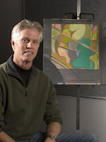
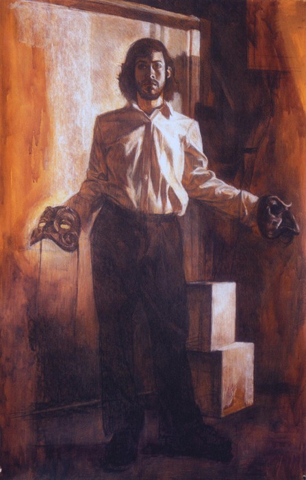
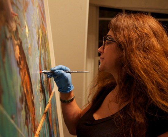
At the Israel Museum in Jerusalem, painter Israel Hershberg is currently showing four landscape paintings: two Umbrian landscapes, a view of Tel Kakun in Israel's Hefer Valley, and a small preparatory work done in the Roman Campagna this past summer. The result of painstaking study and observation, Hershberg's landscapes are scrupulous and refined. One of Hershberg's artistic aims is to remove "himself" from his work, an approach that mirrors the thinking of Italian Renaissance masters of the 15th century. "He is watching and looking hard," comments his friend and fellow artist Kyle Staver. "I feel his tenacity and resolution in every move. The work is present and uncompromising: it is absolutely convincing."
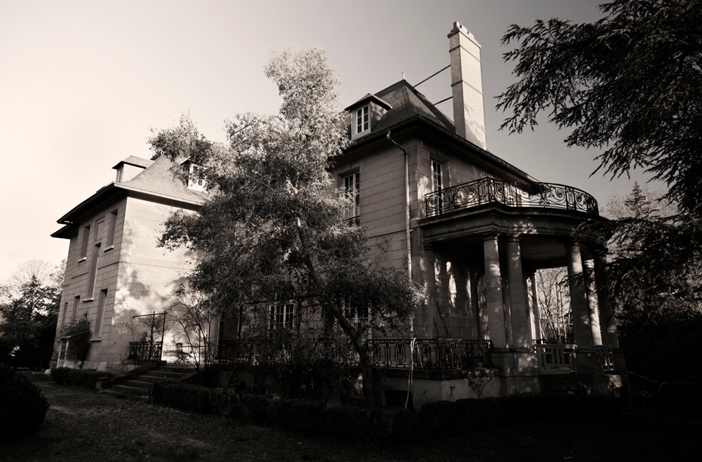
![2013-01-13-001001.jpg]()
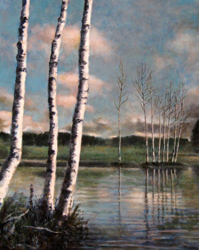
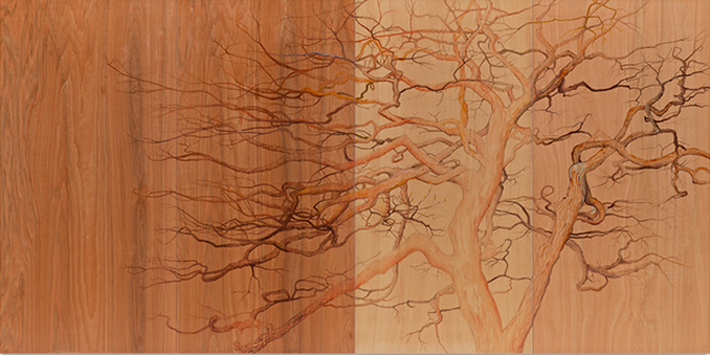
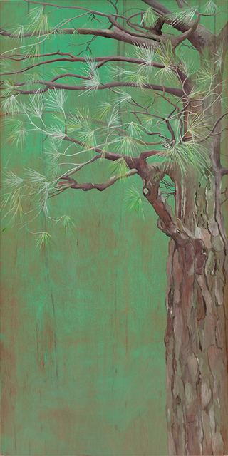
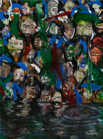
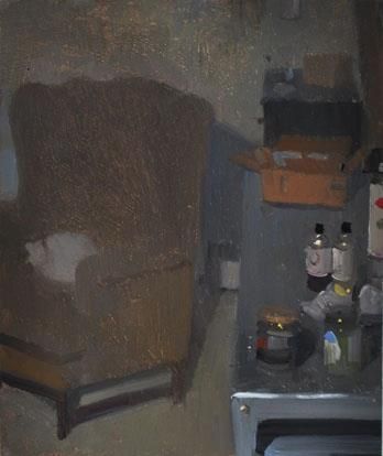
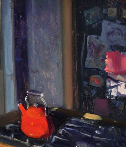
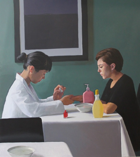
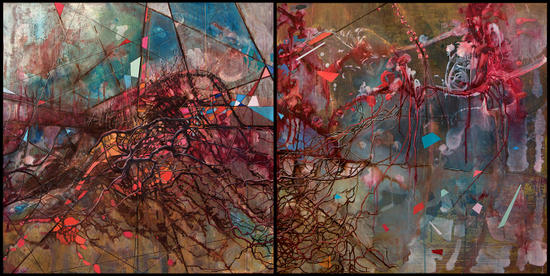
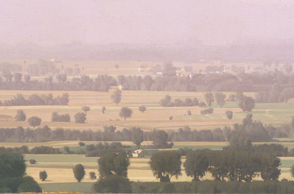
DETAIL: Aria Umbra I, 2003 - 2004, oil on linen, 119 x 250.5 cm. Collection: Israel Museum Image courtesy of Marlborough Gallery, New York Hershberg was educated in the United States: at the Brooklyn Museum School, The Pratt Institute and the State University of New York at Albany. Between 1973 and 1984 he taught painting and drawing at the Maryland Institute College of Art in Baltimore and also briefly taught at the New York Academy of Art before moving to Israel in 1984.
In 1998 he founded the Jerusalem Studio School, the first school in Israel to focus on figurative painting. The school's core program is a four year Master Class comprised of 40 students and focuses on the primacy of painting and drawing from observation, the human figure and in depth study and research after old and modern masters. Its stress on classical as well as modernist values distinguishes it from the neo-classical realist ateliers more common today.
I recently interviewed Israel Hershberg and asked him about his approach to painting, his show in Jerusalem, and about the Jerusalem Studio School.
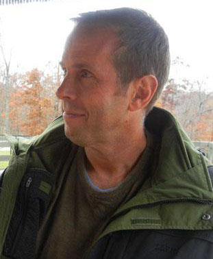
John Seed Interviews Israel Hershberg
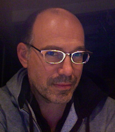
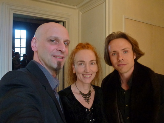
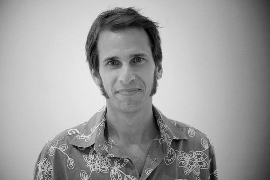
![2013-01-13-589pxIsrael_hershberg_portrait.jpg]()
Israel Hershberg JS: Israel, is it fair to say that your paintings are grounded in your experience of the real world?
IH: There is a quality, an essential concrete experience that I wish very much to transmit, but in its various formational stages I take whatever liberties are necessary for the painting. My finished pictures are not a document of the thing observed. I'd like them to be a new nature, a registration, if you will, of experience as opposed to record. They must be first and foremost, paintings. When I am painting a landscape it's not the nature which captivates me. When looking at a landscape I consider it just as I would any other motif; it's seen through an imposed particularized lens, an accumulated corpus of painterly pictorial desires I have amassed, like the amassing of barnacles on an old ship's hull, it becomes an archetype and one with its own eco-system. One of the reasons I am seduced by the Italian landscape is that it's impossible for me to consider it outside that historical lens of painting, whether imagined or empiric. Seeing the concrete as such becomes canonical, and painting, fertile, pregnant and full of potential.
![2013-01-13-001.jpg]()
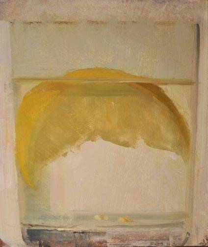
Aria Umbra I, 2003 - 2004, oil on linen, 119 x 250.5 cm. Collection: Israel Museum Image courtesy of Marlborough Gallery, New York JS: So, the paintings you have on display at the Israel Museum in Jerusalem should not be seen as plein air paintings, right?
IH: I don't see myself as a plein air painter. Actually, I'm appalled by what is called plein air painting today. It's been hijacked by an ever expanding group of hobbyists who have turned it into something between a fundamentalist religion and an outdoor sport. Their mantra: A painting is to be done en plein air from start to finish and not one stroke away from the nature! That approach was never the practice or intent of the great landscape painters, not Corot's, not anybody's. All landscape painting, all painting, is studio painting if pondered, whether done on site or in inside a sensory deprivation tank for that matter - painting is the expression of the experience of painting. That said, I am very concerned with maintaining what I think of as the plein air impulse: the stuff I try to nail down in the smaller preparatory works I start on site before embarking on the large pieces and precisely because I do covet the incidental, empiric, the random as important values.
![2013-01-13-002.jpg]()
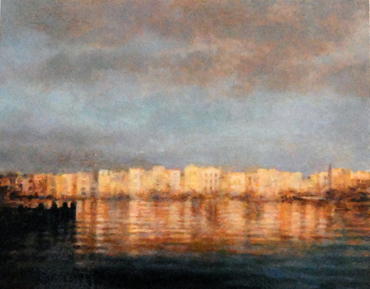
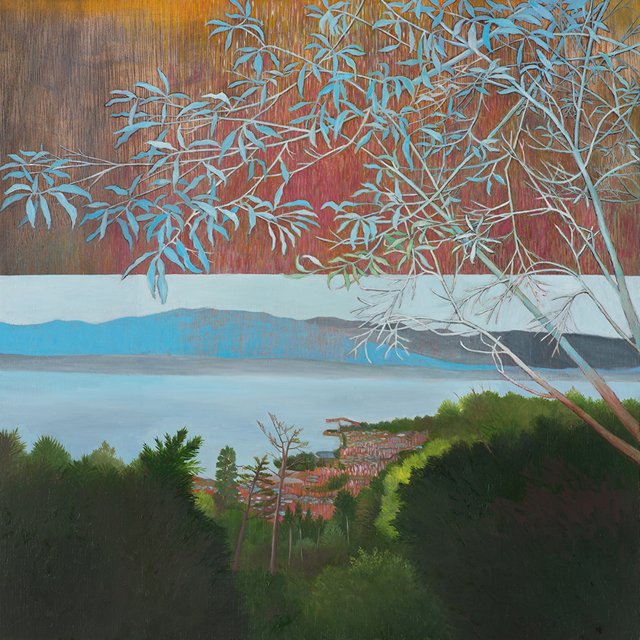
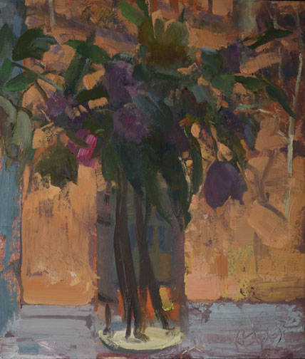
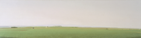
Tel Kakun, 2005 - 2007 oil on linen, 68.6 x 250.5 cm. Private Collection. Image courtesy of Marlborough Gallery, New York JS: You are showing two paintings of Italy alongside a painting of a landscape in Israel. How do the landscapes work together?
IH: There is a lot of overlap. People here, at first glance, have thought that the Italy paintings were done here in the north. Israel is after all in the Mediterranean basin: there are a lot of cypress trees, olive, date, and figs trees. There are pockets here, without manmade structures to give it away, nestled into the hills surrounding Jerusalem that could make you think you are in Italy. Also, I have always been fascinated by the historical connections, relationships and exchanges between ancient Rome and Jerusalem.
![2013-01-13-003.jpg]()
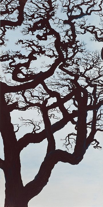
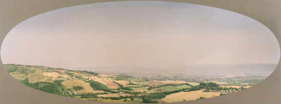
Aria Umbra II, 2007 - 09, oil on linen, 93 x 250.5 cm. Collection: National Gallery of Canada, Ottawa, Canada Jerusalem, Israel Image courtesy of Marlborough Gallery, New York JS: It must be very exciting to be the founder of the Jerusalem Studio School, and to feel that you are taking part in the creation of a new set of artistic traditions in what is still a relatively young country.
IH: It is pretty amazing. Amazing that the consensus here, and elsewhere, is that the school has changed the face of Israeli art. When the state of Israel was born there was this kind of muddled connection to modernism with no real or complex conversation, no memory of anything earlier. That one can't really start there even un-muddled, was and still is in some sectors, anathema. Even those unhappy with such a school in their midst acknowledge that the Jerusalem Studio School has changed the face of Israeli art, as was recently stated in the Israel Museum's latest quarterly. We are putting out some remarkable young artists, ambitious and with a serious hunger for visual culture, and significant notice is being taken both abroad and in Israel.
![2013-01-13-004.jpg]()
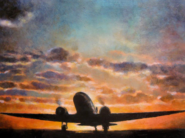
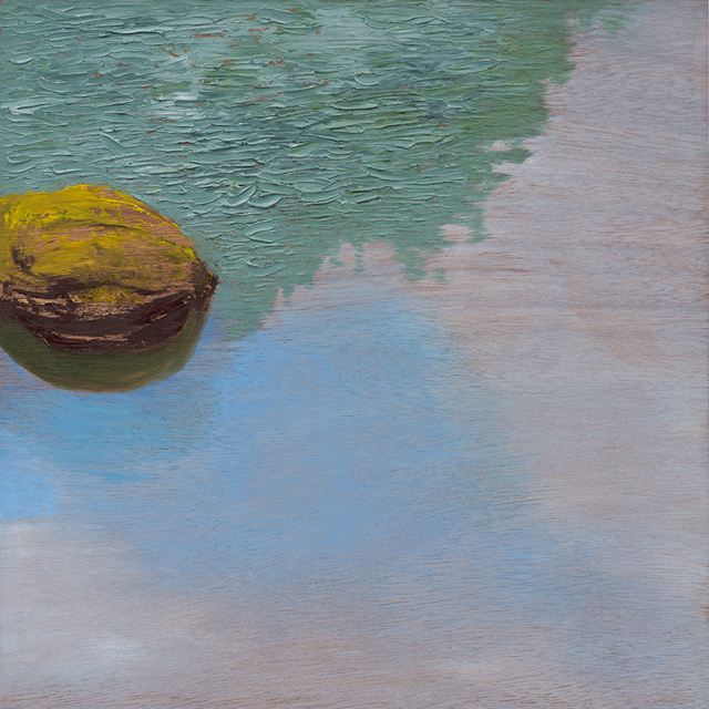
From Soratte - Study, 2012, oil on linen mounted on wood, 15.5 x 60 cm, Private Collection Image courtesy of Marlborough Gallery, New York JS: I understand that you spend part of the each summer in Italy with students from the JSS. Can you tell me more about the program you run there?
IH: The school, in general, and its Italy summer program, more specifically, were established to address a troubling paucity of necessary artistic archetypes I observed in both young and mature artists in Israel when first coming here. With the dearth in Israel of significant collections, I mean the direct unmediated experience of live pivotal and transformative masterworks one needs to acquire such artistic archetypes, an Italy summer program seemed the perfect way of both surmounting and illuminating what I saw as the dark zones. Frankly, I believe that such a program is an artistic imperative even where such a dearth is not so much in evidence!
Out of the school's alternative and immersive pedagogical approach the JSS in Civita Italy summer program evolved and is now attracting serious artists from around the world.
The program is located in Civita Castellana, less than an hour's ride north from Rome in the Lazio region of Italy. The area, town and the imposing presence of the legendary Monte Soratte were the epicenter of open air landscape painting for artists sojourning through the Roman Campagna. So many eminences have worked here: Corot, Ingres, Turner, a list too long to get into here... This summer we have added a whole new dimension to our program: the Terrano Studio Center is just a spectacular studio, classroom, lecture hall and gallery facility in a former WWI-era factory building with gorgeous north windows. In addition we are accepting application for Residencies anywhere from two to ten weeks between June 24th and September 2nd. It all makes for the best community of artists I've seen anywhere in Italy.
![2013-01-13-04copy.jpg]()
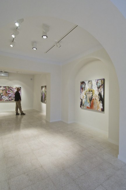
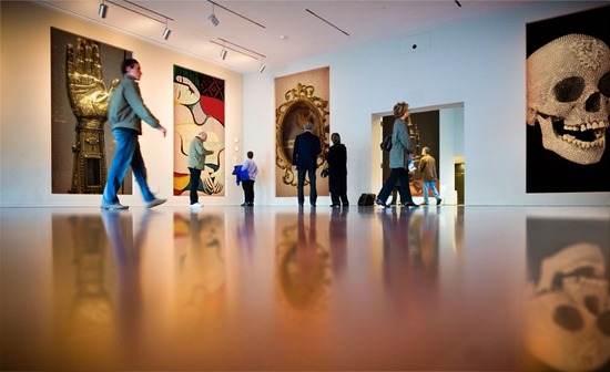
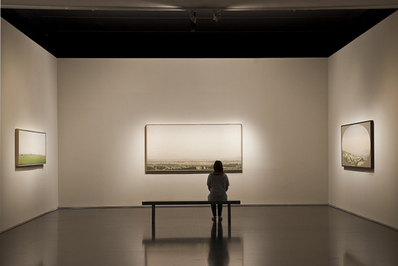
Exhibition View: Fields of Vision -- Photo by Elie Posner, The Israel Museum JS: When someone visits your Jerusalem show, what kind of experience do you hope that they will have?
IH: It is a show of only four works: not a lot of paintings but certainly a lot of painting. I would hope people would stop and embark on a journey of another kind, one that allows for exploration and discovery via a hungry eye. I would hope my paintings slow things down a bit, slow looking. In a very fast everything world, I want the paintings to seduce. I was a little pessimistic about whether my paintings could do this to someone, but I have watched from the museum café which is separated by a large cathedral-like space across from the nave-like space my work now occupies, and watched visitors to the museum just sit for long periods to ponder the paintings. Not all of course, but far more than I'd ever thought. It moved me.
Fields of Vision - Landscapes by Israel Hershberg
The Israel Museum, Jerusalem
Through Feb 9, 2013
In 1998 he founded the Jerusalem Studio School, the first school in Israel to focus on figurative painting. The school's core program is a four year Master Class comprised of 40 students and focuses on the primacy of painting and drawing from observation, the human figure and in depth study and research after old and modern masters. Its stress on classical as well as modernist values distinguishes it from the neo-classical realist ateliers more common today.
I recently interviewed Israel Hershberg and asked him about his approach to painting, his show in Jerusalem, and about the Jerusalem Studio School.
John Seed Interviews Israel Hershberg

IH: There is a quality, an essential concrete experience that I wish very much to transmit, but in its various formational stages I take whatever liberties are necessary for the painting. My finished pictures are not a document of the thing observed. I'd like them to be a new nature, a registration, if you will, of experience as opposed to record. They must be first and foremost, paintings. When I am painting a landscape it's not the nature which captivates me. When looking at a landscape I consider it just as I would any other motif; it's seen through an imposed particularized lens, an accumulated corpus of painterly pictorial desires I have amassed, like the amassing of barnacles on an old ship's hull, it becomes an archetype and one with its own eco-system. One of the reasons I am seduced by the Italian landscape is that it's impossible for me to consider it outside that historical lens of painting, whether imagined or empiric. Seeing the concrete as such becomes canonical, and painting, fertile, pregnant and full of potential.

IH: I don't see myself as a plein air painter. Actually, I'm appalled by what is called plein air painting today. It's been hijacked by an ever expanding group of hobbyists who have turned it into something between a fundamentalist religion and an outdoor sport. Their mantra: A painting is to be done en plein air from start to finish and not one stroke away from the nature! That approach was never the practice or intent of the great landscape painters, not Corot's, not anybody's. All landscape painting, all painting, is studio painting if pondered, whether done on site or in inside a sensory deprivation tank for that matter - painting is the expression of the experience of painting. That said, I am very concerned with maintaining what I think of as the plein air impulse: the stuff I try to nail down in the smaller preparatory works I start on site before embarking on the large pieces and precisely because I do covet the incidental, empiric, the random as important values.
IH: There is a lot of overlap. People here, at first glance, have thought that the Italy paintings were done here in the north. Israel is after all in the Mediterranean basin: there are a lot of cypress trees, olive, date, and figs trees. There are pockets here, without manmade structures to give it away, nestled into the hills surrounding Jerusalem that could make you think you are in Italy. Also, I have always been fascinated by the historical connections, relationships and exchanges between ancient Rome and Jerusalem.
IH: It is pretty amazing. Amazing that the consensus here, and elsewhere, is that the school has changed the face of Israeli art. When the state of Israel was born there was this kind of muddled connection to modernism with no real or complex conversation, no memory of anything earlier. That one can't really start there even un-muddled, was and still is in some sectors, anathema. Even those unhappy with such a school in their midst acknowledge that the Jerusalem Studio School has changed the face of Israeli art, as was recently stated in the Israel Museum's latest quarterly. We are putting out some remarkable young artists, ambitious and with a serious hunger for visual culture, and significant notice is being taken both abroad and in Israel.

IH: The school, in general, and its Italy summer program, more specifically, were established to address a troubling paucity of necessary artistic archetypes I observed in both young and mature artists in Israel when first coming here. With the dearth in Israel of significant collections, I mean the direct unmediated experience of live pivotal and transformative masterworks one needs to acquire such artistic archetypes, an Italy summer program seemed the perfect way of both surmounting and illuminating what I saw as the dark zones. Frankly, I believe that such a program is an artistic imperative even where such a dearth is not so much in evidence!
Out of the school's alternative and immersive pedagogical approach the JSS in Civita Italy summer program evolved and is now attracting serious artists from around the world.
The program is located in Civita Castellana, less than an hour's ride north from Rome in the Lazio region of Italy. The area, town and the imposing presence of the legendary Monte Soratte were the epicenter of open air landscape painting for artists sojourning through the Roman Campagna. So many eminences have worked here: Corot, Ingres, Turner, a list too long to get into here... This summer we have added a whole new dimension to our program: the Terrano Studio Center is just a spectacular studio, classroom, lecture hall and gallery facility in a former WWI-era factory building with gorgeous north windows. In addition we are accepting application for Residencies anywhere from two to ten weeks between June 24th and September 2nd. It all makes for the best community of artists I've seen anywhere in Italy.
IH: It is a show of only four works: not a lot of paintings but certainly a lot of painting. I would hope people would stop and embark on a journey of another kind, one that allows for exploration and discovery via a hungry eye. I would hope my paintings slow things down a bit, slow looking. In a very fast everything world, I want the paintings to seduce. I was a little pessimistic about whether my paintings could do this to someone, but I have watched from the museum café which is separated by a large cathedral-like space across from the nave-like space my work now occupies, and watched visitors to the museum just sit for long periods to ponder the paintings. Not all of course, but far more than I'd ever thought. It moved me.
Fields of Vision - Landscapes by Israel Hershberg
The Israel Museum, Jerusalem
Through Feb 9, 2013